Using the Overview Dashboard: Content Panel
The Overview Dashboard is the main dashboard that is displayed when you log in to Ruckus Analytics. It provides an overview of some important statistics of your Wi-Fi network, shown in the figures below.
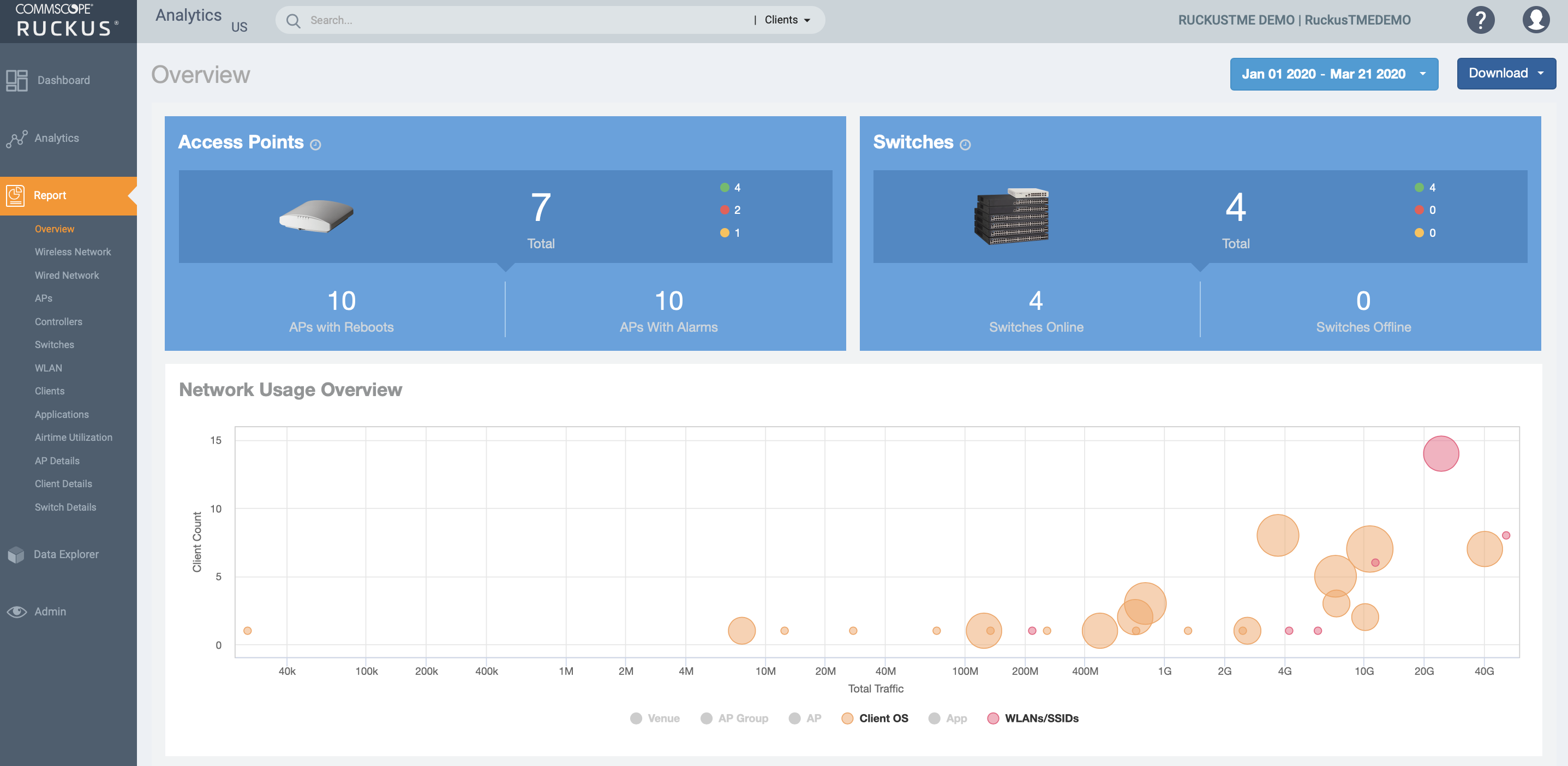
The top portion of the
Overview Dashboard shows the following tiles:
- Access Points: Shows the number of APs in the network. The green, red, and yellow dots show the number of active APs (green), inactive APs (red), and provisioned, in discovery, or rebooting APs (yellow).
- Switches: Shows the number of switches in the network. The green, red, and yellow dots show the number of active switches (green), inactive switches (red), and provisioned, in discovery, or rebooting switches (yellow).
- Network Usage Overview: Shows the relationship between the number of clients and the total traffic in the network. The bubble chart contains bubbles of different colors that indicate different dimensions of the network, including application, domain, OS type, zone, AP, system, AP group, switch, and SSID. Pause the pointer on an individual bubble to display the number of connected clients and traffic information. Bubble sizes vary depending on their values (except for APs and Switches).
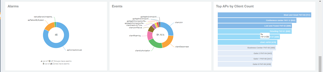
The middle portion of the Overview Dashboard shows the following tiles:
- Alarms: Displays the most frequently occurring alarms in the network. Pause the pointer over a color or name to display the full name of the alarm. Go to the Data Explorer dashboard for more information about alarms.
- Events: Displays the most frequently occurring events in the network. Pause the pointer over a color or name to display the full name of the event. Go to the Data Explorer dashboard for more information about events.
- Top APs by Client Count: Displays the APs being accessed by the most clients. This information is also represented in more detail in the Wireless Report.
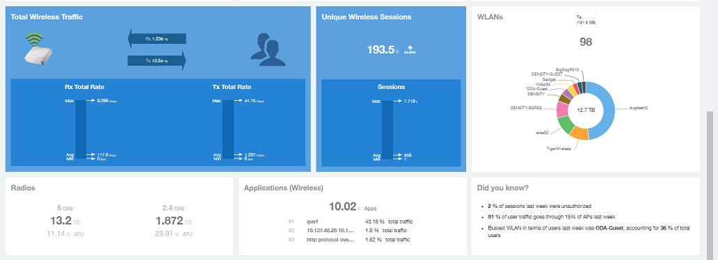
The lower portion of the Overview Dashboard shows the following tiles:
- Total Traffic: Shows statistics about traffic received and transmitted by the access points, including the maximum and minimum rates of traffic. Go to the Wireless Report for more information about traffic.
- Total Unique Sessions: Shows the number of IEEE 802.11 sessions between all clients and APs on the network. Go to the Data Explorer dashboard for more information about sessions.
- WLANs: Displays the top SSIDs by traffic, which is also shown in the WLANs Report. Pause the pointer over a portion of the donut display to obtain more information about each SSID.
- Radios: Displays client data usage, in terabytes, for both the 2.4 GHz and 5.0 GHz networks. For more information about radios, go to the Airtime Utilization Reports.
- Applications: Shows the applications being used more frequently by the clients in the network. For more information about applications usage, go to the Applications Reports.
- "Did you know?": Provides a short, bulleted list about your system, such as the average duration of a session for a week, or the busiest SSID. The "Did you know?" section is updated every time you return to the Overview Dashboard.