Analytics Page
The Analytics page provides a breakdown of incidents by severity and category, allowing you to focus on incidents of interest, for which they can view details. For any given incident, you can view the severity, client impact, root cause, and recommendations, as well as the events, anomalies, data, or problems that were used to identify the incident.
The analytics page consists of different sections which are described as follows:
The Analytics page contains a number of components:
- Network Filter menu
- Date and Time filter
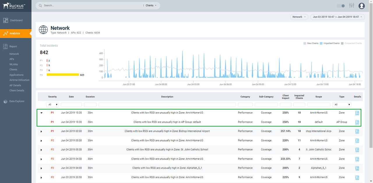
- Network Node Details tile
- Severity Filter tile
- Incident Timeline
- Incident List table
- Incident Details
- Network Impact tile
- Insights
- Incident Info tile
Network Filter Menu
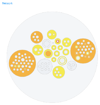
Click the Network menu to select a network node within the circle packing representation. By default, Network is selected, which displays a circle packing view of all the systems in the network. A network node can be a cluster, domain, zone, AP group, or access point in the network. After selecting a node, click X to close the circle packing representation.
Click the Network menu to select a network node within the circle packing representation. By default, Network is selected, which displays a circle packing view of all the systems in the network. A network node can be a Venue, AP group, or access point in the network. After selecting a node, click X to close the circle packing representation.
Date and Time Filter
The date and time filter is used to plot the date and time for a specific time period, including such as Today, Last 24 hours, Last 7 days, or Last Month.Use the Custom option to select the dates and times for a specific customized time period.
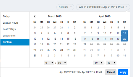
Click Apply to save the specified date and time filters and update the Analytics page.
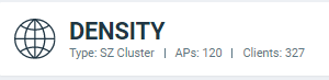
Network Node Details
The Network Node Details tile displays the name of the selected node from the Network Filter menu as a header.
For example, the following figure shows the Density network node and its attributes (Type, APs, and Clients).

| Node | Attributes |
|---|---|
| Cluster |
|
| Domain |
|
| Zone |
|
| AP Group |
|
| AP |
|
| Client |
|
| Node | Attributes |
|---|---|
| Network |
|
| AP Group |
|
| AP |
|
| Client |
|
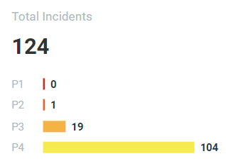
Severity Filter
Incident Timeline
The Incident Timberline is a graphical representation of the number of new clients connecting to the network (the light gray line), the number of clients actively connected to the network (the dark gray line) and the number of clients affected by the network incidents (the blue area in the chart).
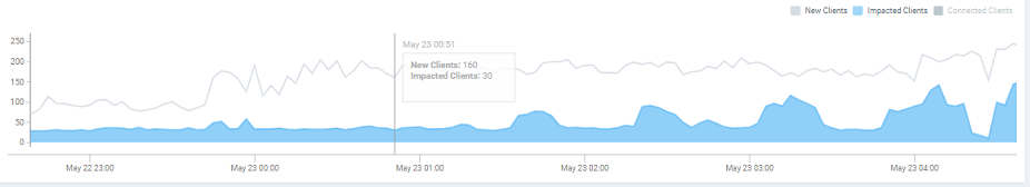
Pausing the pointer at any instance on the timeline displays an information box that shows the number of new clients, impacted clients, and connected clients. You can modify the information displayed in the information box by selecting the New Clients, Impacted Clients, and Connected Clients check boxes.
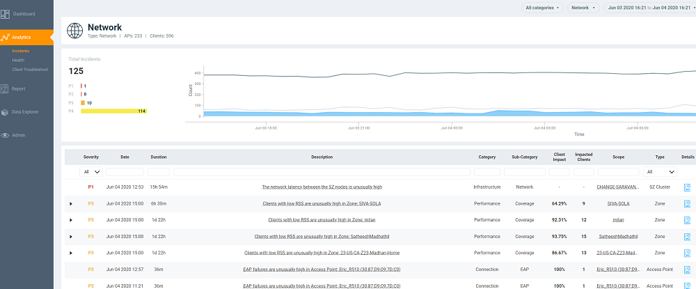
Incidents List Table
Attribute | Description |
|---|---|
Severity | The severity of an incident ranges from P1 to P4; P1 being the highest priority and P4 the lowest. The severity of an incident is determined by the client impact, duration, and other factors. You can see the severity score when you hover the mouse over the number. The severity score of the incident takes into account the scope of the incident, duration of the incident, and the severity of the incident; giving equal consideration to all the mentioned parameters to arrive at the severity score. |
Date | The date and time when the incident started. |
Duration | The measure of how long the incident lasted. |
Description | A short description of the incident. Pausing the pointer over the description displays more information about the incident. |
Category | The type of incident, for example: Connection, Performance, and Infrastructure. |
Sub-Category | Connection incidents consist of the following categories:
Performance incidents consist of the following categories:
Infrastructure incidents consist of the following categories:
|
Client Impact | The percentage of clients impacted by the incident. |
Impacted Clients | The number of clients impacted by the incident. |
Type | The type of incident that occurred. You can view this by selecting the options from the drop-down menu. Options include SZ Cluster, Domain, Zone, AP Group and Access Point. |
Scope | The area of the network in which the incident was detected. Pausing the pointer over the scope displays the entire path of the network node. |
Details | Clicking the Details icon displays the Incident details page to find more details about the incident such as impacted areas, root cause, and recommendations. |
Attribute | Description |
|---|---|
Severity | The severity of an incident ranges from P1 to P4; P1 being the highest priority and P4 the lowest. The severity of an incident is determined by the client impact, duration, and other factors. You can see the severity score when you hover the mouse over the number. The severity score of the incident takes into account the scope of the incident, duration of the incident, and the severity of the incident; giving equal consideration to all the mentioned parameters to arrive at the severity score. |
Date | The date and time when the incident started. |
Duration | The measure of how long the incident lasted. |
Description | A short description of the incident. Pausing the pointer over the description displays more information about the incident. |
Category | The type of incident, for example: Connection, Performance, and Infrastructure. |
Sub-Category | Connection incidents consist of the following categories:
Performance incidents consist of the following categories:
|
Client Impact | The percentage of clients impacted by the incident. |
Impacted Clients | The number of clients impacted by the incident. |
Type | The type of incident that occurred. You can view this by selecting the options from the drop-down menu. Options include Venues, AP Group and Access Point. |
Scope | The area of the network in which the incident was detected. Pausing the pointer over the scope displays the entire path of the network node. |
Details | Clicking the Details icon displays the Incident details page to find more details about the incident such as impacted areas, root cause, and recommendations. |
Incident Details Page
The header of the Incident details page displays the severity level of a selected incident and the description of the incident.
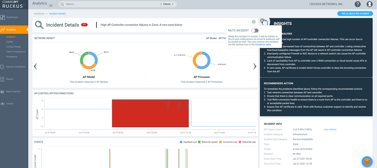
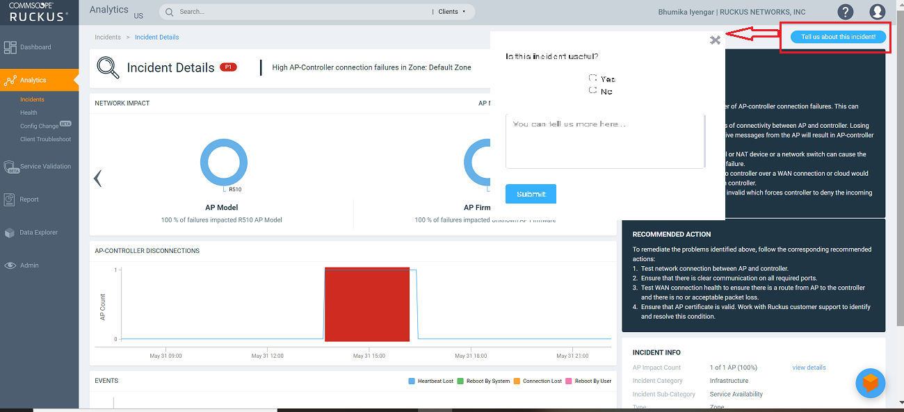
The Tell us about this incident! option allows users to provide feedback about how useful the incident information is based on their production environment. In general, an incident is assigned a severity based on various factors but as a user you can also provide feedback as to what severity best fits the incident.
Incident Details Page
The header of the Incident details page displays the severity level of a selected incident and the description of the incident.
Network Impact Tile
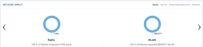
The Network Impact tile consists of various donut charts that represent the areas of the network that were impacted by the incident. Each incident type and subtype has a different set of network impact donut charts, but it is common to see WLANs, Client OS Types, AP Models, Radio Bands, and Reason Codes, which all help to explain some of the common questions: who is impacted, which devices are contributing, what are the reason codes, and more. Every donut chart is divided into donut charts of different colors. If you pause the pointer over any portion of the donut chart, an information box displays the impacted area of the incident and the clients affected by this the incident. Beneath each donut chart is a summary line Two donut charts are shown by default. You can click the right arrow and left arrow to navigate to other donut charts, or click Radio, WLAN, Client Manufacturers, or Reason to access a specific donut chart.
| Incident Type | Donut Charts | Chart Elements |
|---|---|---|
| User Authentication |
|
|
| EAP |
|
|
| Association |
|
|
| DHCP |
|
|
| RADIUS |
|
|
| Time to Connect |
|
|
| RSSI |
|
|
| Network Latency |
| |
| Reboot |
|
|
| SmartZone CPU overload insight |
|
|
| High AP-controller connection failures |
|
|
| Channel Distribution |
|
|
| VLAN Mismatch |
|
Incident identifies incorrect VLAN configurations between switches and wired devices due to which data transmission could be impaired.
|
| Memory Utilization | Incident identifies memory leaks within the switch. The time series
chart displays high memory utilization by a switch against the
threshold set. Pause the pointer over the graph to determine the
switch memory used against the threshold set, at a time. The Detected Time identifies when the memory leak happened and based on the threshold set, a Projected Time is calculated and plotted on the graph. Projected time is predicted; it is the time by when the switch will run out of available memory. Contact RUCKUS Support for assistance. You can select the check-box to displays only Memory Used or Threshold graphs. |
|
| PoE Power |
|
The Impacted Switches table displays detailed information about the switch (name, MAC address, port) for which PoE power was denied. |
| AP PoE Underpowered |
|
|
| AP Ethernet Auto-negotiation |
|
|
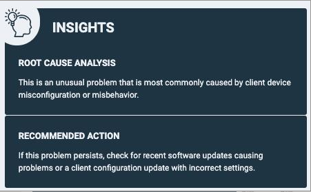
Insights Tile
The Insight tile of the Incident Details page provides a summary of the root cause and recommended action for the incident. The root cause varies based on the incident type, impacted area, data events, and reason codes.
Incident Info Tile
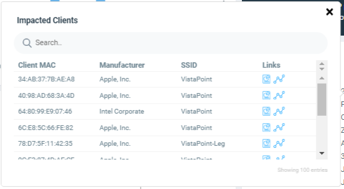
The Incident Info tile lets you know the client impact count, the category and sub-category of the incident, the type, scope, duration, and date and time of the incident.. To explore more about the impacted clients, click Client Impact Count.
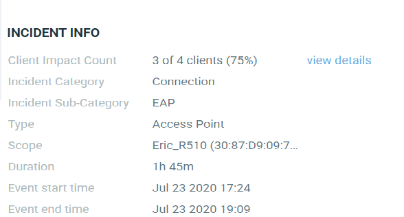
Click view details for more
information about the impacted clients. The Impacted
Clients page displays the user name, host name, client MAC address,
SSID, and manufacturer of the client. To troubleshoot the client, click the Client
Troubleshooting icon ( ) to generate the client details
report, click the Client Details icon (
) to generate the client details
report, click the Client Details icon ( ) on the Impacted Clients page. You can search for impacted clients by the
client MAC address and manufacturer.
) on the Impacted Clients page. You can search for impacted clients by the
client MAC address and manufacturer.