Data Reporting
Data Studio is a next generation reporting tool that is fast and intuitive. It is easy to use and provides a rich user interface to create and edit charts and dashboards.
Create and customize your own dashboards or build upon existing templates. Data Studio provides a wide variety of interactive functions. The following list gives a quick look at them:
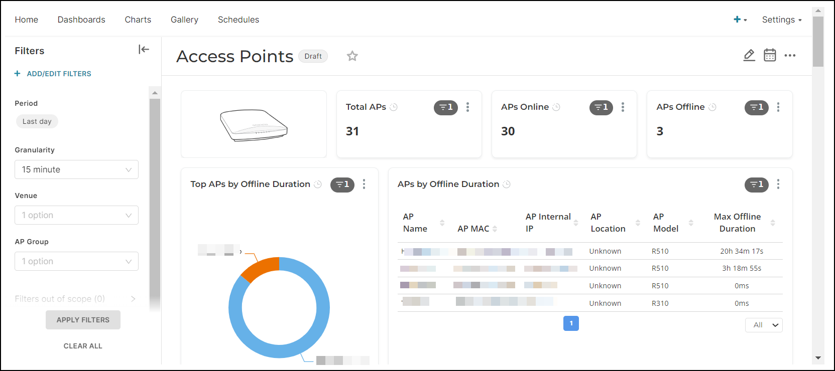
- Create Custom Dashboards: Design personalized dashboards by selecting relevant widgets to visualize network historical data.
- Generate Reports: Schedule and generate customized reports based on specific criteria, such as network performance, user behavior, or security events.
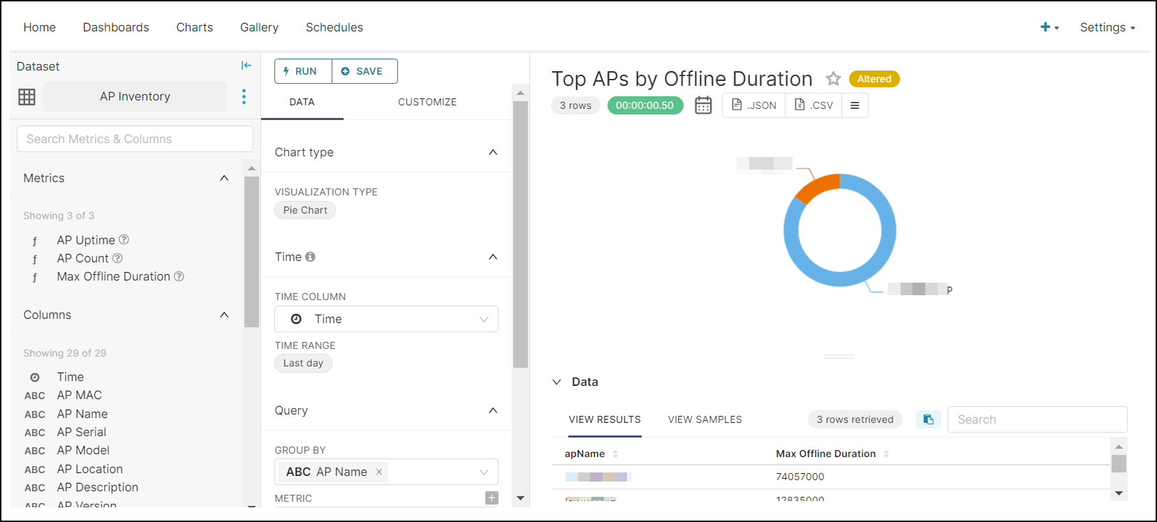
- Visualize Network Metrics: Use various chart types (line charts, bar graphs, and so on) to display metrics like client count, throughput, and AP health as you find most helpful.
- Analyze Historical Data: Dive into historical trends and patterns to identify performance bottlenecks or anomalies.
- Monitor Alarms and Events: Receive alerts and notifications for critical events, such as AP failures or subscription expirations.
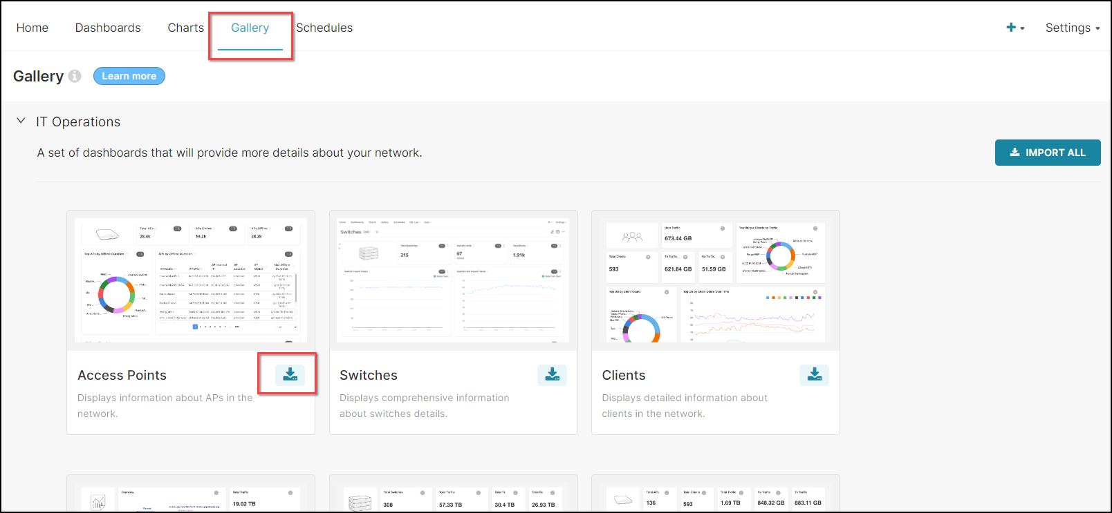
In the Gallery tab in Data Studio, you will find a set of prebuilt dashboards ready for you to import. Click the Import icon to import the template into your dashboards.
Note: Avoid clicking the IMPORT ALL option as this action may lead to system errors
due to the large amount of information that will be processed.