Data Studio
Data Studio is a next-generation reporting and analytics tool that enables visualization of network data through customizable charts, interactive dashboards, and automated report scheduling, all within an intuitive, efficient, and feature-rich interface designed for operational insight.
- Custom Dashboards: Combine multiple visualizations into a unified workspace that highlights the metrics and trends most important to your network operations. Dashboards offer layout flexibility with rows, columns, tabs, and so on, enabling clear contextual views of network health, usage patterns, and performance indicators.
- Flexible Charting: Visualize data with a variety of chart types including time series, bar, pie, table, pivot, and advanced visualizations to suit different analytical needs. You can define metrics, dimensions, filters, and time ranges to tailor each chart.
- Filter and Scope Controls: Apply dynamic filters to refine the data displayed across charts and dashboards, and configure cross-filtering behavior to interactively explore relationships between visualizations.
- Scheduled Reporting: Automate the delivery of analytical insights via email on a scheduled basis (daily, weekly, monthly), enabling users to receive up-to-date reports without manual intervention.
- Pre-Built Templates: Access a gallery of pre-packaged dashboard templates for common operational views and vertical-specific reporting. These templates can be imported and customized to accelerate reporting workflow.
- Export Options: Extract data or visual representations in multiple formats such as CSV, JSON, PNG, or PDF for external analysis, archival, or sharing with stakeholders.
By consolidating chart creation, dashboard building, and scheduled reports into a single self-service environment, Data Studio helps organizations transform raw network data into actionable insights that drive operational effectiveness and strategic planning.
Accessing Data Studio
- Dashboards tab
- Charts tab
- Schedules tab
- Gallery tab
Charts Tab
Charts help visualize network and operational data using different visualization formats such as bar charts, pie charts, time-series charts, big number indicators, box plots, and other supported chart types.
Charts can be created independently or added to dashboards for combined visualization. While users can view shared charts, only the chart owner can edit or delete a chart. Other users can create their own editable copy using the Save As option, which makes them the owner of the copied chart.
The Charts tab displays charts available in Data Studio and allows you to view, create, manage, and organize charts used for data visualization.
- From the navigation bar,
select , then click the Charts tab.
The Charts page is displayed.
You can use the available filters to display charts based on Name (chart title), Type (visualization format), Dataset (data source used), Owner (chart creator), Dashboard (dashboards where the chart is used), and Favorite (charts marked as favorites).
Charts Tab 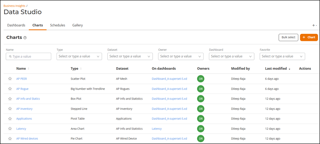
- View the chart details in the
table.
- Name: Displays the name of the chart. Click the name to open the chart details page.
- Type: Displays the visualization type used in the chart.
- Dataset: Indicates the dataset from which the chart retrieves data.
- On dashboards: Displays the dashboards to which the chart is currently added.
- Owners: Displays the user who created the chart.
- Modified By: Displays the user who last modified the chart.
- Last Modified: Displays when the chart was last updated.
- Actions: Displays available actions for the chart. The delete option is available only to the chart owner; for other users, it appears greyed out. Action icons are visible when you hover your cursor over the charts entry in the table.
A
 icon beside each chart allows you to mark
or unmark it as a favorite for quick access.
icon beside each chart allows you to mark
or unmark it as a favorite for quick access. - (Optional) Click Bulk select to select multiple charts and delete them in a single operation. Only charts owned by the logged-in user can be deleted.
Creating a Chart
- From the navigation bar, select , and then click the Charts tab. The Charts page is displayed.
- Click +Chart. The
Create a new chart page is displayed.
Creating a New Chart 
- In Choose a
Dataset, select a Dataset from the
drop-down list. The selected dataset determines the columns and metrics
available for chart creation.
Refer to Dataset Filters for details regarding the metrics and columns included in each dataset.
- In Choose Chart
Type, select a chart type. You can choose a chart from the
following chart selection options:
- All charts: Displays all chart types available for chart creation, without filtering.
- Featured: Displays commonly used or recommended chart types to help you quickly select suitable visualizations for typical analytics scenarios.
- Category: Groups charts based on the analytical purpose or visualization style. When a category is selected, relevant chart types appear in the right panel for selection. Categories organize charts by how data is analyzed, such as showing trends over time, comparing values, analyzing distributions, showing relationships, representing parts of a whole, displaying rankings, presenting tabular data, or visualizing flows and KPIs.
- Tags: Provides additional filtering based on visualization characteristics or rendering styles (for example, bar-based, line-based, intensity-based, legacy formats, and so on). Selecting a tag filters the available charts to those supporting the selected visualization style or capability.
You must select both dataset and chart type to proceed. After you select the chart, a brief introduction and examples of the selected chart are displayed.
- Click Create New
Chart. A new chart editor page is displayed with the
following panels:
- Chart Source (left panel): Displays the selected dataset and lists all available metrics and columns, including any calculated or derived metrics defined within the dataset. You can drag and drop columns or metrics from this panel into the configuration fields in the Data tab and Customize tab to build the chart.
- Data and Customize configuration tabs (center
panel): Provides the configuration interface for defining how
the chart retrieves and displays data.
- The Data tab allows you to configure query settings such as dimensions, metrics, filters, time range, sorting, aggregation mode, and other analytical options.
- The Customize tab allows you to control the visual presentation of the chart, including formatting, color schemes, labels, axes, legends, and other display properties.
The options available in these tabs vary depending on the selected chart type.
- Visualization canvas (right panel): Displays the chart preview based on the selected configuration. After defining the required columns, metrics, and filters, click Create Chart (or Update Chart) to execute the query and render the chart in this panel. This area reflects changes made in the configuration settings and allows you to validate the output before saving the chart.
Create New Chart Page 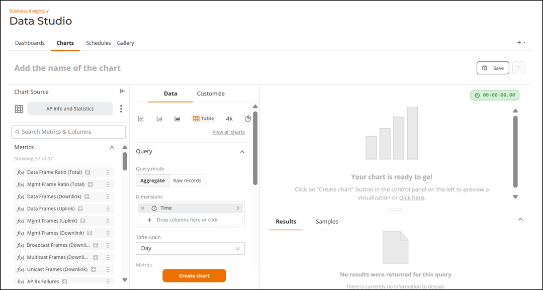
- In the Add the name of the
chart field, enter a title for the chart.
Under Chart Source, the selected dataset is displayed.
- (Optional) Swap the dataset if you want to use a different one. Complete the
following steps to swap the dataset:
- In the Chart Source
panel, click the
 icon next to the dataset name and
select Swap dataset. The Swap dataset
window is displayed, including the following warning: Warning!
Changing the dataset may break the chart if the chart relies on
columns or metadata that do not exist in the target
dataset.
icon next to the dataset name and
select Swap dataset. The Swap dataset
window is displayed, including the following warning: Warning!
Changing the dataset may break the chart if the chart relies on
columns or metadata that do not exist in the target
dataset. - Choose the required
dataset. A confirmation window appears, displaying the following
warning message:
Warning! Changing the dataset may break the chart if the metadata does not exist.
- Click Proceed. If
the system detects matching controls (columns or metrics) between
the old and new dataset, the following dialog appears in the
Data tab:
Keep control settings? You've changed datasets. Any controls with data (columns, metrics) that match this new dataset have been retained.
Select one of the options:
- Clear form: Removes previously configured columns and metrics.
- Continue: Retains compatible controls and removes only incompatible ones.
- In the Chart Source
panel, click the
- Complete the following steps
to configure the Data tab:
The Data tab controls how data is queried, grouped, aggregated, filtered, and structured before visualization.
- (Optional) Change the
previously selected chart type. Under the Data tab, a snapshot of commonly used chart types is displayed for quick selection. By default, the chart type selected during chart creation is highlighted. If you want to select a different chart, complete the following steps: If required, you can select any other chart type directly from this snapshot. If you want to select a chart type that is not listed in the snapshot, complete the following steps:
- Click View all charts. The Select a visualization type window is displayed.
- Select the required chart type and click Select.
When you change the chart type, the configuration options available under the Data and Customize tabs automatically change to reflect the analytical and visualization requirements of the selected chart type.Note: When the same metric is used across multiple charts within a dashboard, a consistent base color is applied to maintain visual uniformity. In time-based comparison charts (for example, multi-week comparisons), the same metric across different time periods is displayed using the same color with varying shades. To override the default color behavior and apply distinct colors for time-based comparisons, enable the Match time shift color with original series option under Customize > Chart Options in the chart configuration.Note: When you change the chart type (for example, from a Mixed Chart to a Table or Pivot Table), previously configured Metrics and Columns may not be displayed in the chart source, and the message Ineligible items are hidden may appear. This occurs because certain fields are not compatible with the selected chart type. To view and restore applicable fields, expand the Query section in the chart configuration panel.The following steps explain the options available when the chart type is selected as Table Chart.
- In the
Query section of the Data tab,
complete the following fields:
- Query Mode: Select one of the
following modes: Aggregate or
Raw Records. In aggregate, data is
aggregated by grouping it using selected Dimensions and
calculating summary metrics. In raw records, displays
individual rows from the dataset without aggregation.
- Aggregate: Aggregates data by grouping it using selected Dimensions and calculating summary metrics.
- Raw Records: Displays individual rows from the dataset without aggregation.
- For
Aggregate, complete the following
fields:
- Dimensions: You can define
how data is grouped in the table and the level of
detail provided. To add a dimension, complete one of
the following steps:
- Drag and drop a column from the Columns section in left panel into the Dimensions field.
- Click the + button. The My column dialog box is displayed. Select a predefined column from the Saved or Simple tab, or define a custom SQL expression using the Custom SQL tab, and then click Save.
Refer to Dataset Filters for details regarding the metrics and columns included in each dataset.
Note: To access and enable the Time Grain option, you must add the Time column to the Dimensions field. Once added, the Time Grain field appears. For other chart types (such as Bar Chart or Line Chart), the Time column must be added to the X-axis field under Query to enable Time Grain. - Time Grain: You can define the interval at which data is aggregated. Select a time from the drop-down list. Available options include 30 second, minute, 3 minute, 5 minute, 10 minute, 15 minute, 30 minute, Hour, Day, Week, Month, and Quarter. By default Time Grain is set to Day. As an example, if Hour is selected, the system groups data into hourly intervals and calculates the selected metrics for each hour within the defined Time Range filter.
- Metrics: You can define the
metrics that represent the numerical values
calculated for each dimension group. To add a
metric, complete one of the following steps:
- Drag and drop a column or metric from the left panel into the Metrics field.
- Click the + button. The My
metric dialog box is displayed. Select a
predefined metric from the
Saved tab, a predefined
column and an aggregation function from the Simple tab, or define a custom SQL expression
using the Custom SQL tab, and
then click Save.
Refer to Dataset Filters for details regarding the metrics and columns included in each dataset.
Note: You can add more than one metric to the chart. - Percentage metrics: You can
define metrics to be displayed as a percentage of
the total. The percentage is calculated from only
the data within the row limit. To add a percentage
metric, complete one of the following steps:
- Drag and drop a column or metric from the left panel into the Percentage metrics field.
- Click the + button. The My metric dialog box is displayed. Select a predefined metric from the Saved tab, a predefined column and an aggregation function from the Simple tab, or define a custom SQL expression using the Custom SQL tab, and then click Save.
- Filters: You can restrict
the dataset before aggregation is performed. To add
a filter, complete one of the following steps:
- Drag and drop a column or metric from the left panel into the Filters field.
- Click the + button. A dialog box is displayed. Define a custom filter using the Simple or Custom SQL tab and click Save.
By default, a Time filter is applied with the value “Last Day”. This filter determines the time range for the query. Click the existing Time filter to configure a different Time Range. A dialog box is displayed, defaulting to the Simple tab. Click the Time Range field. The Edit time range dialog box is displayed. Complete the fields, confirm that the Actual time range displayed at the bottom of the dialog box displays your intended configuration, and click Apply.
- Range Type: Select a range type from the
drop-down list:
- Last: Relative to current time
- Previous: Completed calendar period
- Custom: User-defined range
- Advanced: Advanced time logic
- No Filter: Removes time restriction
- For
Last, select from following options:
- Last day: This generates a daily report from the present day (12 AM) until the current time.
- Last week: This generates a weekly report of the previous seven days from 12 AM until the current time.
- Last month: This generates a monthly report of the previous 30 days from 12 AM until the current time.
- Last quarter: This generates a quarterly report of the previous 90 days from 12 AM until the current time.
- For
Previous, select from following options:
- previous calendar week: This generates a weekly report for the previous calendar week. Example: If you are creating a report on September 14, you will get the report from September 2 (Sunday) at 12 AM until September 9 (Sunday) at 12 AM. This generates a daily report from the present day (12 AM) until the current time.
- previous calendar month: This generates a monthly report for the previous calendar month. Example: If you are creating a report on September 14, you will get the report for the entire month of August.
- For
Custom, select START (INCLUSIVE) and END
(EXCLUSIVE) times and dates from the following
options:
- Relative Date/Time: This option allows you to select the time grain ranging from seconds to a quarter and specify the duration before which you want to generate the report. Select a time range from the drop-down. After that, enter a time range that is less than or equal to three months before the day you want to generate the report.
- Specific Date/Time: Select a date and time range from the calendar less than or equal to three months before the day you want to generate the report. This generates a monthly report for the previous calendar month. Example: If you are creating a report on September 14, you will get the report for the entire month of August.
- Now: This option sets the time as the current system time of the current day (00:00:00). You can use this option in the END (EXCLUSIVE) field to get the data from a previous start time to the current time. Select Now in both the START (INCLUSIVE) and END (EXCLUSIVE) fields to obtain real-time, live data.
- Midnight: This option sets the time as midnight of the current day (00:00:00).
- For Advanced, define START (INCLUSIVE) and END (EXCLUSIVE) relative or expression-based time ranges for more granular filtering.
- Select No Filter to include data from all available time periods.
- (Optional) Sort query by: You
can define a metric or column to use to sort the
order of results. If not defined, the system sorts
by the first selected metric by default. To add a
metric of sorting, complete one of the following
steps:
- Drag and drop a column or metric from the left panel into the Sort query by field.
- Click the + button. The My
metric dialog box is displayed. Select a
predefined metric from the
Saved tab, or define a custom
column using the Simple or
Custom SQL tab and click Save.
After a metric or column has been selected, the Sort descending option is displayed and is enabled by default, sorting the results/values in descending order. Click the checkbox to disable this option, results will be sorted in ascending order.
- Server pagination: When
enabled (default), pagination is handled on the
server side to improve performance.
- Server Page Length: Select number of rows per page using the drop-down; available options are: 10 (default), 20, 50, 100, and 200.
If the option is disabled, you must define a Row Limit using the drop-down.
Note: In Data Studio table charts, disabling pagination limits the display to a maximum of 500 rows. - Show summary: When enabled, displays an additional row showing total aggregation of the selected metrics. The summary calculation is not restricted by the server pagination row limit.
- Dimensions: You can define
how data is grouped in the table and the level of
detail provided. To add a dimension, complete one of
the following steps:
- Click Query
mode option Raw Records to
define the fields to display detailed row-level data.
Complete the following fields:
- Columns: Select dataset
columns to display. If Time is added, the Time Grain option appears.
Refer to Dataset Filters for details regarding the metrics and columns included in each dataset.
- Filters: Same configuration process as Aggregate query mode.
- Ordering: Select the order from the drop-down.
- Server Pagination: Same configuration process as Aggregate query mode.
- Columns: Select dataset
columns to display. If Time is added, the Time Grain option appears.
- Query Mode: Select one of the
following modes: Aggregate or
Raw Records. In aggregate, data is
aggregated by grouping it using selected Dimensions and
calculating summary metrics. In raw records, displays
individual rows from the dataset without aggregation.
- In the Time Comparison section, complete the
following field:
- Time shift: Used to analyze performance changes across periods. Select the value from the drop-down list. Available options include 1 day ago, 1 week ago, 1 month ago, 1 year ago, Custom date, and Inherit range from time filter. If Custom date is selected, then you must also select the Shift start date (which defaults to the current day).
- (Optional) Change the
previously selected chart type.
- Click the
Customize tab to customize the chart that you have
selected. The Customize tab is displayed only for the
selected charts. If required, you can customize the chart color, row size,
column size, labels, and alignments. Like the Data tab, the Custom tab is divided
into sections and only the options applicable to the selected chart type are
displayed. Note: Bitrate values are displayed using the SI standard (base-1000) unit conversion. As a result, values may differ slightly from those displayed in earlier versions, which used a 1024-based calculation. This behavior applies to all charts where bitrate-based metrics (for example, MCS rate) are displayed.
The remainder of this step explains the sections and configuration options available when the chart type is selected as Table Chart.
In the Options section, configure the following"
- Timestamp format: Select date and time format from the drop-down.
- Page length: This field appears when the Server pagination option is disabled on the Data tab.
- Search box: This option displays a client-side search box in the chart. By default, this option is disabled; click the checkbox to enable it.
- Allow columns to be rearranged: This option allows the user reading the table chart to rearrange columns in the rendered table by dragging and dropping the column headers to the position required. By default this option is disabled; click the checkbox to enable it. Note that the rearranged column order is not persistent; the columns will appear in their default order the next time the chart is opened.
- Render columns in HTML format: When enabled (default), HTML content inside table cells is rendered as formatted HTML elements such as hyperlinks.
In the Visual formatting section, configure the following:- Show Cell bars: Displays background bar indicators inside numeric cells to visually represent magnitude. By default, this option is enabled; click the checkbox to disable it.
- Align +/-: This option aligns the background chart with both positive and negative values at zero. Click the checkbox to enable this option.
- Add colors to cell bars for +/-: Applies color differentiation to positive and negative values. By default, this option is enabled; click the checkbox to disable it.
- Basic
conditional formatting: This option applies
uniform color rules to the entire table. For color type, select
one of the following options:
- Green for increase, red for decrease: Displays positive changes in green and negative changes in red.
- Red for increase, green for decrease: Displays increases in red and decreases in green (useful when increases indicate negative impact, such as error counts).
- Custom
Conditional Formatting: Allows you to apply
rule-based color formatting to specific numeric columns. Note
that configuring this setting overrides any configuration set
for Basic
conditional formatting. Click + Add new
color formatter. The Add new
formatter dialog box is displayed. Complete the
following fields:
- Column: Select the numeric column to which the formatting rule should be applied.
- Color Scheme: Choose the color style from the drop-down list to apply when the condition is met. Available options include success, alert, error, success dark, alert dark, error dark, Green for increase, red for decrease, and Red for increase, green for decrease.
- Operator: Define the comparison condition (for example, >, <, =, ≥, ≤). The default is None.
- Target Value: Specify the threshold value that
triggers the formatting rule.
Click Apply to save and enforce the rule.
- Click Create Chart to
execute the configured query and generate a preview of the chart. The system
executes the query based on the selected columns and metrics, filters, time
range, and time grain. The resulting visualization is rendered in the
preview canvas (right panel). The chart is displayed for validation purposes
only and is not saved at this stage.
View and interact with the visualization in the preview canvas to verify that the current configuration settings are producing the expected output. If you modify any configuration settings after generating the preview, click Update Chart to re-execute the query and refresh the visualization.
The chart must be explicitly saved to retain it beyond the preview session.
- Click Save to store the
configured chart for future access and reuse. The Save
chart window is displayed.
Save Chart 
- Complete the
following fields:
- Chart name: Enter a name for the chart. If a name was previously entered during chart configuration, this field is automatically pre-filled. You can modify it before saving.
- Add to dashboard: Allows you to embed the chart directly into an existing dashboard. Select a dashboard from the drop-down list if you want the chart to appear there upon saving.
- Click Save
as... to create a new chart and save it to the
Charts tab without navigating away from the
current page. If you have selected a dashboard, you can select
Save & go to dashboard; this will
redirect you to the Dashboard tab.
The Save (Overwrite) option is applicable only when modifying an existing chart and is available only to the owner of the chart.
- Complete the
following fields:

Accessing and Managing Individual Charts
After creating and saving a chart, you can access its details page to review its configuration, view ownership information, and perform additional management actions.
To access a saved chart, complete the following steps:
- From the navigation bar, select , and then click the Charts tab. The Charts page is displayed.
- From the list of available charts, click the name of the chart that you want
to view. The page displays informational icons that provide quick visibility into chart details:
- The
 icon indicates the number of
dashboards to which this chart has been added. Pause your cursor
over the icon to view the list of associated dashboards.
icon indicates the number of
dashboards to which this chart has been added. Pause your cursor
over the icon to view the list of associated dashboards. - The
 icon displays the chart ownership
details. Pause your cursor over the icon to view who created the
chart, owner, and date and time when the chart was created.
icon displays the chart ownership
details. Pause your cursor over the icon to view who created the
chart, owner, and date and time when the chart was created. - The
 icon displays modification details.
Pause your cursor over the icon to view the last modified time
and the user who modified the chart.
icon displays modification details.
Pause your cursor over the icon to view the last modified time
and the user who modified the chart.
- The
- Modify the chart as required, and then click Save. The Save
chart window is displayed with the following options:
- Save as...: Creates a new chart based on the current configuration. This option allows you to save a copy of the chart with a different name, without modifying the original chart.
- Save (Overwrite): Updates the existing chart with the latest changes. This option is available only to the chart owner. Users who are not the owner cannot overwrite the original chart and must use the Save as... option to create a new chart.
- Perform the following
additional actions from the details page of the selected chart:
- Configure a Report Schedule for the Chart. For more information, refer to Configuring a Report Schedule for the Chart.
- Download the Chart Report. For more information, refer to Downloading the Chart Report.
Configuring a Report Schedule for the Chart
You can configure a report schedule for the chart that you have created.
The configured schedule is displayed in the Schedules tab. Alternatively, you can create a report schedule for the chart from the Schedules tab, refer to Creating a Schedule.
- From the navigation bar, select , and then click the Charts tab. The Charts page is displayed.
- In the table, select the chart for which you want to create an email schedule.
- Click the
 icon at the top-right corner and select . The Schedule a New Email Report dialog
box is displayed.
icon at the top-right corner and select . The Schedule a New Email Report dialog
box is displayed. - Complete the following
fields:
Add Schedule for Chart 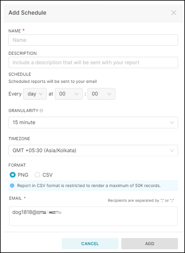
- Schedule Name: Enter a name for the report schedule.
- Description: Enter a description for the report.
- Schedule: Select the frequency (day, week,
or month) and time at which you want to trigger the report to be run
and sent to the email recipients.
- Day: Select the time at which you want the report to be sent each day.
- Week: Select the day of the week and time at which the report to be sent.
- Month: Select the day of the month (for example, 1st–31st) and the time at which you want the report to be sent each month.
Note: The reporting period is determined by the schedule frequency and overrides any time filters configured in charts.- For daily schedules, the report includes data for the previous day.
- For weekly schedules, the report includes data for the last 7 days.
- For monthly schedules, the report includes data for the last 30 days.
- Granularity: Specifies the time
interval used to aggregate and present data in the scheduled
report. The selected time interval determines the level of
detail in the report. For example, if you set Granularity to Week,
and schedule the report to run monthly, the report displays
data aggregated by week within the reporting period.
The values available for the Granularity option are dependent on the frequency configured in the Schedule option.
Table 1. Granularity Options for Scheduled Reports Report Schedule Granularity Day 15 minute, Hour, or Day Week 15 minute, Hour, Day, or Week Month Hour, Day, Week, or Month A default granularity value is defined for existing schedules. For daily and weekly schedules, the default granularity is set to 15 minute, while for monthly schedule, the default granularity is Hour.
- Timezone: Select a timezone from the list.
- Format: Select a report format
PNG (image) or CSV
(spreadsheet).Note: The scheduled report in CSV format is restricted to render a maximum of 50,000 records.
- Email: Specify the email address of the recipient to whom you want to send the report. The current user's email address appears by default. You can enter email addresses of multiple recipients separated by commas or semicolons.
- Click Add Schedule to create a report schedule for the chart.
Downloading the Chart Report
- From the navigation bar, select , and then click the Charts tab. The Charts page is displayed.
- In the table, select the chart for which you want to download the chart report.
- Click the icon at the top-right corner and select to download the report in CSV format.
- Click the icon at the top-right corner and select to download the report in JSON format.
- Click the icon at the top-right corner and select to download the report as an image.
Dashboards Tab
Dashboards provide a consolidated view of multiple charts in a single workspace. They enable users to monitor key metrics, compare related data, and gain actionable insights through a customizable layout.
A dashboard can contain one or more charts arranged to meet specific monitoring or reporting needs. Dashboards help centralize analysis by presenting related visualizations in a single, organized view.
The Dashboards tab displays all the dashboards listed in a table. It provides visibility into dashboard ownership, status, and modification history, along with options to manage, filter, export, or delete dashboards.
- From the navigation bar,
select . The Dashboards page is displayed by
default.
You can search, sort, and filter dashboards to quickly locate specific entries. Use the available filters to display dashboards based on dashboard name, status of the dashboard (Draft or Published), owner of the dashboard, and dashboards marked as favorites.
A
icon beside each dashboard allows you to
mark or unmark it as a favorite for quick access. - View the dashboard details in
the table.
- Name: Displays the dashboard title. Click the name to open the selected dashboard details page.
- Status: Indicates whether the dashboard is in Draft or Published state.
- Owners: Displays the initials of the user who owns the dashboard.
- Last Modified: Displays when the dashboard was last updated.
- Actions:
Allows you to perform the following actions. The action icons become
visible when you hover your cursor over a dashboard entry in the
table.
- Delete: Allows you to delete the dashboard. Click
the
 icon and confirm to delete the
dashboard. The delete option is available only to the
dashboard owner. For other users, the option appears greyed
out.
icon and confirm to delete the
dashboard. The delete option is available only to the
dashboard owner. For other users, the option appears greyed
out. - Export: Allows you to export a dashboard to create
a backup copy or to share with other users. Click the
 icon to export the
dashboard.
icon to export the
dashboard.Dashboards are exported as .zip files instead of the earlier .dashboard format. This ZIP file must be imported as-is without extracting its contents. On some systems (for example, macOS), ZIP files may be automatically extracted and the original ZIP file removed. In such cases, ensure that the original ZIP file is used for import. Data Studio continues to support backward compatibility with the legacy .dashboard format.
You can import the exported file into the same or another account. To import a dashboard, click the
 icon to open the Import
Dashboard window, select the exported file, and
then click Import. The imported dashboard is
added to the dashboard list.
icon to open the Import
Dashboard window, select the exported file, and
then click Import. The imported dashboard is
added to the dashboard list.
- Delete: Allows you to delete the dashboard. Click
the
You can also use the Bulk Select option to select multiple dashboards and delete or export them in a single operation.
Creating a Dashboard
- From the navigation bar, select . The Dashboards tab is displayed by default.
- Click +Dashboard. A
new dashboard opens with the default title [untitled dashboard]
and displays an empty canvas ready for adding charts and layout elements.
Creating a New Dashboard 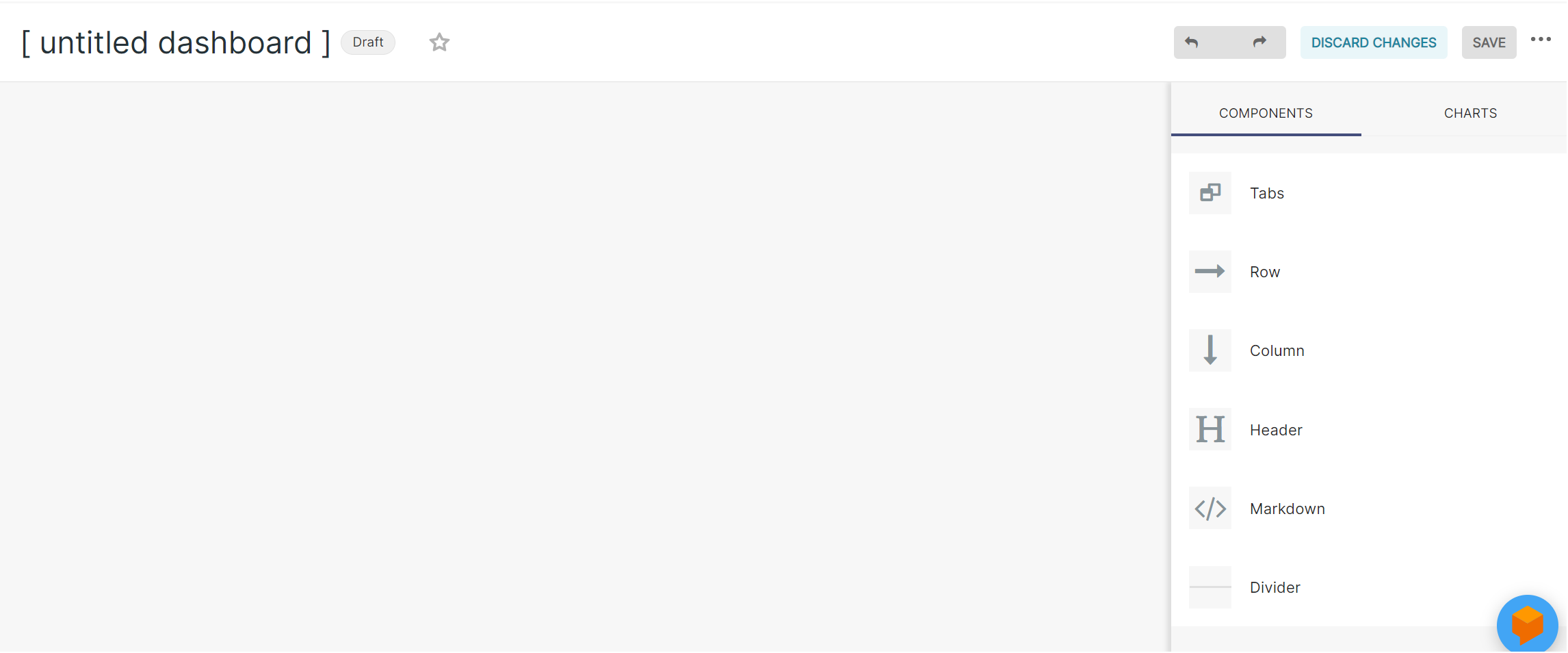
- Click inside the title field and rename the default title [untitled dashboard] with a meaningful name.
- Use the panel on the right side of the page to build your dashboard:
- The Charts tab displays the list of charts available to you.
- The Layout elements tab allows you to add structural components to organize the dashboard.
- (Optional) Organize the
dashboard layout; select the Layout elements tab
and drag the required components onto the canvas:
- Tabs: Creates tabbed sections within the dashboard. You can enter a title for the tab.
- Row: Adds a horizontal container to place charts or columns.
- Column: Adds a vertical container within a row to structure charts side by side.
- Header: Inserts a title or section heading.
- Text/Markdown: Adds formatted text for notes or contextual information.
- Divider: Inserts a horizontal separator to visually distinguish sections.
- Add charts to the dashboard.
You can either create a new chart or add an existing chart.
- Add an existing
chart: To add an existing chart, drag and drop it from the Charts tab in
the right panel onto the dashboard canvas.Use the filtering and sorting options in the Charts tab to locate specific charts by recent creation or modification, name, visualization type, and dataset.
- Show only my charts: If selected, displays only charts owned by you; when cleared, displays all charts you have access to.
- Create and add a new chart: To create a new chart, click + Create new chart and configure the chart as required. Once saved, the chart is automatically added to the dashboard. For more information, refer to Creating a Chart.
After adding charts to the dashboard canvas, additional controls become available for managing both individual charts and the overall dashboard. At the chart level, you can click on the chart to modify the title, resize the chart tile using the corner and side handles, reposition it using the drag handle, or remove it from the dashboard by clicking the
icon. At the dashboard level, you can
delete the entire dashboard (if you are the owner) or use the  icon to change the background to
Transparent, which inherits the underlying page theme, or White, which
applies a solid white background for a consistent visual presentation.
icon to change the background to
Transparent, which inherits the underlying page theme, or White, which
applies a solid white background for a consistent visual presentation.
- Add an existing
chart: To add an existing chart, drag and drop it from the Charts tab in
the right panel onto the dashboard canvas.
- Use the Undo and Redo icons at the top-right corner to reverse or reapply recent changes.
- Click Discard to remove unsaved changes made during the current session. A confirmation window appears; click Leave.
- After configuring the
dashboard, click Save
to save the dashboard. By default, the dashboard is saved as a Draft and appears
under the Dashboards
tab.
Alternatively, click the
icon and select Save
as. The Save dashboard window is displayed.
- Choose one of the
following options:
- Overwrite Dashboard [Dashboard Name]: Updates the existing dashboard with the current changes.
- Save as: Allows you to save a copy of the dashboard with a different name, without modifying the original dashboard.
- (Optional) Select also copy (duplicate) charts to create independent copies of the charts included in the dashboard.
- Click Save to save the dashboard.
- Choose one of the
following options:
By default, the dashboard is saved as a Draft and is visible only to the dashboard owner in the Dashboards tab. Click Draft and change the status to Published to make the dashboard visible to other users.
Accessing and Managing Individual Dashboards
After creating and saving a dashboard, you can access its details page displaying the configured dashboard layout, embedded charts, filter controls, and dashboard-level and chart-level management options.
To access and manage a dashboard, complete the following steps:
- From the navigation bar, select . The Dashboards tab is displayed by default.
- From the list of available dashboards, click the name of the dashboard that
you want to view. The selected dashboard details page is displayed. Along with the name of the Dashboard, the header area of the dashboard includes the following elements:
- The icon allows you to mark or unmark
it as a favorite for quick access.
- Draft / Published): Indicates the visibility state of the dashboard. Click the status to toggle between Draft (dashboard visibility only to the owner) and Published (dashboard visibility to other authorized users within the organization).
- The icon displays the dashboard
ownership details. Pause your cursor over the icon to view the
creator, owners, and date and time when the dashboard was
created.
- The icon displays modification details.
Pause your cursor over the icon to view the last modified time
and the user who modified the dashboard.
- Edit dashboard: Switches the dashboard to edit mode, allowing you to modify layout elements, charts, filters, and configuration settings. Click Save to save changes to your dashboard.
- The
Filter Bar
The Filter Bar displays the filters configured for the dashboard and allows you to dynamically refine the data displayed across all applicable charts without modifying the underlying chart configurations. Filters appear in the Filter Bar only after they have been added to the dashboard. Once added, each filter is displayed as a selectable control. You can select the required filter values and click Apply. All associated charts are refreshed, and the dashboard data is updated based on the selected criteria.
Although the filters configured for the dashboard remain saved, the selected filter values are session-based. Any applied selections are temporary and reset when the browser page is refreshed or when you navigate away from the dashboard. When you export a CSV report, the filters that are applied on the dashboard will not be saved but will be honored in the report. Conversely, when you apply the filters and schedule a report, the filters will be saved for the schedule and honored in the scheduled report. The saved filters persist for the schedule unless you edit the schedule after applying new filters.
Filter Configuration Settings
 icon available in the Filter Bar.
 The following configuration options are available:
- Add or edit filters: Allows you to create new filters, modify existing filters, or remove filters from the dashboard. For more information, refer to Adding Filters to a Dashboard.
- Enable cross-filtering: When enabled (default setting), allows interactive filtering between charts within the dashboard. Selecting a data point in one chart (for example, a table row, bar, or pie slice) automatically applies that selection as a filter to other charts that use the same dataset and are included within the defined cross-filtering scope. This enables coordinated data exploration across related charts.
- Cross-filtering scoping: Defines which charts participate in cross-filtering interactions. This setting controls which charts respond when a data point is selected in another chart. For more information, refer to Configuring Cross-filtering Scope.
- Orientation of filter bar: Allows you to change the layout of the Filter Bar to either Horizontal (Top) (default setting) or Vertical (Left). The configured filters are displayed according to the selected orientation.
Adding Filters to a Dashboard
You can create various filters for a dashboard and apply them to all panels or specific panels in the dashboard. Filters enable you to dynamically refine the data displayed across all applicable charts without modifying the underlying chart configurations. After a filter is added, it is displayed as a selectable control in the Filter Bar.
- From the navigation bar, select . The Dashboards page is displayed.
- In the table, select the
dashboard for which you want to apply filters. The selected dashboard is
displayed.
Example Dashboard - Filter Bar and Icon 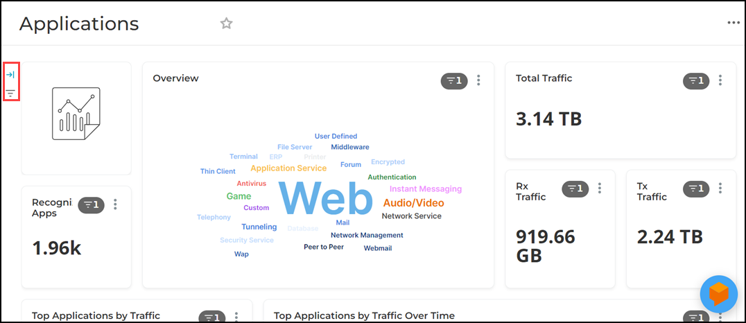
- Click the icon in the Filter Bar and select Add or edit
filters. The Add and edit filters
dialog box appears. Note: Only the dashboard owner can add or edit filters.
Add and Edit Filters Dialog Box 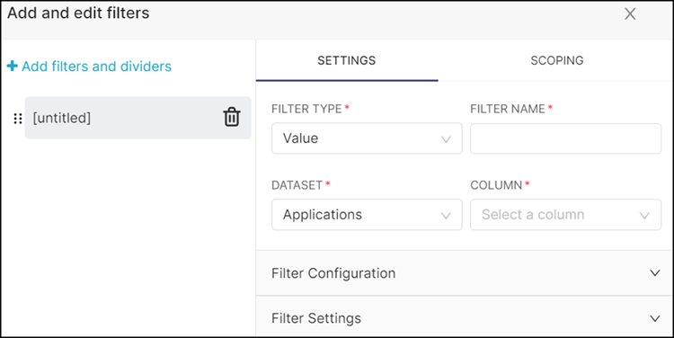
- Complete the following steps
to create the filters:
- In the
Settings tab, configure the following
fields:
- Filter Type: Select a filter type
from the drop-down:
- Value
- Numerical Range
- Time Range
- Time Column
- Time Grain
- Filter Name: Enter a name for the filter. The filter name you enter automatically appears in the left side of the dialog box.
- Dataset: Select the dataset to
which the filter applies.
This option is not available when Filter Type is set to Time Range, as the time range is applied globally.
- Column: Select the dataset column on which filtering will be applied. This option is displayed only when the Filter Type is set to Value or Numerical Range.
- Filter Configuration: Allows
additional filter behavior customization. Options displayed
are dependent on the Filter Type selected.
- Values are dependent on other
filters: This filter configuration
option is available only when more than one filter
is created. Select this option if you want to limit
available filter values based on selections made in
other filters, ensuring only relevant values are
shown.
- Values dependent on: Using the drop-down, select a filter whose selected values will influence this filter’s available options.
- Time Column: Select the dataset time column used when dependency is based on a time period selection.
- Pre-filter available values:
If you want to add a dataset filter, select this
option and complete the following fields:
- Pre-filter: Click the +Add filter field. The filter dialog box is displayed. Define a custom filter using the Simple or Custom SQL tab.
- Time range: Click the time range field to open the Edit time range dialog box. Select the time period for which data should be displayed. You can set the Range Type to filter data using commonly used recent periods (such as Last day, week, month, or quarter), Previous calendar periods (such as previous calendar week or month), Custom ranges to manually specify start and end date and time, or Advanced options to define relative or expression-based time ranges for more granular filtering. You can also select No filter to include data from all available time periods.
- Sort filter values: If you
want to sort the displayed result, select this
option and complete the following fields:
- Sort Ascending: Select this option if you want to display the results in ascending order.
- Sort Descending: Select this option if you want to display the results in descending order.
- Sort Metric: Select this option if you want to display the results based on the metric value.
- Single Value: This option is displayed only
when the Filter Type is set to
Numerical Range. Select this option if you
want to restrict numeric filtering to a single
comparison type instead of a range.
- Minimum: Select this option to display results greater than or equal to the specified value.
- Exact: Select this option to display results matching the specified value exactly.
- Maximum: Select to display results less than or equal to the specified value.
- Values are dependent on other
filters: This filter configuration
option is available only when more than one filter
is created. Select this option if you want to limit
available filter values based on selections made in
other filters, ensuring only relevant values are
shown.
- Filter Settings: If you want to
add the filter value, complete the following fields:
- Description: If required, enter a brief description of the filter.
- Filter has default value: Select this option if you want to select a default value for the filter. This option displays the results based on the default value.
- Filter value is required:
Select this option if you want to choose a different
default value for the filter every time. This option
enables you to select a filter value and displays
the result based on the selected value.Note: If you select this option, the Filter has default value option will be disabled.
- Select first filter value by default: Select this option if you want to select the default first filter value. This option will not allow you to select a default filter value.
- Can select multiple values: Select this option if you want to choose multiple filter values. This option enables you to select multiple filter values and displays the result based on the selected values.
- Dynamically search all filter values: Select this option if your dashboard displays more than 1000 filter values. Selecting this option enables dynamically searching that load filter values as users type.
- Inverse selection: Select this option if you want to exclude the selected filter values from the result.
- Filter Type: Select a filter type
from the drop-down:
- Scoping: Use the Scoping tab
to control where the filter is applied. You can apply the filter to
all panels or select specific panels or charts individually.
Selecting All
panels applies the filter across the entire dashboard, while
clearing it allows you to choose specific panels or charts.
Scoping Tab 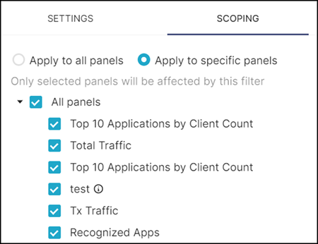
- (Optional) If you
want to add a divider, click Add Divider.
Complete the following fields:
- Title: Enter a title for the divider.
- Description: Enter a brief description about the divider.
- (Optional) Add more filters. Scroll to the bottom of the dialog box and click Add Filter.
- (Optional) Reorder the filters and dividers using the drag-and-drop method.
- Click Save to add the filters.
- In the
Settings tab, configure the following
fields:
Configuring Cross-filtering Scope
Complete the following steps to define or modify the cross-filtering scope for a dashboard:
- From the navigation bar, select . The Dashboards page is displayed.
- In the table, select the
dashboard for which you want to enable cross-filtering. The selected
dashboard is displayed.
Example Dashboard - Filter Bar and Icon
- To configure where cross
filters apply, click the icon in the Filter Bar and select Cross-filtering
scoping. The Cross-filtering scoping window is displayed.
Cross-filtering Scoping Window 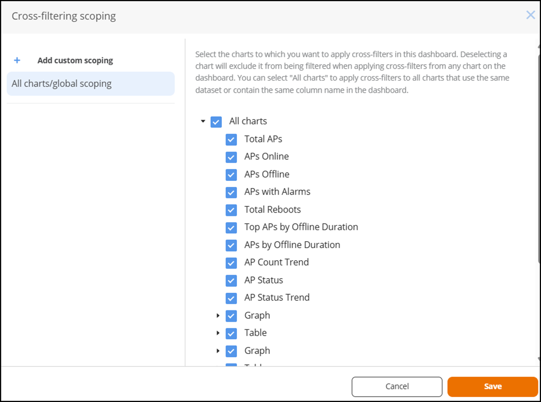
By default, all charts are selected. This means cross-filtering interactions apply to all charts in the dashboard.
- Select or clear charts to control where cross filters are applied. Selecting a chart includes it in cross-filtering interactions. Deselecting a chart will exclude it from being filtered when applying cross-filters from any chart on the dashboard.
- (Optional) Click Add custom scoping to define cross-filtering relationships for specific charts. Select a source chart from the drop-down list, and then select or clear the target charts that should respond to cross-filter selections from that source chart.
- Click Save to apply and store the cross-filtering scope configuration.
- In the dashboard, click a
data element in any chart (for example, a table row or chart segment). The
other charts included within the configured cross-filtering scope
automatically update to display data filtered based on the selected value.
Charts that are updated through cross-filtering display the
 icon, indicating that cross-filters are
currently applied.
icon, indicating that cross-filters are
currently applied.Dashboard Showing Charts Updated by Cross Filtering 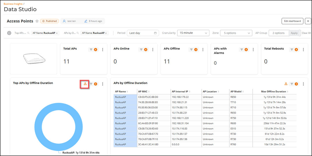
Dashboard-Level Actions
icon at the top-right corner to access dashboard-wide
management options and perform the following actions:- Refresh dashboard: Reloads the dashboard with the latest available data.
- Enter fullscreen: Expands the dashboard to fullscreen mode for an improved viewing experience. The option changes to Exit fullscreen to return to the standard view.
- Save as: Provides the options to update the existing dashboard with the current changes or create a copy of the current dashboard. While saving a new copy, you can save it with a new name and optionally duplicate the underlying charts.
- Download: Downloads the dashboard report. For more information, refer to Downloading the Dashboard Report.
- Manage schedule: Configures a report schedule for the dashboard. For more information, refer to Creating a Report Schedule for the Dashboard.
- Set auto-refresh interval: Configures automatic dashboard refresh for the current dashboard session. Click Set auto-refresh interval to open the Refresh interval dialog box, where you can set the refresh frequency. Available options are Don't refresh (default), 10 minutes, 30 minutes, and 1 hour. Select a refresh frequency and click Save for this session to automatically reload the dashboard with the latest available data at the specified interval. The selected refresh interval is not retained after a browser refresh or after navigating away from and returning to the dashboard.
Creating a Report Schedule for the Dashboard
You can create a report schedule for automated report delivery of the dashboard that you have created.
- On the navigation bar, select . The Dashboards page is displayed.
- In the table, select the dashboard for which you want to create an email schedule.
- Click the icon at the top-right corner and select . The Schedule a New Email Report dialog
box is displayed.
- Complete the following
fields:
- Schedule Name: Enter a name for the report schedule.
- Description: Enter a description for the report.
- Schedule: Select the frequency (day, week,
or month) and time at which you want to trigger the report to be run
and sent to the email recipients.
- Day: Select the time at which you want the report to be sent each day.
- Week: Select the day of the week and time at which the report to be sent.
- Month: Select the day of the month (for example, 1st–31st) and the time at which you want the report to be sent each month.
Note: The reporting period is determined by the schedule frequency and overrides any time filters configured in dashboards.- For daily schedules, the report includes data for the previous day.
- For weekly schedules, the report includes data for the last 7 days.
- For monthly schedules, the report includes data for the last 30 days.
- Granularity: Specifies the time
interval used to aggregate and present data in the scheduled
report. The selected time interval determines the level of
detail in the report. For example, if you set
Granularity to
Week, and schedule the report to
run monthly, the report displays data aggregated by week
within the reporting period.
The values available for the Granularity option are dependent on the frequency configured in the Schedule option.
Table 2. Granularity Options for Scheduled Reports Report Schedule Granularity Day 15 minute, Hour, or Day Week 15 minute, Hour, Day, or Week Month Hour, Day, Week, or Month A default granularity value is defined for existing schedules. For daily and weekly schedules, the default granularity is set to 15 minute, while for monthly schedule, the default granularity is Hour.
- Timezone: Select a timezone from the list.
- Format: Select a report format
PNG (image), CSV
(spreadsheet), or PDF (document).Note: The scheduled report in CSV format is restricted to render a maximum of 50,000 records.Note: When scheduling a dashboard report, only the first page (or tab) of a multi-page dashboard is included in the generated report. Additional pages are not included in the scheduled email.
- Email: Specify the email address of the recipient to whom you want to send the report. The current user's email address appears by default. You can enter email addresses of multiple recipients separated by commas or semicolons.
- Click Add Schedule to create a report schedule for the dashboard.
Downloading the Dashboard Report
You can download the dashboard report data in CSV, PDF, and JPG formats. The reports in CSV format provide a full report for the time range you specified in the chart. If you choose to download the report as an image or PDF, the system prints the dashboard report in JPG or PDF format, respectively, exactly as it is displayed on the Web UI. The PDF and JPG download functionality of the entire dashboard operates on the principle of WYSIWYG (What You See Is What You Get). As a result, any data or elements that are not visible on the dashboard interface during the download process will be excluded from the PDF and PNG output.
- On the navigation bar, select . The Dashboards page is displayed.
- In the table, select the dashboard for which you want to download the dashboard report.
- Click the icon at the top-right corner and select to download the report in PDF format.
- Click the icon at the top-right corner and select to download the report in PNG format.
- Click the icon at the top-right corner and select to download the report in CSV format.
Chart-Level Actions
 icon on a chart to access the chart-level options and
perform the following actions:
icon on a chart to access the chart-level options and
perform the following actions:- Force refresh: Refreshes only the selected chart panel and retrieves the latest data.
- Enter fullscreen: Expands the selected chart into fullscreen mode for focused analysis. The option changes to Exit fullscreen to return to the standard view.
- Edit chart: Opens the chart in edit mode, allowing modification of columns, metrics, filters, visualization type, and formatting.
- Cross-filtering scoping: Defines whether the selected chart participates in cross-filtering interactions. You can select or clear the target charts that should respond to cross-filter selections from the source chart. For more information, refer to Configuring Cross-filtering Scope.
- View as table: Displays the chart data in tabular format.
- Download: Downloads the dashboard report in JPG format or CSV format.
Drill By
The Drill By feature enables you to further analyze a selected data point directly within a dashboard chart, without navigating to another chart or manually applying dashboard filters. It operates within the context of the same dataset used to create the chart and allows you to break down a selected value by another available dimension from that dataset.
When you apply Drill By to a specific element, such as a table row, bar, or chart segment, the system filters the dataset to the selected value and re-aggregates the metric based on the chosen column. This allows you to analyze the selected data across another dimension within the same dataset, while remaining in the current dashboard view.
- On the navigation bar, select . The Dashboards page is displayed.
- In the table, select a dashboard and locate the chart containing the data you want to analyze.
- Right-click the required data point (for example, a row in a table or a segment in a chart) and select Drill By from the context menu.
- Choose the column (dimension) by which you want to analyze the selected
value.
A Drill By pop-up window opens, displaying the selected metric filtered to the chosen data point and regrouped by the selected column. The window shows the drill path, visualization (Chart or Table view), and related dataset details, allowing you to analyze the breakdown without modifying the original dashboard chart.
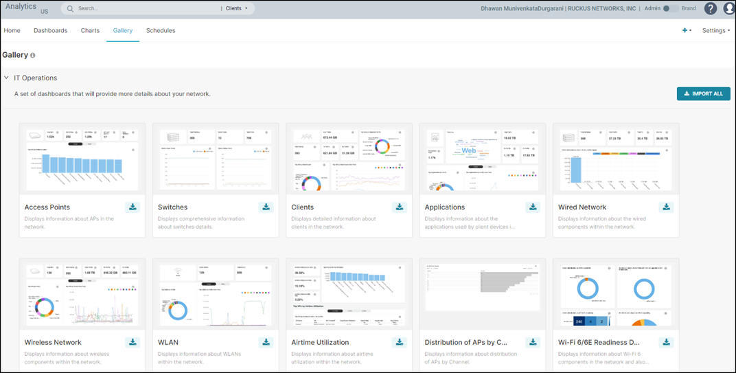
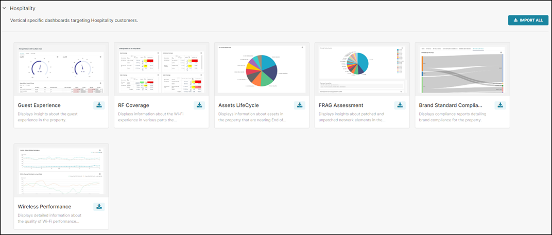
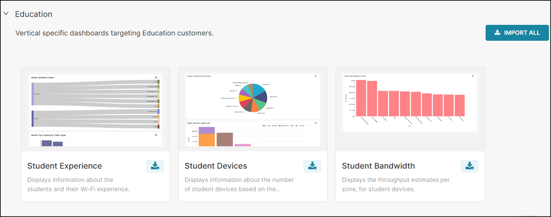
Gallery Tab
The Gallery tab displays a collection of pre-packaged dashboards. They are categorized as vertical-specific reports. The Gallery tab displays a preview of each of the prebuilt dashboards available to you.
You can import the dashboards in each category by clicking Import. After importing the dashboard, it will appear in the Dashboards tab for review or analysis. The dashboards can be edited and deleted as required and are also customizable.
Schedules Tab
The Schedules tab allows you to automate the delivery of dashboards and charts as reports. A report captures a point-in-time snapshot of the selected dashboard or chart and distributes it via email to designated recipients.
You can configure recurring schedules (daily, weekly, or monthly) to ensure stakeholders receive timely updates without manually exporting reports. Reports can be sent to both internal and external recipients, based on the defined schedule.
Only the owner of a dashboard or chart, with Prime Administrator or Administrator privileges, can create and manage report schedules for that dashboard or chart.
- From the navigation bar,
select , then click the Schedules
tab. The Schedules page is displayed.
Schedules Tab 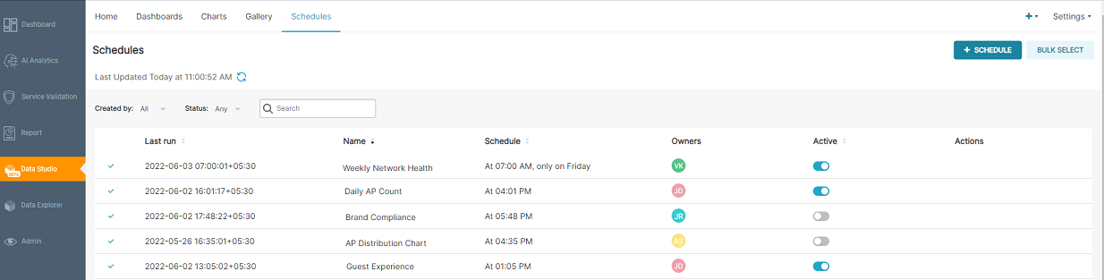
- View the schedule details in
the table.
You can also use the available filters to display schedules based on Name (name configured for the schedule), Status (operational state), Owner (who created the schedule), and Format (how the report is rendered).
- Last Run: Displays the date and time at which the report was last run.
- Name: Displays the name of the report.
- Schedule: Displays the time at which the report is scheduled to run.
- Format: Displays the format of the report.
- Owners: Displays the name of the user who created the scheduled report.
- Active: Indicates whether the schedule is enabled or disabled. Only the owner of the scheduled report and users with Prime Administrator privileges can enable or disable the schedule.
- Actions: Displays all the actions that you
can perform on a configured schedule, as described in the following
table. Action icons are visible when you hover your cursor over the
schedule entry in the table.
Table 3. Actions Description Action Icons Description  (Edit)
 Edit the scheduled report. Only the schedule owner can edit the schedule.  (Send Now)
Sends an immediate report of the dashboard or chart to the email recipients configured in the schedule. This action is available only to the schedule owner and does not affect the existing schedule or its next run time. To prevent duplicate requests, the action is temporarily disabled for 60 seconds after it is triggered.  (Execution Log)
View the execution log of the scheduled report.  (Delete)
 Delete the scheduled report. Only the schedule owner can delete schedules individually or use the Bulk Select option to delete multiple schedules at once.
Creating a Schedule
You can create schedules for the dashboard and chart that you have created.
- From the navigation bar, select , and then click Schedules tab. The Schedules page is displayed.
- Click + Schedule.
The Add Schedule dialog box is displayed.
Add Schedule Dialog Box 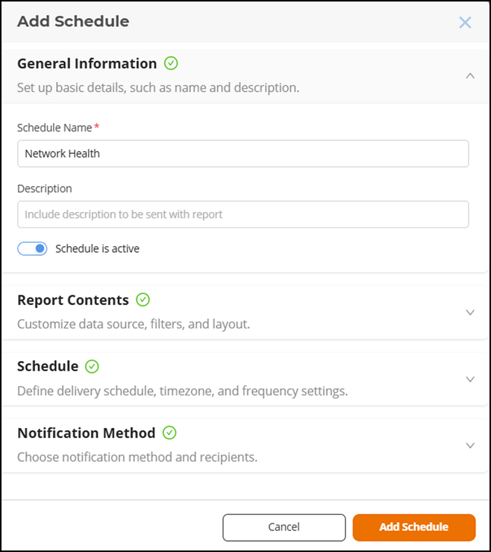
- Complete the following
fields:
Under General Information, specify basic details to identify and manage the schedule, including its name, description, and activation status.
- Schedule Name: Enter a unique name to identify the scheduled report.
- Description: Enter an optional description for the schedule. This description is included in the report notification to help recipients understand the purpose or context of the report.
- Schedule is
active: Use the toggle button to enable (default
setting) or disable the schedule.
If the schedule is enabled, the reports will be sent to the recipient according to the schedule. If the schedule is disabled, the schedule becomes inactive and the report does not run at the configured frequency.
Under Report Contents, define the report source and output format.
- Content
Type: Select one of the following:
- Dashboard: Specifies to create a schedule for a dashboard report.
- Chart: Specifies to create a schedule for a chart report.
- Select Chart / Select Dashboard: Based on the selected content type, choose the specific chart or dashboard from the drop-down list to include in the scheduled report.
- Content
Format: Select the format in which the report will be
delivered. The supported formats are PNG, CSV, and PDF; PDF is
available only for the Dashboard content type. Note: When scheduling a dashboard report, only the first page (or tab) of a multi-page dashboard is included in the generated report. Additional pages are not included in the scheduled email output.Note: The scheduled report in CSV format is restricted to render a maximum of 50,000 records.
Under Schedule, configure the schedule frequency, time range used for data aggregation, and time-zone settings. The default configuration is every day at midnight (00:00) in your local time zone and a granularity of 15 minutes.
- The report schedule
can be set on a daily, weekly, or monthly basis.
- Day: Select the time at which you want the report to be sent each day.
- Week: Select the day of the week and time at which the report to be sent.
- Month: Select the day of the month (for example, 1st–31st) and the time at which you want the report to be sent each month.
Note: The reporting period is determined by the schedule frequency and overrides any time filters configured in charts or dashboards.- For daily schedules, the report includes data for the previous day.
- For weekly schedules, the report includes data for the last 7 days.
- For monthly schedules, the report includes data for the last 30 days.
- Granularity: Specifies the time interval
used to aggregate and present data in the scheduled report. The
selected time interval determines the level of detail in the report.
For example, if you set Granularity to
Week, and schedule the report to run
monthly, the report displays data aggregated by week within the
reporting period.
The values available for the Granularity option are dependent on the frequency configured in the Schedule option.
Table 4. Granularity Options for Scheduled Reports Report Schedule Report Granularity Day 15 minute, Hour, or Day Week 15 minute, Hour, Day, or Week Month 15 minute, Hour, Day, Week, or Month A default granularity value is defined for existing schedules. For daily and weekly schedules, the default granularity is set to 15 minutes, while for monthly schedule, the default granularity is Hourly.
- Timezone: Select the time zone to use for the schedule.
Under Notification Method, specify how the report is delivered and the recipients who receive it.
- Notification Method: Displays the delivery method used for sending reports. Currently, reports are delivered via Email.
- Email subject name (optional): Enter a custom subject line for the email notification.
- Email recipients: Enter the email addresses of primary recipients who will receive the report. The current user's email address appears by default. You can enter email addresses of multiple recipients separated by commas or semicolons.
- Click Add Schedule to save the configuration and activate the scheduled report delivery.