Site Report
The Site Report displays information specific to the selected site such as the site, utilization for a selected period, the avgerage dwell time of visitors, the total number of visitors in the site, and user information in both graphical and tabular formats.
- On the Navigation bar, click . The Occupancy page is displayed.
- In the Sites
Listing table, click the
 icon. The Site Report page is displayed.
Site Report Page 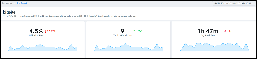
The top portion of the report displays the number of APs grouped into the site and the duration for which you would like to view site data. Options include the last 24 hours and the last 7 days.
- Utilization Rate tile
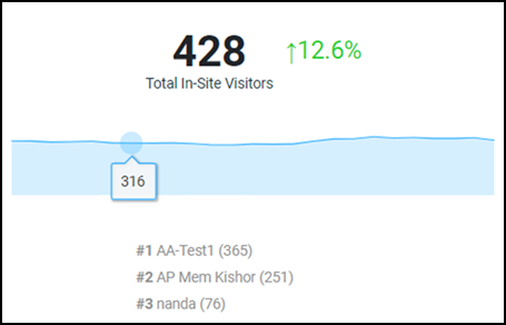
- Total In-Site Visitors tile
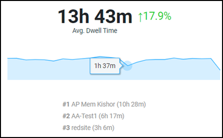
- Avg. Dwell Time tile
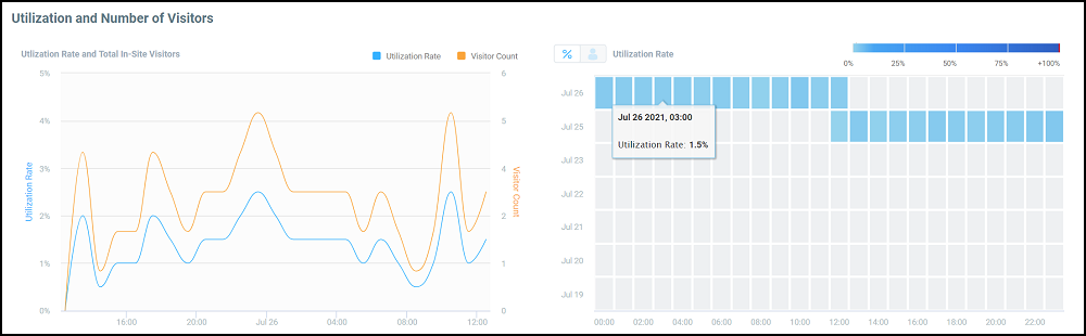
- Utilization and Number of Users tile
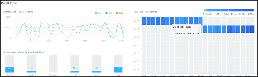
- Dwell Time tile
- Clients table
Utilization Rate Tile
Total In-Site Visitors Tile
Avg. Dwell Time Tile
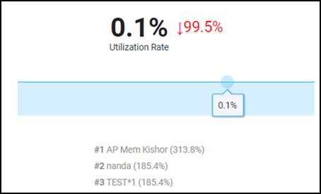
Utilization and Number of Users Tile
The Utilization and Number of Users tile displays the site utilization and number of users in a time series graph and a heat map. In the time series graph, the utilization rate is displayed as a percentage and the number of users at a time is also displayed. Pause the pointer over the graph for more information. You can choose to view both the utilization rate and user count on the graph or choose only one of them by selecting the check boxes over the graph.
Dwell Time Tile
The Dwell Time tile displays the dwell time of a client or device for the selected time period as a time series graph,bar graph, and heat map. The time series graph displays the average, maximum, and minimum dwell time information. Pause the pointer over the graph for more information. You can choose to view all the average, maximum, and minimum values on the graph or choose one or two of them by selecting the check boxes over the graph.
The bar graph displays the dwell time distribution over a time range such as the first 15 minutes, the second 15 minutes, from 30 minutes to 60 minutes, from 1 hour to 3 hours, from 3 hours to 8 hours, and 8 hours and longer. Each bar displays the percentage of dwell time for that time period.
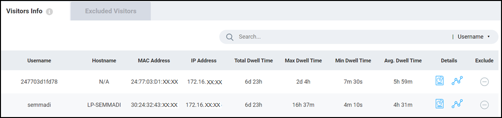
Clients Table
The Clients table
displays information about the top thousand clients. You can use the Search field to look
for clients by username, hostname, client MAC address, or client IP address. The
Clients tab displays client information such as the device
name, MAC address, IP address, hostname, dwell time (total, average, maximum, and
minimum), and contains links to the Client Details page and the
Client Troubleshooting page. Click the  icon
to remove the selected client from the Site Report statistics.
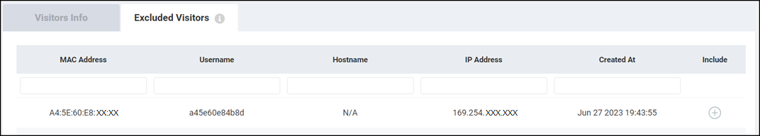
After the client is excluded, the client information is removed from the Clients tab and populated in
the Excluded Visitors tab. The list of excluded clients for the
site is maintained in this tab. Including or excluding clients updates the graphs,
heat maps, bar charts and time series graphs in the tiles of the Site
Report.
icon
to remove the selected client from the Site Report statistics.
After the client is excluded, the client information is removed from the Clients tab and populated in
the Excluded Visitors tab. The list of excluded clients for the
site is maintained in this tab. Including or excluding clients updates the graphs,
heat maps, bar charts and time series graphs in the tiles of the Site
Report.
 icon returns the client back to the Site
Report for analysis. The client is also repopulated back into the
Clients tab by refreshing the information in the charts of
the Site Report.
icon returns the client back to the Site
Report for analysis. The client is also repopulated back into the
Clients tab by refreshing the information in the charts of
the Site Report.