Compare Filters
Compare Filters help compare sets of data within the networks against one another to provide a better understanding of network health based on various dimensions such as network deployments, brand, region to name a few.
Comparison reports are only available for Admin and Super admin users.
The following figure shows only the upper sections of the Compare Filters page:
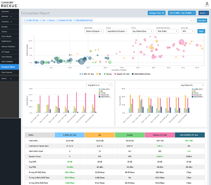
The Comparison Report consists of the following components:
Compare Filters tile
Overview tile
Metric Over Time tiles
Comparison table
Compare Filters Tile
You can select the filters you want to compare from the Compare Filter drop-down.
The drop-down displays existing saved filters and those created newly as well, and you can compare up to a maximum five filters at a time. After selecting the filter, click Compare to initiate data comparison between the filters selected. The order of the filter selection is maintained across all the graphs and table. This report cannot be scheduled.
The Compare button is disabled if you select more than five filters or less than one filter.

Overview Tile
The Overview section displays a scatter-plot of data being compared from the filters selected. You can select the following parameters to plot the Overview graph:
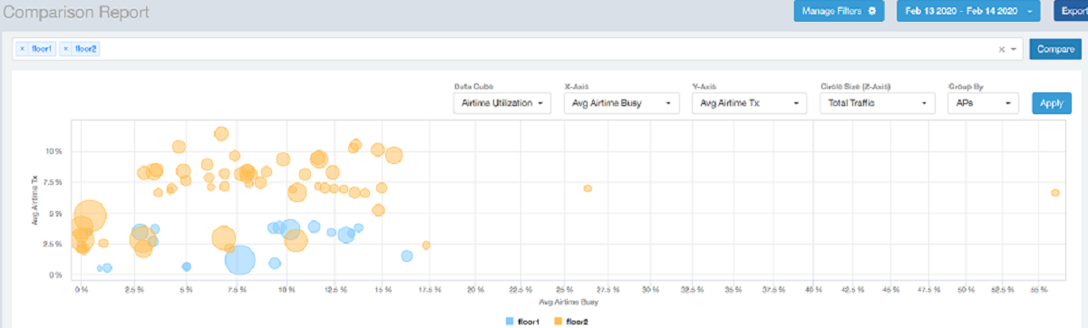
DataCube: select from Airtime Utilization, Network, and Clients from the menu.
X axis and Y axis: select the parameter to display on the axis. The options in these menus change based on the data cube selection. For example, if you selected Airtime Utilization, then some of the parameters you can choose to display in the X and Y axis include Avg Airtime Utilization, Avg Airtime Busy, Avg Airtime Tx/Rx, and Total Traffic.
Circle Size (Z Axis): displays the data by the size fo the circle. For example, the Total Traffic value in GB is shown as a smaller circle in comparison to the one in TB.
Note:Each filter data is represented as a circle with a specific color for the filter. For example, in this image the scatter plot circle displays are for the floor1 filter in blue and floor2 filter in yellow.
Group By: this option allows you to group the scatter plots based on the AP, Ap Group, Zone, System, Domain, and WLAN/SSIDs. Pausing the pointer over the circle displays a summary of the data point.
Click Apply to apply these parameters. Based on the parameters selected, the Overview graph is refreshed and plotted for your analysis.
You can toggle the circles below the chart (on and off) to display or not display the filters they represent.
Note:No two parameters in the X, Y, Z axis fields can be the same.
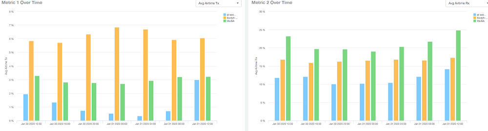
Metric Over Time Tiles
The two Metric charts compare a variety of potential metrics in a historical view, as a bar graph. You can select any two matrices in both the charts to compare. All the metrics are available in the drop-down for comparison. The X axis of the chart displays a time range, and the Y axis parameter can be selected from the drop-down provided. The bar graphs are displayed after the Y axis selection and the colors of the bar pertain to the respective filters selected. Pausing the pointer over the bar displays a summary of the data point. You can toggle the boxes in the chart (on and off) to display or not display the filters they represent.
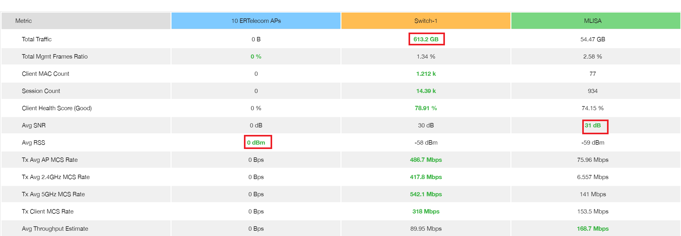
Comparison Table
The Comparison Table shows columns of comparison filters and rows of all metrics that are compared. You can use the gear icon to select the columns you want to displays and also select the number of rows to display. For each metric of a filter, the data comparison is done and data that is top performing is highlighted green as shown in the figure.