Dashboard Overview
The RUCKUS Analytics dashboard provides a summary of the network health and incident occurrences across the system. The dashboard is a starting point for network administrators seeking specific work-flows and issues that may require attention. Refer to Navigating the RUCKUS Analytics User Interface more information.
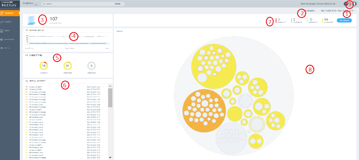
| Callout Number | Dashboard Elements |
|---|---|
| 1 | Time Selection field |
| 2 | Incident Selection |
| 3 | Scrolling Data tile |
| 4 | Incident Types tile |
| 5 | Critical Incidents tile |
| 6 | Network History tile |
| 7 | Incident Summary tile |
| 8 | Interactive Network Hierarchy |
| 9 | Settings |
Melissa AI Assistant

- How’s my network today?
- What are the top applications?
- How is client Rob doing?
- How many incidents are there in Zone Lobby yesterday?
- Is Zone Boardroom meeting expectations?
- Which WLAN is the busiest?
- Show me client office-laptop
at 2pm.
Using key identification words like client, zone, system, etc. before the name will ensure a faster response from Melissa as names are often non-unique strings. Full names are not necessary as Melissa has the capabilities for partial search. You could also indicate the time periods by using terms like today, yesterday, last week, 3pm, etc.
- Check the status of devices (APs, clients, and switches) and troubleshoot issues
- Check the status of incidents and nodes
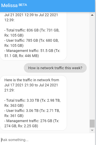
- Check network SLAs, traffic load on the network, and status of Zoom video call tests
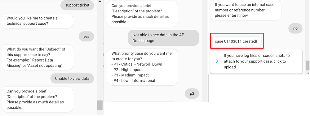
- Create a support ticket through the chat box and also track it. You can review the status of the ticket by entering the ticket number in the chat box.
- Verify top applications, SSIDs, APs, zones and clients, configuration changes
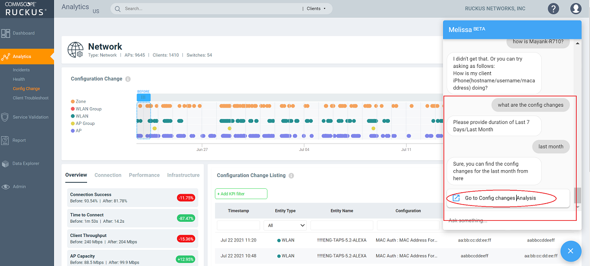
Melissa is still in beta phase and we are constantly training the algorithm to interpret more intents and increase the breadth of coverage.
Time Selection Field
Incident Selection
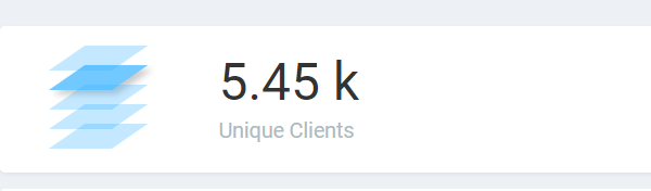
Scrolling Data Tile
The scrolling data tile is located in the upper-left corner of the dashboard and provides a scrolling summary of key usage metrics.
The scrolling data tile maintains five layers of data, as shown in the following table. The scroll mechanism displays a different layer of data every two seconds. If you click one of the tiered layers, the data for that layer of data is displayed. If you click the displayed data result, the relevant data report in the Reports menu is displayed.
| Tile Data | Description | Link Destination |
|---|---|---|
| AP Count | Shows the number of unique APs supported by, and reporting data into, the system. | The AP Inventory report focuses on AP details and inventory. |
| Unique Clients | Shows the number of unique clients that have connected in the displayed time window. | The Client report focuses on client, device, and user details. |
| Traffic | Shows a sum of traffic sent and received by all APs in the displayed time window. | The Network report focuses on network and traffic usage. |
| Applications | Shows the total number of detected applications in the displayed time window. | The Application report focuses on application consumption. |
| Active WLANs | Shows the total number of WLANs that have been active on APs (client has connected) in the displayed time window. | The WLANs report focuses on WLAN traffic, client, and usage details. |
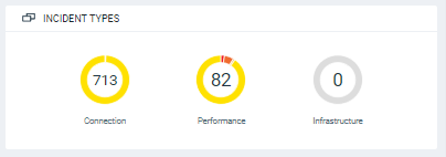
Incident Types Tile
The incident types tile shows the types of incidents, the number of incidents of each type, and the relative severity of the incidents. Incidents are categorized into three primary incident types: Connection, Performance, and Infrastructure. Each incident type contains many subtypes.
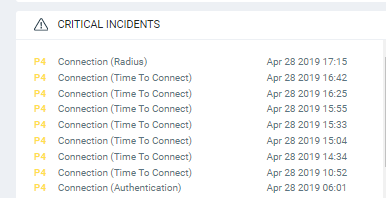
Critical Incidents Tile
The critical incidents tile list the severity of the incident, the type of the incident, and the time the incident occurred.
If you click one of the incidents, the specific incident is displayed on the Incident Details page.
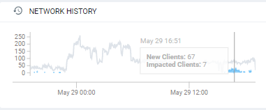
Network History Tile
The network history tile represents the number of clients serviced by the network (the gray lines in the chart), and the number of clients affected by incidents (the blue area in the chart).
The client count value in the chart includes all unique clients that attempted to connect to the network, including both failed and successful connections. The data depicts a large number of clients that may be impacted by incidents, even if a large number were not able to connect.
Incident Summary Tile
The incident summary tile offers a summation of the overall network status and compares the severity levels of each incident on the selected network. Each severity level is identified by priority and color. To explore the analytics details or view incidents of a specific layer of hierarchy, click See Incidents.

The following table lists the incident severity level, the priority, and the color assigned to the incident severity level.
| Incident | Priority | Color |
|---|---|---|
| P1 | Critical | Red |
| P2 | High | Dark Orange |
| P3 | Medium | Orange |
| P4 | Low | Yellow |
Interactive Network Hierarchy
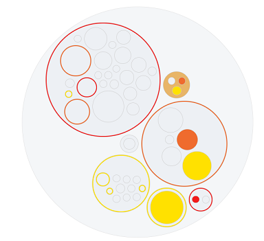
The interactive network hierarchy is introduced by using circle packing. Circle packing is a hierarchical representation of the network that illustrates the controller clusters, domains, zones, AP groups, and individual APs visually. You can identify the areas of the network that are impacted by issues or showing problems.
The interactive network hierarchy is introduced by using circle packing. Circle packing is a hierarchical representation of the network that illustrates the Venues, AP groups, and individual APs visually. You can identify the areas of the network that are impacted by issues or showing problems.
The size of a circle depends on the number of APs. You can navigate within each circle, exploring layers within the hierarchy by clicking the circles themselves. The boundary of a circle indicates that there are incidents occurring within it. To view the analytics details or the incidents of a specific hierarchical layer, click See Incidents in the incident summary tile.
Interactive Network Topology
The network topology page is interactive and displays the arrangement of various types of elements within the network such as switches, routers, port connections and so on.
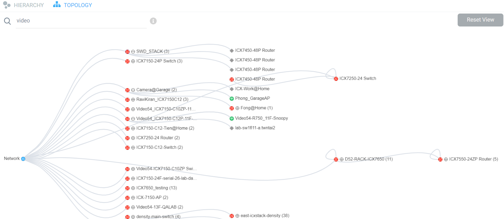
You can also use the search bar to look for
devices (AP or switch) within the network topology diagram either with their name or
MAC address. By clicking on the switch group icon ( ), you
can expand and view the devices within the group such as routers, APs (
), you
can expand and view the devices within the group such as routers, APs ( ). The
switch group can have a stack of switches as well. If the network contains devices
other than ICX switches and RUCKUS APs, the device is displayed against this icon -
). The
switch group can have a stack of switches as well. If the network contains devices
other than ICX switches and RUCKUS APs, the device is displayed against this icon -
 . Pause the pointer over the icons for more information about the devices and over
the lines for more information about the port connections. For example, the port
connections are displayed as Connection Port: 1/1/35 <-> eth1 which implies that the ports 1/1/35 of the switch are
connected to the eth1 port of
the AP. In the switch ports representation, the first number represents the first
switch in the group or stack, the next number represents the switch module, and the
last number the switch port. Clicking Reset View collapses
all the device views and resets the network topology connection diagram.
. Pause the pointer over the icons for more information about the devices and over
the lines for more information about the port connections. For example, the port
connections are displayed as Connection Port: 1/1/35 <-> eth1 which implies that the ports 1/1/35 of the switch are
connected to the eth1 port of
the AP. In the switch ports representation, the first number represents the first
switch in the group or stack, the next number represents the switch module, and the
last number the switch port. Clicking Reset View collapses
all the device views and resets the network topology connection diagram.
You can zoom-in or zoom-out the Topology page and also click on the page to move it.
You can also use the Auto Update feature to update the dashboard data, every 3 minutes.
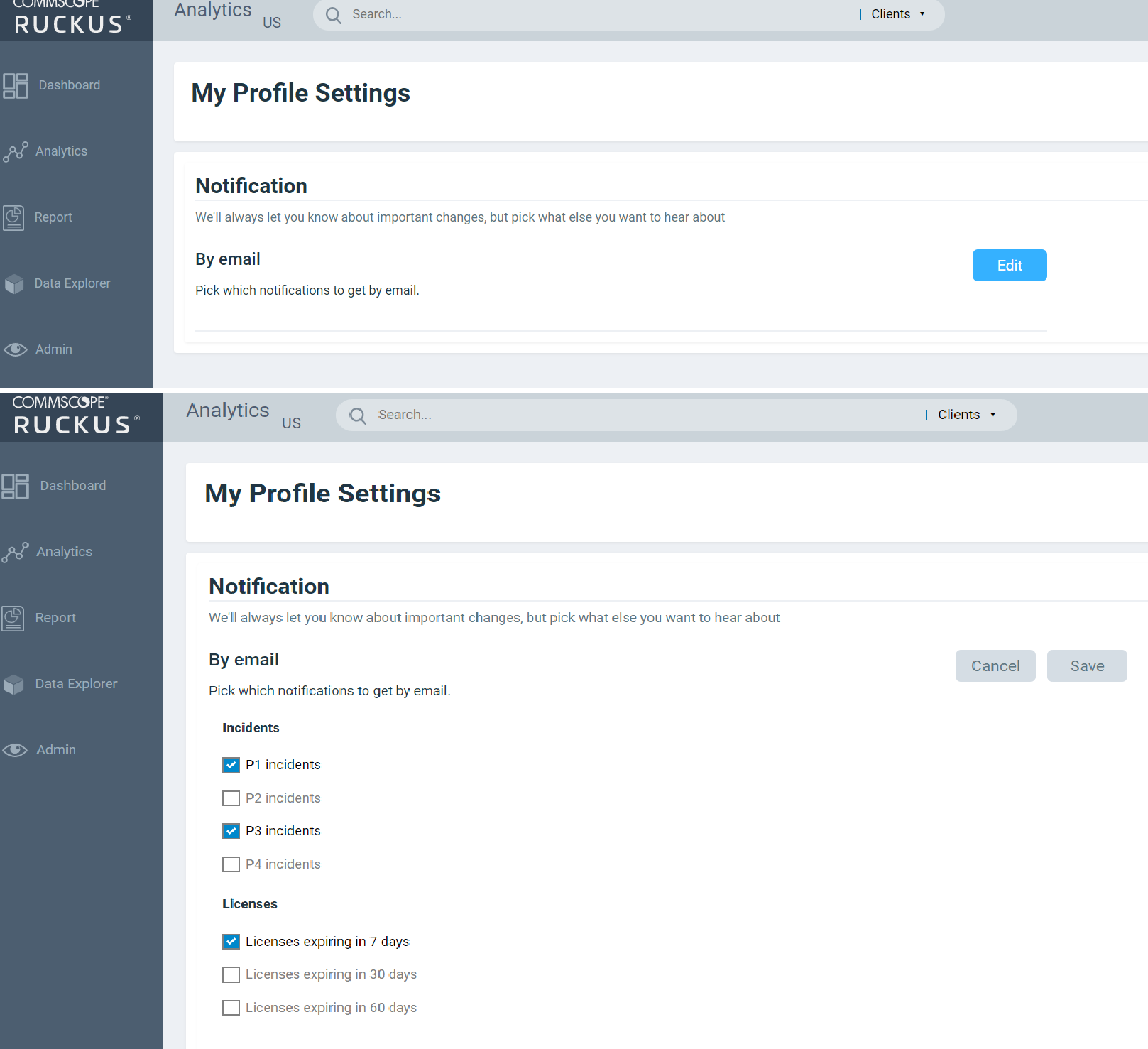
Settings
You can modify the user profile from the My Profile Settings page and enable the option to receive notification email alerts for incidents of varying severity ranging from P1 to P4.
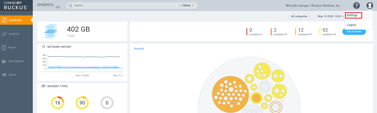
Click Edit and select the check boxes to indicate the incident severity range or license expiration time for which you want to receive email notifications.
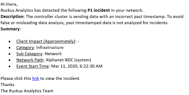
- Client Impact: Displays the estimated percentage of clients impacted due to the incident.
- Category: Displays the type of issue impacting the client. For example, if the time to connect to the network is high, the Category would be displayed as "Connection". Other options include "Infrastructure" and "Performance".
- Sub Category: Displays the subcategory of the incident. For example, if the time to connect to the network is high, the Subcategories would vary based on the three categories (Connection, Infrastructure, and Performance). For more information, refer to the "Incidents List Table" and "Incidents Details Page" in Analytics Page.
- Network Path: Displays the location of the client within the network.
- Event Start Time: Displays the timestamp of the event when it occurred.
A link to view the incident details is also available in the email notification.
Accounts
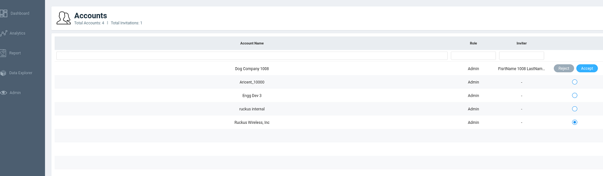
Users with one account will be directed to the Dashboard view of the RUCKUS Analytics user interface, by default. Those with multiple accounts will be directed to the Accounts page soon after logging into the RUCKUS Analytics user interface so they can choose the account to operate from.