Data Studio
Data Studio is a next-generation reporting tool that is fast and intuitive. It is easy to use and provides a rich user interface to create and edit charts and dashboards.
- Home tab
- Dashboard tab
- Charts tab
- Gallery tab
- Schedules tab
In the Brand mode, a brand can get an aggregate view of data of all the associated partners by creating dashboards, charts, and schedules. Note that, in the Brand mode, a brand can view dashboard templates created only by the users of the brand's RUCKUS Analytics service account. If a partner wants to share a dashboard template with the brand, the import and export dashboard option must be used.
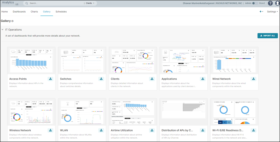
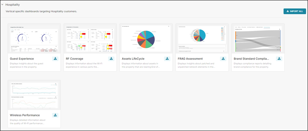
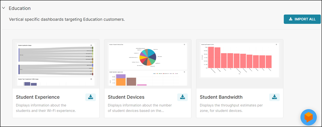
Gallery Tab
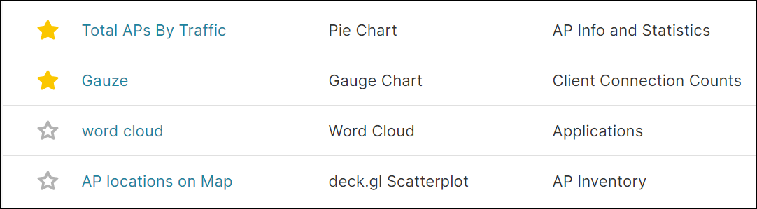
The Gallery tab displays a collection of pre-packaged dashboards. They are categorized as vertical-specific reports. The Gallery tab displays a preview into each of the dashboards listed on the page.
You can import all the dashboards in a category by clicking Import all, or view each dashboard and choose a specific dashboard to import by clicking the import icon next to it.
After importing the dashboard, it would appear in the Dashboards tab for review or analysis. The dashboards can be edited and deleted as required and are also customizable.
Home Tab
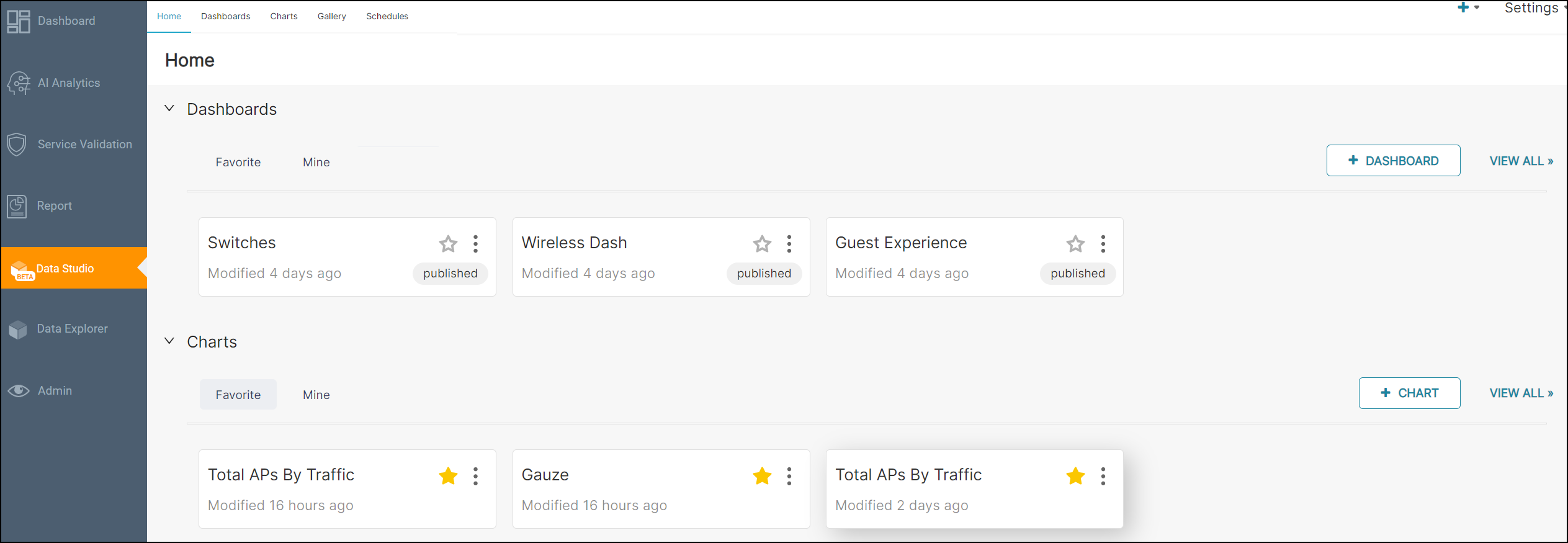
You can create your own charts and dashboards and save them under the Mine tab.
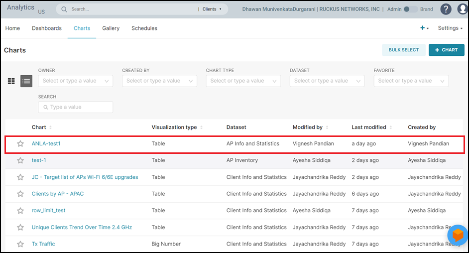
Charts Tab
Charts aid in visualizing network data from as simple as a pie chart to complex network graphs. There are a variety of options to choose from, to visualize data.
Creating a Chart
- In the Navigation tab, click . The Charts page is displayed.
- Click +Chart icon.
The Create a new chart page is displayed.
Creating a New Chart 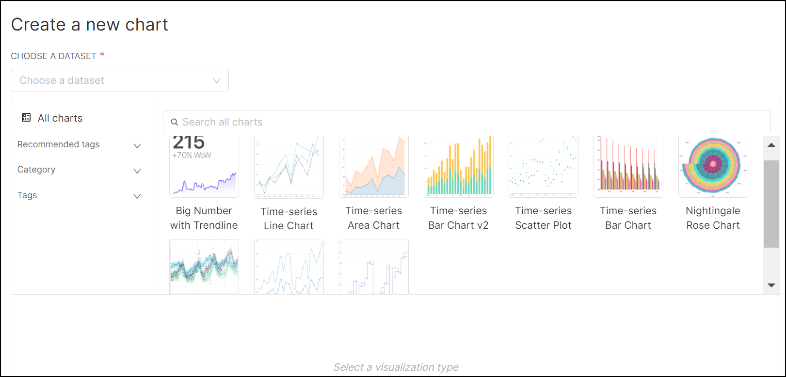
- In the Choose a Dataset field, select a Dataset from the list. Refer to Dataset Filters Columns table, for more information on the Dataset.
- In the Choose a
Chart Type tab, select a chart type. You can choose a chart
by filtering with following options:
- All charts: This option displays the most used charts across organization.
- Recommended
tags: The option displays the most suitable charts
based on the data being analyzed. This feature assists in optimal
and meaningful data visualization. You can choose a chart from the
following filter types:
- Popular: This option displays the most popular charts that are used across organization.
- ECharts: This option displays the Funnel, Treemap, Gauge, and various Time-series charts.
- Advanced-Analytics: This option displays the Big Number with Trendline and various Time-series charts.
- Category: The option displays the most
used charts across organization based on the following
catagories:
- Correlation: This option displays the Heatmap, Calendar Heatmap, and Bubble charts.
- Distribution: This option displays the Histogram, Box Plot, and Horizon charts.
- Evolution: This option displays the various Time-series charts.
- Flow: This option displays the Sankey Diagram and Chord Diagram charts
- KPI: This option displays the Big Number, Bullet, Funnel, and Gauge charts.
- Map: This option displays the Deck.GL Scatterplot chart.
- Parts of a Whole: This option displays the Pie, Treemap, Sunburts, Partitions, and Treemap charts.
- Ranking: This option displays the Bar, Word, Nightingale, and Parallel charts.
- Table: This option displays the various Tables charts.
- Tags: The option displays all available charts filtered by chart type.
After you select the chart, a breif introduction and examples about the selected chart is displayed at the bottom.
- Click Create New
Chart. A new page is displayed with a blank content panel to
the right of the page, a Data tab, and a
Customize tab to the left of the page. The
Datasource tab is hidden. Click Open
Datasource tab icon beside the Run
button to view the Datasource tab. The selected
Dataset is displayed in the
Datasource tab.
Create New Chart Page 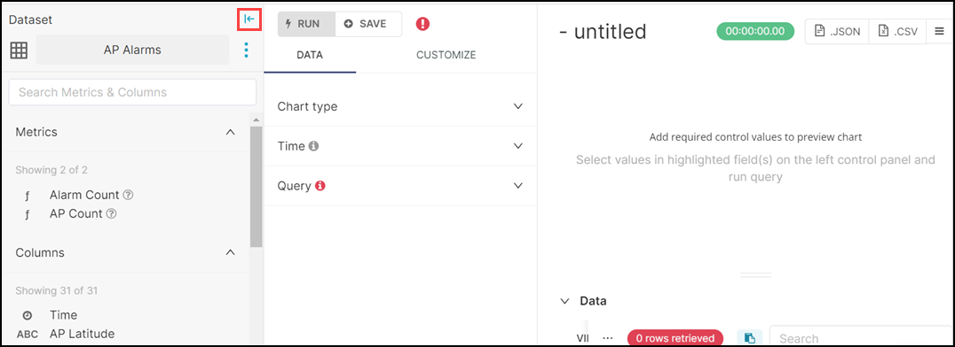 If you want to select different Dataset, complete the following steps:
- Click Open Datasource tab icon beside the Run button to view the Datasource tab.
- Click . The Change dataset dialog box is displayed.
- Select the
Dataset. The following warning message
is displayed:
"Warning! Changing the dataset may break the chart if the metadata does not exist."
- Click Proceed. The new Dataset
is loaded and if any form or controls settings are available in
the old dataset, they will be moved to the new dataset. If there
are no existing form and controls settings, the following
message will be displayed:
"No form settings were maintained. We were unable to carry over any controls when switching to this new dataset."
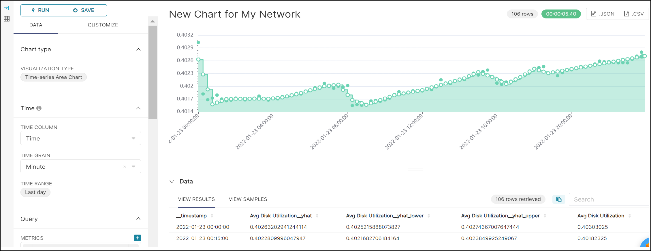
From the Data tab, you can select the chart type, time, query, annotation and layers for the chart, and the analytics trends you wish to see. You can also open the left panel by clicking the table icon, which displays all the columns and calculated metrics of the dataset selected.
From the Customize tab you can select the color schemes for the chart, legend, X-axis and Y-axis parameters, and tool tip options.
- Double click Untitled and enter a title for the chart.
- Complete the following steps to configure the Data
tab:
- In the
Chart type sub tab, the
Visualization Type field is prefilled with
the chart name you have selected at the beginning. If you want to
select a different chart, complete the following steps:
- Click the chart name. The Select a visualization type dialog box is displayed.
- Select the new chart and click Select.
- In the Time sub tab, by default Time
Grain is set to Hours and
Time Range is set to Last
Day, complete the following steps to modify the
Time Grain and Time
Range:
- Time Grain: Select a time from the
drop down list. The time ranges from 30 seconds to a
quarter. This is the duration at which the data is recorded
in the chart.
Example: If you select the time grain as an hour, the data is recorded in the chart every hour.
- Time Range: Click Last
Day. The Edit time range
dialog box is displayed. Complete the following
fields:Note: You have to select the Include Time check box at the bottom of the tab to include the configured time granularity in the chart.
- Range Type: Select a range
type from the drop down list:
- Last
- Previous
- Custom
- Advanced
- Configure Time Range: Set
the duration for which you want to generate the
report.
- For Last, select from
following options:
- Last day: This generates a daily report from the present day (12 AM) until the current time.
- Last week: This generates a weekly report of the previous seven days from 12 AM until the current time.
- Last month: This generates a monthly report of the previous 30 days from 12 AM until the current time.
- Last quarter: This generates a quaterly report of the previous 90 days from 12 AM until the current time.
- For Previous, select from
following options:
- previous calendar week:
This generates a weekly report for the previous
calendar week.
Example: If you are creating a report on September 14, you will get the report from September 2 (Sunday) at 12 AM until September 9 (Sunday) at 12 AM.
- previous calendar month:
This generates a monthly report for the previous
calendar month.
Example: If you are creating a report on September 14, you will get the report for the entire August month.
- previous calendar week:
This generates a weekly report for the previous
calendar week.
- For Custom, select
Start Date/Time and
End Date/Time from the
following options:
- Relative Date/Time: This option allows you to select the time grain ranging from from seconds to a quarter and specify the duration before which you want to generate the report. Select a time range from the drop down. The time ranges from seconds to a quarter. After that, enter a time range that is less than or equal to three months before the day you want to generate the report. In the Anchor To field, select Now to get the live data or select Date/Time and select a date and time to anchor the report to a specific day and time.
- Specific Date/Time: Select a date and time range from the calender less than or equal to three months before the day you want to generate the report.
- Now: You can use this option in the end field to get the data from a specific time to the current time.
- Midnight: This option displays data from the previous midnight (12 AM).
- For Last, select from
following options:
- Range Type: Select a range
type from the drop down list:
- Click Apply to apply the configuration.
- Time Grain: Select a time from the
drop down list. The time ranges from 30 seconds to a
quarter. This is the duration at which the data is recorded
in the chart.
- In the Query sub tab, complete the following
fields:
- Query Mode: Select Aggregate or Raw Records. In aggregate, you can select a column, metrics, apply filters, and sort. In raw records, you can select a column, apply a filter, and sort them by order label.
- For Aggregate, complete the following
fields:
- Group By: Select a column from the drop down. Refer to Dataset Filters Columns table, for more information on the columns.
- Metrics: Click +Add
metric field. The My
metric dialog box is displayed. Select
a predefined metric from the
Saved tab, or define a custom
metrics using the Simple or
Custom SQL tab. Refer to
Dataset Filters
Metrics table, for more
information on the metrics.Note: You can add more than one metrics to the chart.
- Percentage Metrics: You can define metrics for which percentage of the total is to be displayed. The percentage is calculated from only the data within the row limit. Click +Add metric field. The My metric dialog box is displayed. Select a predefined metric from the Saved tab, or define a custom metrics using the Simple or Custom SQL tab.
- Filters: Click +Add filter field. The filter dialog box is displayed. Define a custom filter using the Simple or Custom SQL tab.
- Sort By:You can define metrics to sort the top series in the chart; if this option is not defined, the default first metrics are displayed. Click +Add metric field. The My metric dialog box is displayed. Select a predefined metric from the Saved tab, or define a custom metrics using the Simple or Custom SQL tab.
- Server Pagination: This option enables the server side pagination of results. By default, this option is selected. Uncheck the check box to disable it. If you disable this option, select the chart row limit from the drop down. The row limit ranges from 10 to 5000.
- Include Time: You have to enable this option only if you have defined time granularity in the Time sub-tab. Select the check box to enable this option. If this option is disabled, you can view only last day data.
- Sort Descending: This option sorts the chart data in descending order. By default, this option is selected. Uncheck the check box to disable it.
- Show Totals: This option
displays the total aggregations of selected
metrics.Note: Row limit does not apply to this result.
- For Raw Records, complete the following
fields:
- Columns: Select a column from the drop down. Refer to Dataset Filters Columns table, for more information on the columns.
- Filters: Click +Add filter field. The filter dialog box is displayed. Define a custom filter using the Simple or Custom SQL tab.
- Ordering: Select a order from the drop down.
- Server Pagination: This option enables the server side pagination of results. By default, this option is selected. Uncheck the check box to disable it. If you disable this option, select the chart row limit from the drop down. The row limit ranges from 10 to 5000.
- In the
Chart type sub tab, the
Visualization Type field is prefilled with
the chart name you have selected at the beginning. If you want to
select a different chart, complete the following steps:
- Click
Customize tab to customize the chart that you have
selected. The Customize tab is displayed only for the
selected charts. If required, you can customize the chart color, row size,
column size, labels, and alignments. Only the options applicable to the
selected charts are displayed in the Options sub-tab.
For example, the following options are displayed for the
Table chart type:
- In the
Options sub tab complete the following
fields.
- Timestamp Format: Select date and time format from the drop down.
- Search Box: This option includes a client-side search box in the chart. By default, this option is selected. Uncheck the check box to disable it.
- Align: This option aligns the background chart with both positive and negative values at zero. Select the check box to enable this option.
- Colour: This option colors the positive and negative numerical values. Select the check box to enable this option.
- Conditional Formatting: This option applies the color formating to the numeric columns. Click + Add new color formatter. This option applies the color formatting to the numeric columns. Click + Add new color formatter. The Add new formatter dialog box is displayed. In the Column field, select the column from the drop down. In the Color Scheme field, select the color from the drop-down. In the Operator field, select the condition operator.
Based on the chart type selected, similar options will be displayed.
- Click Apply.
- In the
Options sub tab complete the following
fields.
- Click Run to view the chart that's created after processing the configuration settings.
- Click Save. The
Save chart dialog box is displayed, complete the
following steps.
Save Chart Dialogue Box 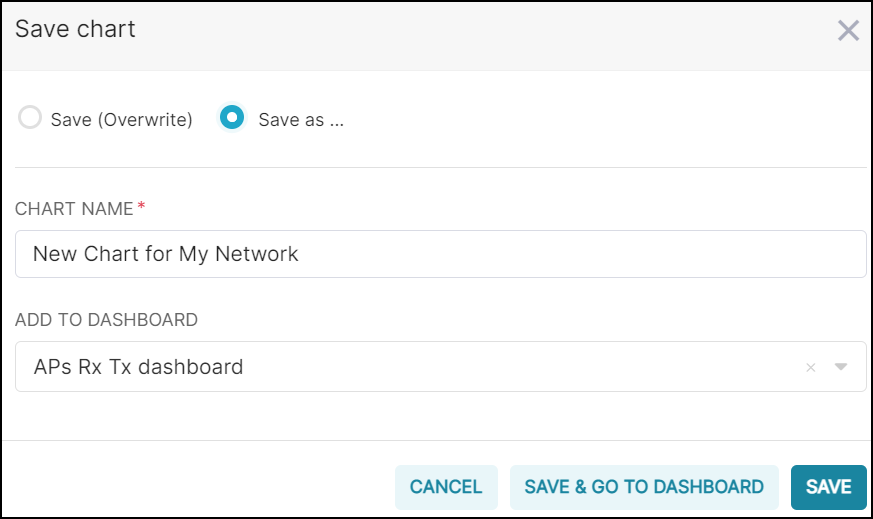
- Complete the
following fields:
- Chart Name: Enter a name for the chart.
- Add to Dashboard: Select a dashboard from the list. This option saves the chart to a Dashboard page.
- Click Save to save the chart to the Charts page. If you have selected a dashboard, you can select Save & Go To Dashboard this will redirect you to the Dashboard page.
- Complete the
following fields:
The owner of the chart is provided with an option to schedule an email report from the screen while viewing it. Click a chart to view the details.
Create a Report Schedule for the Chart
You can create a report schedule for the chart that you have created.
- In the Navigation tab, click . The Charts page is displayed.
- In the table, select the chart for which you want to create an email schedule.
- Click the
 icon at the top-right corner. The New Email Schedule
dialog box is displayed.
icon at the top-right corner. The New Email Schedule
dialog box is displayed.Schedule Email from Chart Page 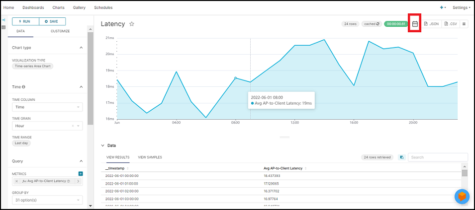
- Complete the following
fields:
New Email Schedule for Chart 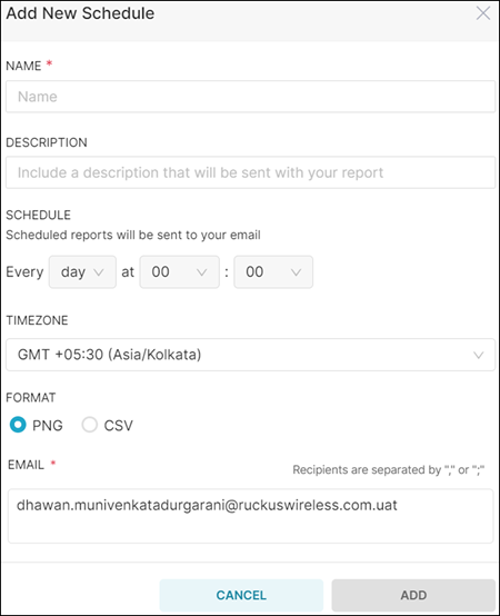
- Name: Add a name to the schedule.
- Description: If necessary, add a description of the schedule.
- Schedule: Select the day and time at which you
want to trigger the report to be sent to your email.
- Day: Select the time in Hours and Minutes at which you want to trigger the report to be sent to your email.
- Week: Select the Day and time in Hours and Minutes at which you want to trigger the report to be sent to your email.
- Month: Select the Date and time in Hours and Minutes at which you want to trigger the report to be sent to your email.
- Timezone: Select a timezone from the list.
- Format: Select a report format PNG, or CSV.
- Email: Enter the email address to which the report will be sent.
- Click Add to create a report schedule for the chart.
Export and Download the Chart Report
You can export and download the chart report data in csv, json, and imagine formats. The csv or json reports provide a full report for the time range you specified in the chart. The image report prints the chart report in image format exactly as it is displayed on the Web UI.
- In the Navigation tab, click . The Charts page is displayed.
- In the table, select the chart for which you want to export and download the chart report.
- Click .csv icon at the top-right corner to export and download the report in csv format.
- Click .json icon at the top-right corner to export and download the report in json format.
- Click at the top-right corner to export and download the report in image format.
Dashboard Tab
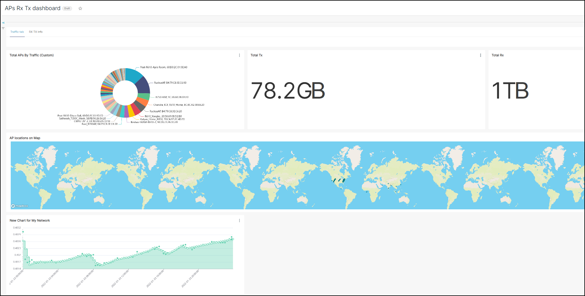
Creating dashboards in the Data Studio page is simple and easy. The dashboards are a collection of charts which is highly customizable according to user needs.
The Dashboard tab displays all the dashboards created either as widgets or tables (contains one or many widgets, and or charts). It displays information about the owner of the dashboard, dashboard title, status (Published or Draft), modification details and so on. Individual dashboards can be selected and deleted, or they can be selected in bulk and deleted. Only dashboard owners can edit or delete them. You can search for a particular dashboard in the search field, by title. The dashboard information can also be sorted and viewed by the options recently modified, least recently modified, and in alphabetical order. You can also filter the dashboards by using created by or owner drop-downs.
Creating a Dashboard
- In the Navigation tab, click . The Dashboard page is displayed.
- Click +Dashboard
icon. The Untitled Dashboard page is displayed with two
tabs Components and Charts.
From Components, you can add various components to customize the appearance of the dashboard, such as tabs, rows, columns, dividers, headers, and markdowns.
From Charts, you can also choose the charts you want to add to the dashboard and view them based on their time of creation, dataset, visualization type, and name.
Creating a New Dashboard 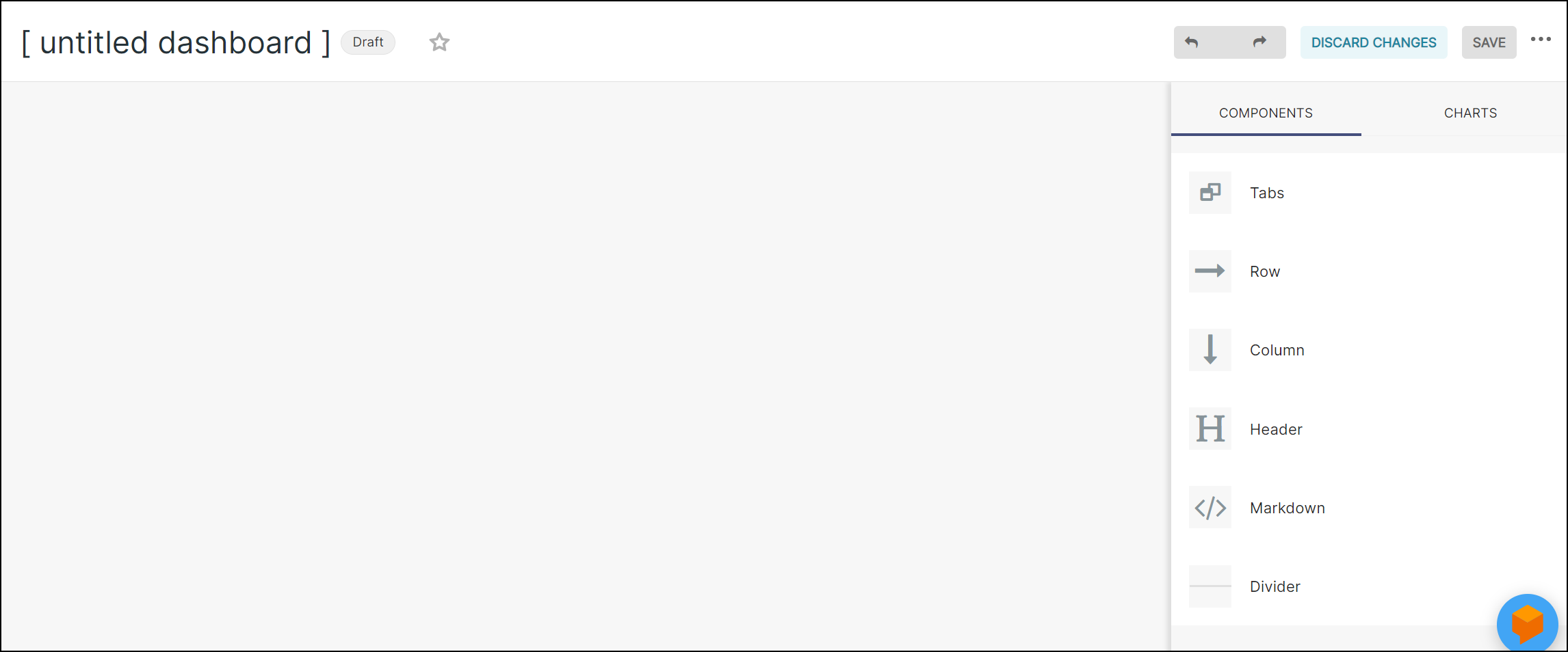
- Double click Untitled Dashboard and enter a title for the dashboard.
- Click +Create a New
Chart to add a new chart, refer Creating a
Chart section. To add an existing chart, select the
Charts tab, then drag and drop the required charts
from the list to the dashboard.
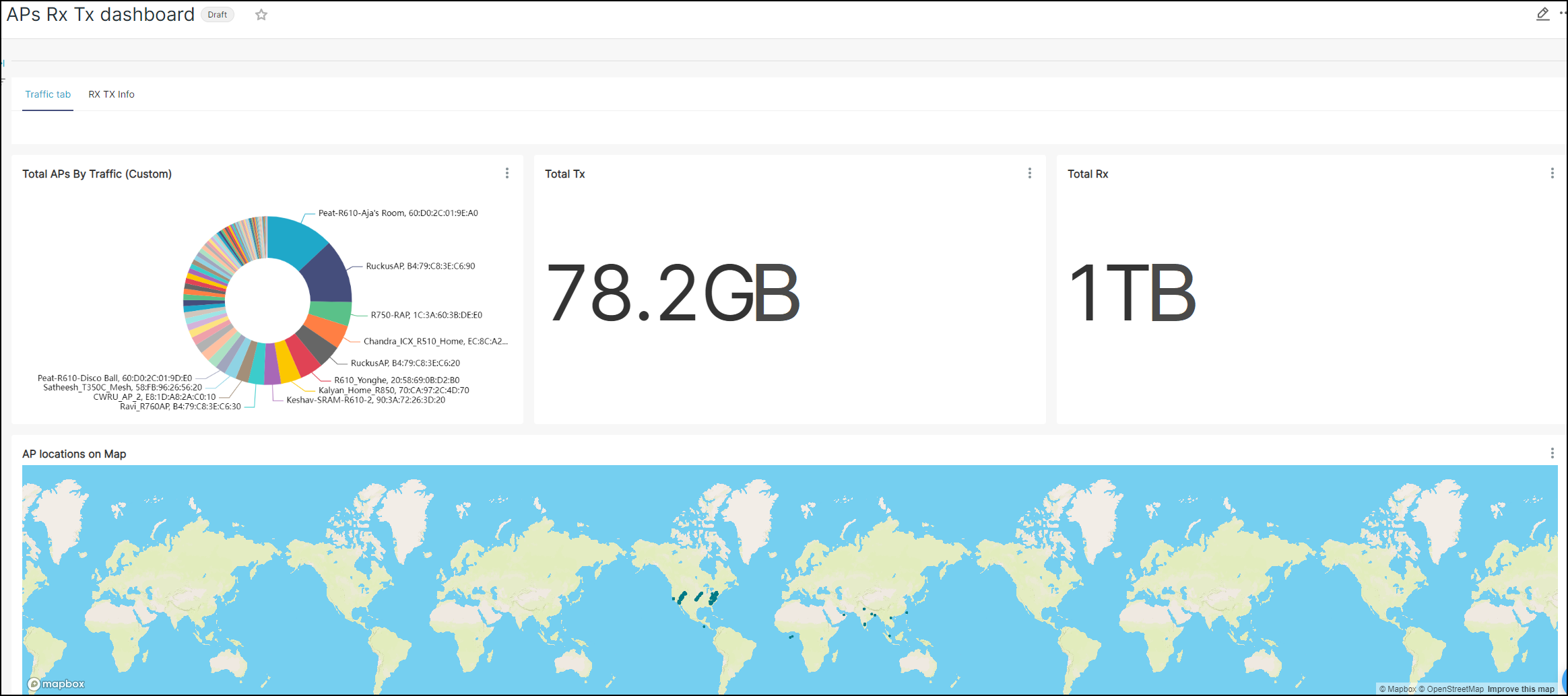
Charts added to the dashboard appear as a widget or tile. You can click on the chart to modify the title and also expand or contract the chart to fit within the dashboard. You can also delete a chart within the dashboard by clicking the delete icon in the widget. For more information about the chart, you can click the data source link from where the chart is included.
- If required, drag and drop
the required components to the dashboard from the
Components tab to configure the dashboard.The dashboard components are described below:
- Tabs: You can use this option to create the tab headings.
- Row: By default, a row is displayed on the dashboard. This row is the placeholder for the charts. If a row is filled with charts, you can use this option to create a new row and add new charts.
- Column: You can use this option to create the table column. This column is the placeholder for the charts. You can use this option to create a new row and add new charts.
- Heading: You can use this option to create the heading.
- Markdown: You can use this option to add notes or information.
- If required, use the Undo and Redo icons at the top right corner of the page to undo or redo any changes made to the dashboard.
- Click Save to save
the dashboard with the same name, or select to overwrite the dashboard with the same name or save the
dashboard with a new name, or select the option also copy
(duplicate) charts to duplicate the dashboard and save it
with a new name.
The dashboard is saved by default as a Draft, and listed in the Dashboard tab.
Note: Click Discard Changes to removes changes done to the dashboard.New Dashboard Added to the Dashboard Tab 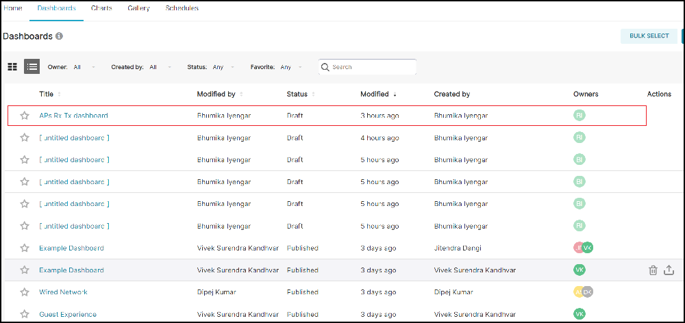
- Select to refresh the dashboard manually.
- Complete the following steps
to set up automatic dashboard refresh:
- Select . The Refresh Interval dialog box is displayed.
- Select the Refresh Frequency from the list and click Save.
Create a Report Schedule for the Dashboard
You can create a report schedule for the dashboard that you have created.
- In the Navigation tab, click . The Dashboard page is displayed.
- In the table, select the dashboard for which you want to create an email schedule.
- Click the icon at the top-right corner. The Add New Schedule
dialog box is displayed.
- Complete the following
fields:
- Name: Add a name to the schedule.
- Description: If necessary, add a description of the schedule.
- Schedule: Select the day and time at which you
want to trigger the report to be sent to your email.
- Day: Select the time in Hours and Minutes at which you want to trigger the report to be sent to your email.
- Week: Select the Day and time in Hours and Minutes at which you want to trigger the report to be sent to your email.
- Month: Select the Date and time in Hours and Minutes at which you want to trigger the report to be sent to your email.
- Timezone: Select a timezone from the list.
- Format: Select a report format PNG, CSV, or PDF.
- Email: Enter the email address to which the report will be sent.
- Click Add to create a report schedule for the dashboard..
Export and Download the Dashboard Report
You can export and download the dashboard report data in csv, pdf, and imagine formats. The csv reports provide a full report for the time range you specified in the chart. The pdf or image report prints the dashboard report in pdf or image format exactly as it is displayed on the Web UI.
- In the Navigation tab, click . The Dashboard page is displayed.
- In the table, select the dashboard for which you want to export and download the dashboard report.
- Click at the top-right corner to export and download the report in csv format.
- Click at the top-right corner to export and download the report in pdf format.
- Click at the top-right corner to export and download the report in image format.
Export and Import Dashboard
 icon
in the Actions column. You can also use the BULK SELECT option to select
and export several dashboards at a time.
icon
in the Actions column. You can also use the BULK SELECT option to select
and export several dashboards at a time. 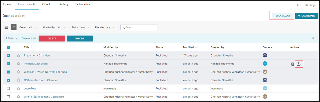
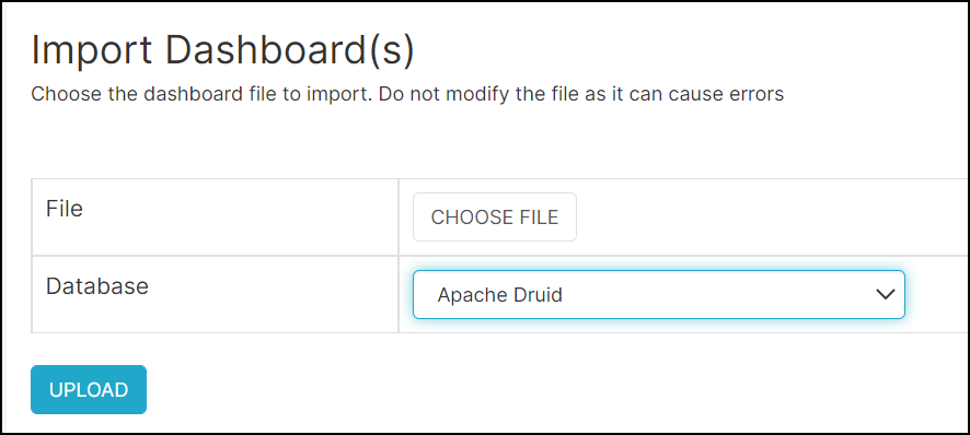
In the Import Dashboard(s) window, choose the exported dashboard file, select the database, and click Upload to import the dashboard file.
Note that the export and import is for the dashboard template only and the data is restricted based on the account and the resource group.
Schedules Tab
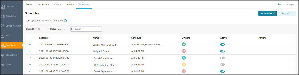
- Status: Displays the status (successful or failed) of the scheduled report.
- Last Run: Displays the date and time (including time zone) at which the report was last run.
- Name: Displays the name of the report.
- Schedule: Displays the time at which the report is scheduled to run.
- Owners: Displays the name of the user who has created the scheduled report.
- Active: Indicates whether the schedule is enabled or disabled. Only the owner of the scheduled report and users with Admin privileges can enable or disable the schedule.
- Actions:
Displays all the actions that you can perform on a configured schedule, as
described in the following table.
Table 1. Actions Description Action Icons Description  (Execution Log)
View the execution log of the scheduled report.  (Edit)
 Edit the scheduled report. Only the user who created the schedule (the owner of the schedule) can edit the schedule.  (Delete)
 Delete the scheduled report. Only the user who created the schedule (the owner of the schedule) can delete the schedule.
The owner of the schedule can also use the Bulk Select option to select several schedules and delete them all at once.
Creating a Schedule
You can create schedules for the dashboard and chart that you have created.
- In the Navigation tab, click . The Schedules page is displayed.
- Click + Schedule.
The Add Schedule dialog box is displayed.
Add Schedule Dialog Box 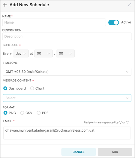
- Complete the following
fields:
- Name: Enter a name for the report.
- Description: Enter a description of the report.
- Active: Use the slide button to enable or
disable the schedule.
If the schedule is enabled, the reports will be sent to the recipient according to the schedule. If the schedule is disabled, the schedule becomes inactive and the report does not run at the configured frequency.
- Schedule: Select the day and time at which
you want to trigger the report to be sent to your email.
- Day: Select the time in Hours and Minutes at which you want to trigger the report to be sent to your email.
- Week: Select the Day and time in Hours and Minutes at which you want to trigger the report to be sent to your email.
- Month: Select the Date and time in Hours and Minutes at which you want to trigger the report to be sent to your email.
- Timezone: Select the time zone that must be considered for the schedule.
- Message
Content: Only the dashboards and charts that you have
created are displayed in the drop down. Select one of the
following:
- Dashboard: Specifies to create a schedule for a dashboard report. Select a dashboard from the drop down.
- Chart: Specifies to create a schedule for a chart report. Select a chart from the drop down.
- Format: You can choose to send the chart report in the PNG, CSV, or PDF formats.
- Email: Specify the email address of the recipient to whom you want to send the report. You can enter email addresses of multiple recipients separated by commas or semicolons.
- Click Add to create the schedule.
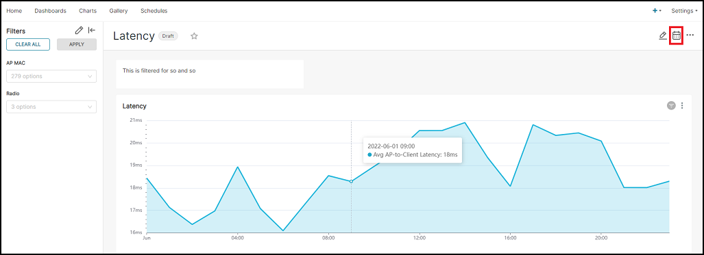
Apply Filters to the Dashboard
You can create various filters for the dashboard and apply them to all panels or specific panels in the dashboard. These filters are temporary, meaning every time you refresh the web UI page or leave the dashboard, they will be reset. These filters display the results on the dashboard page, and if you export a CSV report or schedule a report of this dashboard after applying these filters, you will only get the report of the granularity configured in each of the charts or panels and not that you have applied in the filters.
Example: If you have configured the time granularity as the last day in each chart of the dashboard and you use the filter to apply the time granularity of the week, the dashboard will display the week report, but when you export the csv report of this dashboard, the report will display the last day data as per the time granularity configured in the chart and not the week data that you have configured in the filter.
- In the Navigation tab, click . The Dashboard page is displayed.
- In the table, select the
dashboard for which you want to apply filters. The
Dashboard is displayed.
Dashboard 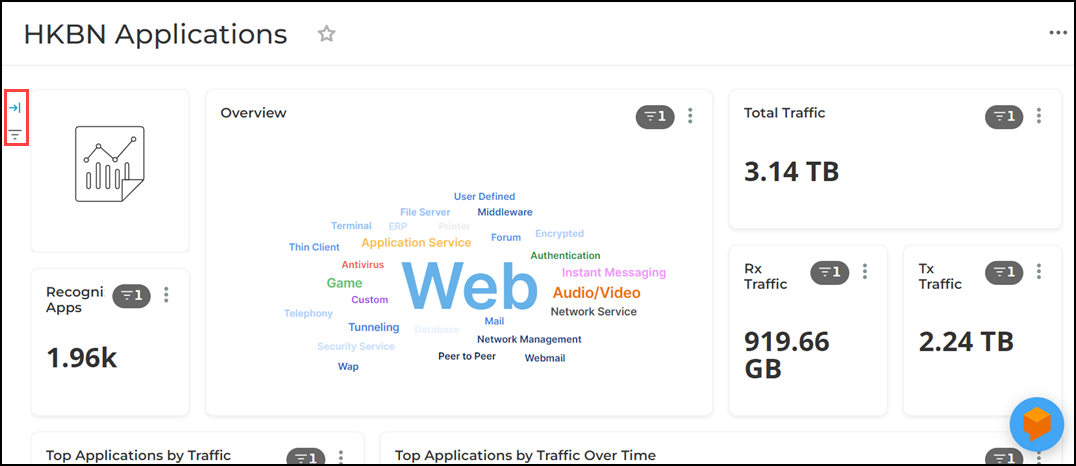
- Click Filter icon
(three horizontal lines) at the left of the dashboard. The
Filters tab is displayed.
Filters Tab 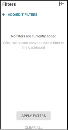
- Click + Add/Edit
Filters. The Add and edit filters
dialog box is displayed.
Add and Edit Filters Dialog Box 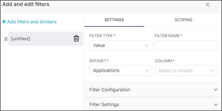
- Complete the following steps to create the filters in the Add and
edit filters dialog box:
- In the + Add filters and dividers tab, by default, an empty filter with name [untitled] is displayed, you can use this and create the filter. To add new Filter or Divider, click + Add filters and dividers icon and select Filter or Divider. The Filter or Divider is displayed in the + Add filters and dividers tab. You can use the Divider to add the addition information about the filters.
- In the Settings tab, complete the following
fields:
- Filter Type: Select a filter type from
the drop down:
- Value
- Time Range
- Time Grain
- Filter Name: Enter a name to the filter.
- Dataset: This option is displayed only if the Filter Type is Value or Time Grain. Select a dataset from the drop down.
- Column: This option is displayed only if the Filter Type is Value. Select a column from the drop down.
- Filter Configuration: Configure the
filter for the selected Filter Type.
- For Value, select Pre-filter available values or Sort filter values check box to enable this filter.
- For Time Range and Time Grain, select Sort filter values check box to enable this filter.
- Filter Settings: Configure the filter
for the selected Filter Type.
- Description: If required, enter a brief description of the filter to which you are applying.
- For Value, select the check box for the applicable filters that you want to enable.
- For Time Range and Time Grain, select the check box for the applicable filters that you want to enable.
- Filter Type: Select a filter type from
the drop down:
- Scoping: You can apply the filter to
individual panels or charts or to all panels or charts by using the
following options:
Scoping Tab 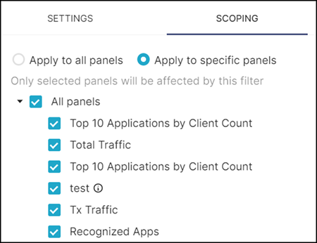
- Apply to all panels: This option applies the filter to all the panels or charts.
- Apply to specific panels: This option applies the filter to selected panels or charts. After selecting this option, select the chart from the drop down to which you want to apply this filter.
- Click Save to save the filters. The added
filter is displayed in the + Add filters and
dividers.
Added Filter View 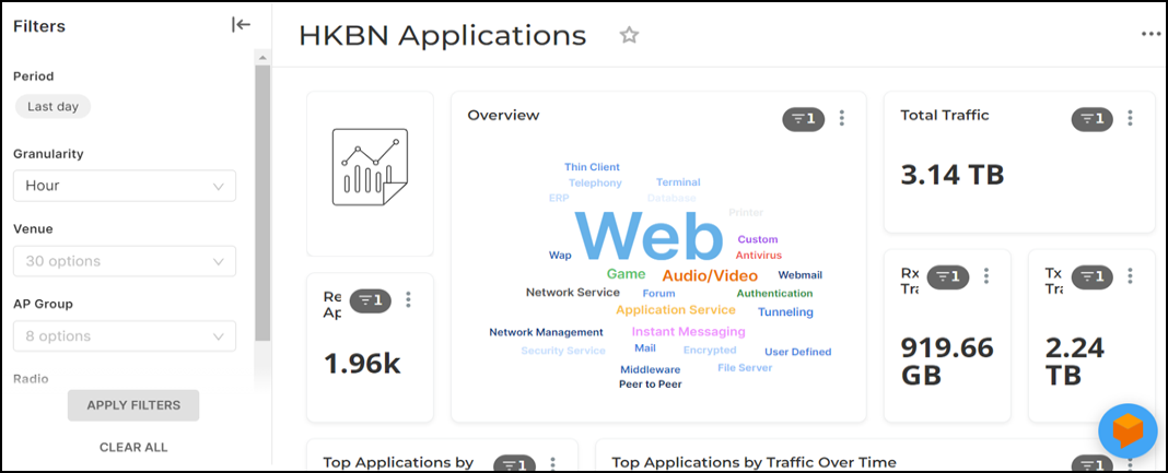
- If you want to add a divider, click + Add filters and
dividers icon and select
Divider. The Divider is
displayed in the + Add filters and dividers
tab. Complete the following fields:
- Title: Enter a title to the divider.
- Description: Enter a brief description about the divider.
- If you want to add more filters or dividers, click + Add filters and dividers icon and select Filter or Divider. Start from Apply Filters to the Dashboard, Step 5.b.
- Complete the following steps to modify the filter and view results in the
dashboard:
- Click filter and select the required filter value.
- Click Apply
Filters, the new results are displayed in the
dashboard. If you export a CSV report or schedule a report of this
dashboard after applying these filters, you will only get the report
of the granularity configured in each of the charts or panels and
not that you have applied in the filters.
Example: If the time granularity configured to the chart is last day and you apply last week time granularity in the filter, the last week results are displayed in the dashboard. If you export a csv report or schedule a report of this dashboard, you will get the report of the last day granularity as configured in the chart. If you want a last week report, then you have to modify the time granularity of each chart in the dashboard and then export a csv report or schedule.
- Complete the following steps to modify the granularity of each chart in the
dashboard:
- Click . The Chart is displayed.
- In the Time sub tab, modify the granularity as required and click Save.