Content Panel
The RUCKUS AI feature details are displayed in this area.
When you click an item on the Navigation bar, the related information (tables, lists, graphs, configuration options, and so on) is displayed in the Content panel. The Network Hierarchy filter, Date and Time filter, Schedule icon, and Export icon are displayed in the upper-right corner of the Content panel for the applicable RUCKUS AI features.
Network Hierarchy Filter
The Network Hierarchy filter allows you to modify the scope of data displayed on the Content Panel. The default view is Entire Organization, which consists of the full hierarchy containing all controller clusters, domains, zones, switch groups, AP groups, and individual switches and APs. Use the drop-down list to select the portion of the network for which data will be displayed on the dashboard.
- Click Network Hierarchy. The cluster list is displayed.
- Select the cluster. The list of domains, zones, and switch groups applicable to the cluster is displayed.
- Select the desired domain, zone, or switch group. The respective list of zones, AP groups, or switches is displayed.
- Select the zone, AP group, or switch. The respective list of zones, AP groups, or switches is displayed.
- As you navigate within the cluster, the selected options are displayed in hierarchical order at the top of the drop-down list. If you want to navigate to one of the previous selections, you can click the option available at the top of the drop-down list.
- Alternatively, you can use the filter's search functionality to select a
specific AP or Switch. Click in the filter field, begin typing the device
attribute, and select from the drop-down list.
-
Searchable AP attributes: Name, Model, MAC Address, or IP Address
- Searchable switch attributes: Name, Model, MAC Address, or IP Address
-
- After selecting the required option, click Apply to display the information in the Content panel.
Date and Time Filter
- Last 8 Hours: This displays the previous 8 hours of information from the current time. This is the default setting.
- Last 24 Hours: This displays the previous 24 hours of information from the current time.
- Last 7 Days: This displays the previous seven days of information from the current time.
- Last 30 Days: This displays the previous 30 days of information from the current time.
- Click Last 8 Hours. The Calendar is displayed.
- Select the start date within the last 90 days.
- Select the end date.
- For additional data refinement, you may select the desired Hour and Minute in the associated start and end time fields.
- If required, in the start and end time fields, select the time in Hours and Minutes during which you want to view the information. If not selected, the current time is selected in the start and end time fields.
- Click Apply to save the specified date and time filters. The Content panel is updated per the filters.
Configuring a Report Schedule
Complete the following steps to create a schedule for the report and share it with recipients via e-mail either on-demand or periodically by configuring a schedule (daily, weekly and monthly):
- Click the
 icon at the top-right corner and select . The Schedule a New Email Report dialog
box is displayed.
icon at the top-right corner and select . The Schedule a New Email Report dialog
box is displayed. - Complete the following
fields:
- Schedule Name: Enter a name for the report schedule.
- Description: Enter a description for the report.
- Schedule: Select the frequency (day, week,
or month) and time at which you want to trigger the report to be run
and sent to the email recipients.
- Day: Select the time at which you want the report to be sent each day.
- Week: Select the day of the week and time at which the report to be sent.
- Month: Select the day of the month (for example, 1st–31st) and the time at which you want the report to be sent each month.
Note: The reporting period is determined by the schedule frequency.- For daily schedules, the report includes data for the previous day.
- For weekly schedules, the report includes data for the last 7 days.
- For monthly schedules, the report includes data for the last 30 days.
- Granularity: Specifies the time
interval used to aggregate and present data in the scheduled
report. The selected time interval determines the level of
detail in the report. For example, if you set Granularity to Week,
and schedule the report to run monthly, the report displays
data aggregated by week within the reporting period.
The values available for the Granularity option are dependent on the frequency configured in the Schedule option.
Table 1. Granularity Options for Scheduled Reports Report Schedule Granularity Day 15 minute, Hour, or Day Week 15 minute, Hour, Day, or Week Month Hour, Day, Week, or Month A default granularity value is defined for existing schedules. For daily and weekly schedules, the default granularity is set to 15 minute, while for monthly schedule, the default granularity is Hour.
- Timezone: Select a timezone from the list.
- Format: Select a report format
PNG (image), CSV
(spreadsheet), or PDF.Note: The scheduled report in CSV format is restricted to render a maximum of 50,000 records.
- Email: Specify the email address of the recipient to whom you want to send the report. The current user's email address appears by default. You can enter email addresses of multiple recipients separated by commas or semicolons.
- Click Add Schedule to create a schedule.
Download
Click the icon
at the top-right corner and select or to download the report locally in PDF or PNG format.
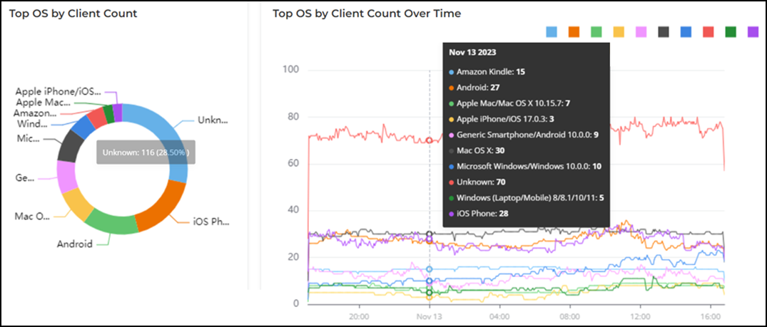
Color Coding for Donut Chart and Graph
The donut charts and graphs exhibit the top 10 results, each identified with a specific color. The highest result is shown in blue, while the lowest result is shown in purple. It is important not to make comparisons between the donut chart and graph based on color codes, as they indicate different types of data. In the following example, the blue color is assigned to the highest result in both the donut chart and the graph, but the data in both the donut chart and the graph is not the same. In the donut chart, the top OS by client count is unknown, while in the graph, the top OS by client count over time at that particular selected date and time is amazon kindle.