Health Page
The Health page provides information about network health by giving insights about key performance indicators (KPIs) of the network. The information provided by the Health page allows you to analyze the network health and behavior in real time..
You can evaluate network health based on a variety of thresholds that you are allowed to set, called goals. For example, you can set the goal (or threshold) to five seconds for all clients to connect to the network, and confirm the number of clients accomplishing the five-second goal in real time. You can thereby determine the metric to understand the number of clients that connect within or before time, and the ones that are delayed. The success rate of network elements meeting each of the goals is typically displayed as a percentage of the metric.
At a high level, the Health page also displays the number of connection attempts, successful connections, failed connections, the connection status, and the average time to connect.
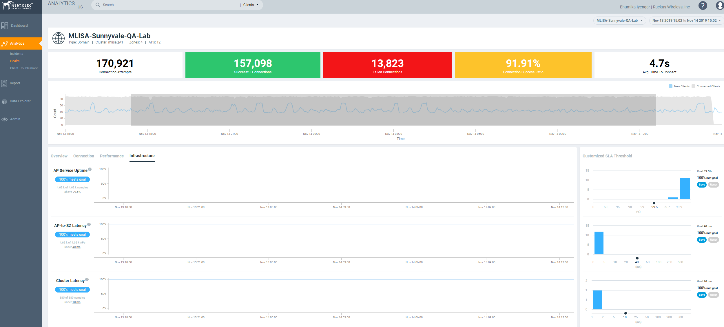
Unique Connected Clients Graph
The Unique Connected Clients graph displays the range of clients attempting to connect to the network. You can modify the range (dark grey area) of clients by moving the scroll bar and this automatically changes the trends displayed in the Overview, Connection, Performance and Infrastructure tabs. Pausing the pointer over the graph or placing the pointer at a particular point provides information about the number of connected clients at a time on a given day.
Overview Tab
The Overview tab displays information about successful client connections, time taken by the client to connect to the network, client throughput, AP capacity, and AP service uptime. The area is graphically divided into three sections: a pill-shaped box depicting the metric as percentages, a time series graph depicting the metric as percentages, and a histogram.
The pill-shaped box not only depicts the percentage of successful connections, but also specifies the connections, sessions, and APs meeting a threshold within the larger sample set.
There are two types of histograms: a view-only histogram that provides information about the threshold trends, and another configurable histogram that allows you to set the threshold for a metric. The threshold you set for the metric is the value against the goal. By default, the goal met for the last 7 days is displayed. Click Apply to set the new threshold for the metric or click Reset to revert to the default threshold value.
The following KPIs are displayed on the tab:
- Connection Success: Measures the number of connection attempts that complete successfully. Pausing the pointer over the time series graph at a point displays the percentage of successful connections made and the number of connections attempted by the client at that time and date. Pausing the pointer over the histogram bar graph displays the number of sample clients that attempted to connect to the network.
- Time to Connect (TTC): Measures the percentage of connection attempts that completed within the service level agreement (SLA). Pausing the pointer over the time series graph at a point displays the percentage of TTC count and connection count at that time and date. Pausing the pointer over the histogram bar graph displays the number of sample clients that attempted to connect to the network.
- Client Throughput: Measures the number of client sessions with the throughput potential that met the SLA. Pausing the pointer over the time series graph at a point displays the percentage of throughput count and session count at that time and date. Pausing the pointer over the histogram bar graph displays the number of sample clients that attempted to connect to the network.
- AP Capacity: Measures the number of APs with the average capacity that met the SLA. Pausing the pointer over the time series graph at a point displays the percentage of capacity count and AP count at that time and date. Pausing the pointer over the histogram bar graph displays the number of sample clients that attempted to connect to the network.
- AP Service Uptime: Measures the percentage of time the radios of an AP are fully available for client service.
| KPI | Pill-Shaped Box | Time Series Graph | Histogram |
|---|---|---|---|
| Connection Success | Displays the percentage of successful connection attempts | Displays the percentage of successful connection attempts | Displays a bar chart of success percentage where the X axis displays time in hours, days, and weeks, and the Y axis displays success percentage |
| Time to Connect | Displays the percentage of connections that completed within the TTC SLA (for the time range selected) | Displays the percentage of connections meeting the SLA over time | Displays a bar chart of TTC where the X axis displays TTC duration and the Y axis displays the connection count;
also displays the percentage of connections that completed within the TTC SLA for the entire time range |
| Client Throughput | Displays the percentage of client sessions with the average throughput that met the SLA (for the time range selected) | Displays the percentage of client sessions with the throughput that met the SLA | Displays a bar chart of throughput by session where the X axis displays the average throughput per session and the Y axis displays the session count;
also displays the percentage of client sessions with the average throughput that met the SLA for the entire time range |
| AP Capacity | Displays the percentage of APs with the per-bin capacity that met the SLA (for the time range selected) | Displays the percentage of APs with the per-bin capacity that met the SLA | Displays a bar chart of average capacity where the X axis displays average capacity and the Y axis displays AP count;
also displays the percentage of APs with the per-bin capacity that met the SLA for the entire time range |
| AP Service Uptime | Displays the percentage of APs with the uptime that met the SLA (for the time range selected) | Displays the percentage of APs with the uptime that met the SLA | Displays a bar chart of AP service uptime where the X axis displays the percentage of AP service uptime and the Y axis displays the number of APs that meet the goal for the selected time;
also displays the percentage of APs with the uptime that met the SLA for the entire time range |
Connection Tab
The Connection tab displays information about successful client connections, time taken by the client to connect to the network, association, user authentication, DHCP, RADIUS, and roaming success. The area is graphically divided into three sections: a pill-shaped box depicting the metric as percentages, a time series graph depicting the metric as percentages, and a histogram.
The pill-shaped box not only depicts the percentage of successful connections, authentications, and associations, but also specifies the connections, authentications, and associations meeting a threshold within the larger sample set.
There are two types of histograms: a view-only histogram that provides information about the threshold trends, and another configurable histogram that allows you to set the threshold for a metric. The threshold you set for the metric is the value against the goal. By default, the goal met for the last 7 days is displayed. Click Apply to set the new threshold for the metric or click Reset to revert to the default threshold value.
The following KPIs are displayed on the page:
- Connection Success: Measures the number of connection attempts that complete successfully. Pausing the pointer over the time series graph at a point displays the percentage of successful connections made and the number of connections attempted by the client at that time and date. Pausing the pointer over the histogram bar graph displays the number of sample clients that attempted to connect to the network.
- Time to Connect (TTC): Measures the percentage of connection attempts that completed within the service level agreement (SLA). Pausing the pointer over the time series graph at a point displays the percentage of TTC count and connection count at that time and date. Pausing the pointer over the histogram bar graph displays the number of sample clients that attempted to connect to the network.
- Association: Measures the number of association attempts that complete successfully. Pausing the pointer over the time series graph at a point displays the percentage of association attempts at that time and date.
- User (L2) Authentication: Measures the number of Layer 2 user authentication attempts that complete successfully. Pausing the pointer over the time series graph at a point displays the percentage of successful Layer 2 user authentications at that time and date.
- DHCP: Measures the number of DHCP connection attempts that complete successfully. Pausing the pointer over the time series graph at a point displays the percentage of successful DHCP connections at that time and date.
- RADIUS: Measures the number of RADIUS connection attempts that complete successfully. Pausing the pointer over the time series graph at a point displays the percentage of successful RADIUS connections at that time and date.
- Roaming Success: Measures the number of client roaming attempts that complete successfully.
| KPI | Pill-Shaped Box | Time Series Graph | Histogram |
|---|---|---|---|
| Connection Success | Displays the percentage of successful connection attempts | Displays the percentage of successful connection attempts over time | Displays a bar chart of success percentage where the X axis displays time in hours, days, and weeks, and the Y axis displays success percentage |
| Time to Connect | Displays the percentage of connections that completed within the TTC SLA (for the selected time range) | Displays the percentage of connections meeting the SLA over time | Displays a bar chart of TTC where the X axis displays TTC duration and the Y axis displays the connection count;
also displays the percentage of connections that completed within the TTC SLA for the entire time range |
| Association | Displays the percentage of successful association attempts | Displays the percentage of successful association attempts over a granular range of time, which is also determined by the time range selected under Unique Connected Clients | Displays a bar chart of successful associations, as a percentage of the sample set, where the X axis displays time in hours, days, and weeks depending upon the time selection made under Unique Connected Clients, and the Y axis displays success percentage |
| User (L2) Authentication | Displays the percentage of successful Layer 2 user authentication attempts | Displays the percentage of Layer 2 user authentication attempts over a granular range of time, which is also determined by the time range selected under Unique Connected Clients | Displays a bar chart of successful Layer 2 user authentication attempts, as a percentage of the sample set, where the X axis displays time in hours, days, and weeks depending upon the time selection made under Unique Connected Clients, and the Y axis displays success percentage |
| DHCP | Displays the percentage of successful DHCP attempts | Displays the percentage of successful DHCP attempts over a granular range of time, which is also determined by the time range selected under Unique Connected Clients | Displays a bar chart of successful DHCP attempts, as a percentage of the sample set, where the X axis displays time in hours, days, and weeks depending upon the time selection made under Unique Connected Clients, and the Y axis displays success percentage |
| RADIUS | Displays the percentage of successful RADIUS attempts | Displays the percentage of successful RADIUS attempts over a granular range of time, which is also determined by the time range selected under Unique Connected Clients | Displays a bar chart of successful RADIUS attempts, as a percentage of the sample set, where the X axis displays time in hours, days, and weeks depending upon the time selection made under Unique Connected Clients, and the Y axis displays success percentage |
| Roaming Success | Displays the percentage of successful roaming attempts | Displays the percentage of successful roaming attempts over time |
Displays a bar chart of roaming percentage where the X axis depicts coarse time and the Y axis dsiplays the success percentage |
Performance Tab
The Performance tab displays information about client throughput, AP capacity, and client RSS. The area is graphically divided into three sections: a pill-shaped box depicting the metric as percentages, a time series graph depicting the metric as percentages, and a histogram.
The pill-shaped box not only depicts the percentage of client throughput, AP capacity, and client RSS, but also specifies the client throughput and AP capacity meeting a threshold within the larger sample set.
There are two types of histograms: a view-only histogram that provides information about the threshold trends, and another configurable histogram that allows you to set the threshold for a metric. The threshold you set for the metric is the value against the goal. By default, the goal met for the last 7 days is displayed. Click Apply to set the new threshold for the metric or click Reset to revert to the default threshold value.
The following KPIs are displayed on the tab:
- Client Throughput: Measures the client throughput sessions that met the service level agreement (SLA). Pausing the pointer over the time series graph at a point displays the percentage of successful client throughput values achieved by the client at that time and date. Pausing the pointer over the histogram bar graph displays the number of sample client throughput goals achieved with the network.
- AP Capacity: Measures the number of APs with the average capacity that met the SLA. Pausing the pointer over the time series graph at a point displays the percentage of average AP capacity at that time and date. Pausing the pointer over the histogram bar graph displays the number of sample clients that attempted to connect to the network.
- Client RSSI: Measures the number of client sessions with the average RSSI that met the SLA. Pausing the pointer over the time series graph at a point displays the percentage of successful RSSI goals achieved by the client at that time and date. Pausing the pointer over the histogram bar graph displays the number of sample client RSSI goals achieved with the network. This metric defines the signal strength.
| KPI | Pill-Shaped Box | Time Series Graph | Histogram |
|---|---|---|---|
| Client Throughput | Displays the percentage of successful client throughput sessions that met the SLA (for the selected time range) | Displays the percentage of successful client throughput sessions that met the SLA over time | Displays a bar chart of success percentage where the X axis displays the average throughput per session and the Y axis displays the session count;
also displays the percentage of successful client throughput sessions that met the SLA for the entire time range |
| AP Capacity | Displays the percentage of the number of APs with the average capacity that met the SLA (for the selected time range) | Displays the percentage of the number of APs with the average capacity that met the SLA over time | Displays a bar chart of average AP capacity where the X axis displays the average capacity and the Y axis displays the AP count;
also displays the percentage of the number of APs with the average capacity that met the SLA for the entire time range |
| Client RSS | Displays the percentage of client sessions with the average RSSI that met the SLA (for the selected time range) | Displays the percentage of client sessions with the average RSSI that met the SLA over time | Displays a bar chart of average RSSI by session where the X axis displays the average RSSI per session and the Y axis displays the session count;
also displays the percentage of client sessions with the average RSSI that met the SLA for the entire time range |
Infrastructure Tab
The Infrastructure tab displays information about the time taken for the AP to respond to the controller. The area is graphically divided into three sections: a pill-shaped box depicting the metric as percentages, a time series graph depicting the metric as percentages, and a histogram.
The pill-shaped box not only depicts the percentage of AP controller latency, but also specifies the AP controller latency meeting a threshold within the larger sample set.
The configurable histogram allows you to set the threshold for a metric. The threshold you set for the metric is the value against the goal. By default, the goal met for the last 7 days is displayed. Click Apply to set the new threshold for the metric or click Reset to revert to the default threshold value.
The following KPIs are displayed on the tab: