Configuration Change Page
You can monitor and analyze changes to network KPIs due to configuration changes and software changes from the Configuration Change page. Network KPIs can be compared before and after a configuration change is applied to the system, thereby presenting the impact of the configuration changes or software updates on the system and its devices.
The Configuration Change page consists of the following components:
- Configuration Change tile
- Configuration Change Listing table
- Health tile
Configuration Change Tile
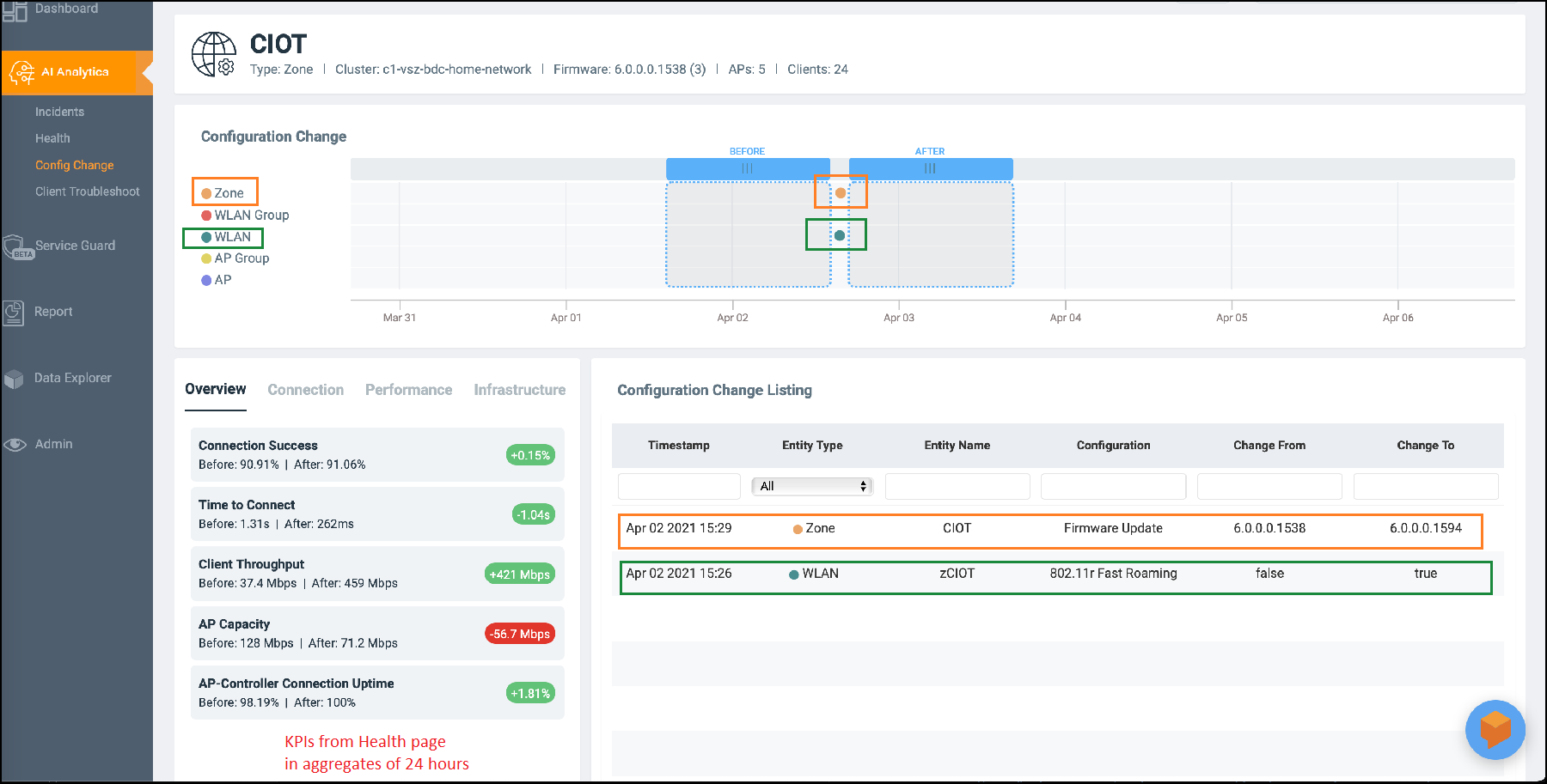
The Configuration Change tile displays configuration changes that have been applied at the Zone, WLAN Group, WLAN, AP Group, and AP levels. Every change in configuration or software change is displayed as a dot on the time series graph. Each dot is colored based on the level on which the configuration was applied and is represented by that color. In the example in the figure, an orange dot represents the configuration change applied at the Zone level, and a green dot represents the configuration change applied at the WLAN level. Clicking the dot highlights the configuration change in the Configuration Change Listing table and vice versa. The first row of the table pertains to data from the orange dot displaying the firmware updated, and the second row pertains to data from the green dot displaying enabling 802.11r fast roaming. In the time series graph, pause the pointer over a dot to see when the configuration change was applied.
To determine the network health before and after the firmware update (the orange dot in the figure), scroll the Before lens to a time prior to the firmware update and scroll the After lens to a time after the firmware update. KPIs on the Health tile are computed and displayed immediately, providing clear "before" and "after" values for each KPI. In the example in the figure, Connection Success, or the number of clients that attempted to connect to the network, increased by 0.15 percent after the firmware update (the configuration change). Connection Success was lower at 90.91 percent before the configuration change than 91.06 percent after the change. Based on this analysis, network administrators can take corrective action to improve the KPI.
Configuration Change Listing Tile
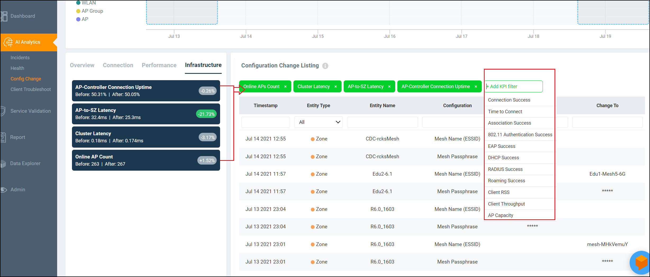
The Configuration Change Listing table is a tabular representation of all the time series data in the Configuration Change tile displaying specific information about what changed after the configuration was applied. It displays information about the timestamp of the configuration change, the entity type for which the configuration was applied (Zone, WLAN, AP, and so on), the entity name, configuration, and information about what specifically changed after the configuration was applied (Change From and Change To columns).
Additionally, you can also filter for relevant configuration changes that are specific to a particular KPI by simply clicking the KPI in the Health tile, or the Add KPI filter above the table.
Health Tile
The Health tile displays the same KPIs that are available on the Health page, the difference being the Health tile displays KPI data aggregated over 24 hours, which is more granular than the Health page with respect to time. For more information, refer to Health Page. In the Health tile, you can view the before and after values of each KPI impacted by the configuration change. The overall impact of the change is displayed within a red, gray or green capsule based on the percentage change. The capsule appears green if the configuration change positively impacted the KPI or improved the performance by more than 5 percent. It appears red if the change negatively impacted the KPI value and diminished the performance by less than 5 percent. It appears gray if the KPI value is strictly + or - 5%. These granular details enable an administrator to monitor network health continuously and ensure the network performs to its highest capabilities.