Health Page
The Health page provides information about network health by giving insights about key performance indicators (KPIs) of the network. The information provided by the Health page allows you to analyze the network health and behavior in real time.
You can evaluate network health based on a variety of thresholds that you are allowed to set, called goals. For example, you can set the goal (or threshold) to five seconds for all clients to connect to the network, and confirm the number of clients accomplishing the five-second goal in real time. You can thereby determine the metric to understand the number of clients that connect within or before time, and the ones that are delayed. The success rate of network elements meeting each of the goals is typically displayed as a percentage of the metric.
At a high level, the Health page also displays the number of connection attempts, successful connections, failed connections, the connection status, and the average time to connect.
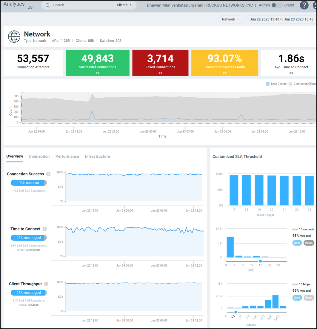
Unique Connected Clients Graph
The Unique Connected Clients graph displays the range of clients attempting to connect to the network. You can modify the range (dark gray area) of clients by moving the scroll bar and this automatically changes the trends displayed in the Overview, Connection, Performance, and Infrastructure tabs. Pausing the pointer over the graph or placing the pointer at a particular point provides information about the number of connected clients at a time on a given day.
Overview Tab
The Overview tab displays information about successful client connections, time taken by the client to connect to the network, client throughput, AP capacity, and AP service uptime. The area is graphically divided into three sections: a pill-shaped box depicting the metric as percentages, a time series graph depicting the metric as percentages, and a histogram.
The pill-shaped box not only depicts the percentage of successful connections, but also specifies the connections, sessions, and APs meeting a threshold within the larger sample set.
There are two types of histograms: a view-only histogram that provides information about the threshold trends, and another configurable histogram that allows you to set the threshold for a metric. The threshold you set for the metric is the value against the goal. By default, the goal met for the last 7 days is displayed. Click Apply to set the new threshold for the metric or click Reset to revert to the default threshold value.
The following KPIs are displayed on the tab:
- Connection Success: Measures the number of connection
attempts that complete successfully. A connection is deemed successful when a
Wi-Fi client is able to complete the 802.11 authentication, association, L2
authentication, and receives an IP address from the DHCP. If any of these stages
fail, it is considered as a failed connection. For L3 authentication such as
WISPr and captive portal authentication, since the WiFi client receives an IP
address before the L3 authentication, the client connection is deemed successful
before the L3 authentication completes.
The time-series graph on the left displays the percentage of successful connections across time, and the bar chart on the right captures the daily percentage over the last seven days of the selected time range. Note that the numbers related to the time-series will change as you zoom-in or zoom-out of a time range, whereas the bar chart remains fixed based on the time range selected at the top of the page.
- Time to Connect (TTC): Measures the total time taken
for a WiFi client to successfully go through all the required stages in order to
establish an IP connection, namely 802.11 authentication, association, L2
authentication, and receiving an IP address from the DHCP. For L3
authentication, such as WISPr and captive portal authentication, since the WiFi
client will receive an IP address before the L3 authentication, the time to
connect does not include the time taken for L3 authentication.
The time-series graph on the left displays the percentage of successful connections across time, that meet the configured TTC SLA. Bar chart on the right displays the distribution of TTC. Note that the numbers related to the time-series will change as you zoom-in or zoom-out of a time range, whereas the bar chart remains fixed based on the time range selected at the top of the page.
- Client Throughput: Measures the down link throughput
estimate of the client, taking into consideration RF channel conditions,
interference, channel contention, and client capabilities.
The time-series graph on the left displays the percentage of WiFi sessions across time that have a client throughput that meets the configured SLA. The bar chart on the right displays the distribution of the client throughput. Note that the numbers related to the time-series will change as you zoom-in or zoom-out of a time range, whereas the bar chart remains fixed based on the time range selected at the top of the page.
- AP Capacity: Measures the downlink saturated
throughput estimate of the AP radios, taking into consideration the RF channel
conditions, interference, channel contention and client capabilities.
The time-series graph on the left displays the percentage of AP capacity samples across time that meets the configured SLA. The bar chart on the right displays the distribution of AP capacity across the number of APs. Note that the numbers related to the time-series will change as you zoom-in or zoom-out of a time range, whereas the bar chart remains fixed based on the time range selected at the top of the page.
- AP-Controller Connection Uptime: Measures the
percentage of time the AP radios are fully available for client service. the
percentage of time the radios of an AP are fully available for client service.
The time-series graph on the left displays the percentage of AP-Controller connection uptime samples across time that meets the configured SLA. The bar chart on the right displays the distribution of AP service uptime across the number of APs. Note that the numbers related to the time-series will change as you zoom-in or zoom-out of a time range, whereas the bar chart remains fixed based on the time range selected at the top of the page.
- Online APs: Measures the percentage of APs which are online and connected to
Smart Zone.
The time-series graph on the left displays the Online AP percentage across time. The bar chart on the right captures the daily Online AP percentage over the last seven days of the selected time range. Note that the numbers related to the time-series will change as you zoom-in or zoom-out of a time range, whereas the bar chart remains fixed based on the time range selected at the top of the page.
| KPI | Pill-Shaped Box | Time Series Graph | Histogram |
|---|---|---|---|
| Connection Success | Displays the percentage of successful connection attempts | Displays the percentage of successful connection attempts | Displays a bar chart of success percentage where the X axis displays time in hours, days, and weeks, and the Y axis displays success percentage |
| Time to Connect | Displays the percentage of connections that completed within the TTC SLA (for the time range selected) | Displays the percentage of connections meeting the SLA over time | Displays a bar chart of TTC where the X axis displays TTC duration and the Y axis displays the connection count;
also displays the percentage of connections that completed within the TTC SLA for the entire time range |
| Client Throughput | Displays the percentage of client sessions with the average throughput that met the SLA (for the time range selected) | Displays the percentage of client sessions with the throughput that met the SLA | Displays a bar chart of throughput by session where the X axis displays the average throughput per session and the Y axis displays the session count;
also displays the percentage of client sessions with the average throughput that met the SLA for the entire time range |
| AP Capacity | Displays the percentage of APs with average capacity that met the SLA (for the time range selected) | Displays the percentage of AP capacity count that met the SLA | Displays a bar chart of average capacity where the X axis
displays average capacity and the Y axis displays AP count; also displays the percentage of APs that met the SLA for the entire time range |
| AP-Controller Connection Uptime | Displays the percentage of APs with the uptime that met the SLA (for the time range selected) | Displays the percentage of APs with the uptime that met the SLA | Displays a bar chart of AP service uptime where the X axis displays the percentage of AP service uptime and the Y axis displays the number of APs that meet the goal for the selected time;
also displays the percentage of APs with the uptime that met the SLA for the entire time range |
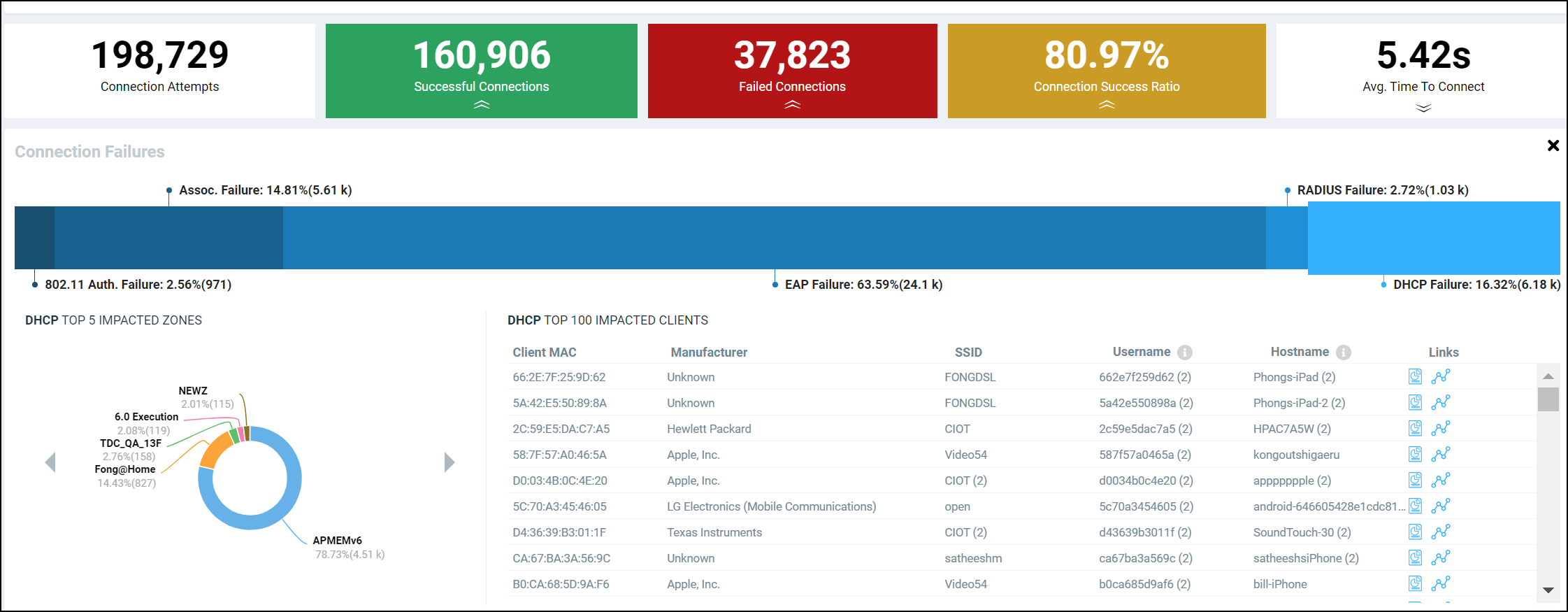
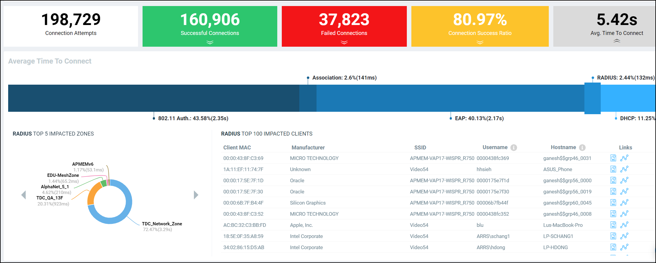
Connection Tab
The Connection tab displays information about successful client connections, time taken by the client to connect to the network, association, user authentication, DHCP, RADIUS, and roaming success. The area is graphically divided into three sections: a pill-shaped box depicting the metric as percentages, a time series graph depicting the metric as percentages, and a histogram.
The pill-shaped box not only depicts the percentage of successful connections, authentications, and associations, but also specifies the connections, authentications, and associations meeting a threshold within the larger sample set.
There are two types of histograms: a view-only histogram that provides information about the threshold trends, and another configurable histogram that allows you to set the threshold for a metric. The threshold you set for the metric is the value against the goal. By default, the goal met for the last 7 days is displayed. Click Apply to set the new threshold for the metric or click Reset to revert to the default threshold value.
The following KPIs are displayed on the page:
- Connection Success: Measures the number of connection
attempts that complete successfully. A connection is deemed successful when a
WiFi client is able to complete the 802.11 authentication, association, L2
authentication, and receives an IP address from the DHCP. If any of these stages
fail, it is considered as a failed connection. For L3 authentication such as
WISPr and captive portal authentication, since the WiFi client receives an IP
address before the L3 authentication, the client connection is deemed successful
before the L3 authentication completes.
The time-series graph on the left displays the percentage of successful connections across time, and the bar chart on the right captures the daily percentage over the last seven days of the selected time range. Note that the numbers related to the time-series will change as you zoom-in or zoom-out of a time range, whereas the bar chart remains fixed based on the time range selected at the top of the page.
- Time to Connect (TTC): Measures the total time taken
for a WiFi client to successfully go through all the required stages in order to
establish an IP connection, namely 802.11 authentication, association, L2
authentication, and receiving an IP address from the DHCP. For L3
authentication, such as WISPr and captive portal authentication, since the WiFi
client will receive an IP address before the L3 authentication, the time to
connect does not include the time taken for L3 authentication.
The time-series graph on the left displays the percentage of successful connections across time, that meet the configured TTC SLA. Bar chart on the right displays the distribution of TTC. Note that the numbers related to the time-series will change as you zoom-in or zoom-out of a time range, whereas the bar chart remains fixed based on the time range selected at the top of the page.
- 802.11 Authentication: The time-series graph on the left displays the percentage
of 802.11 authentication attempts that has completed successfully. 802.11
authentication is the first step in establishing a WiFi connection, and it
requires a WiFi client to establish its identity as a valid 802.11 device with
an AP. No data encryption or security is available at this stage, and it is not
to be confused with WPA or 802.1X authentication.
The bar chart on the right captures the daily percentage over the past seven days. Note that the numbers related to the time-series will change as you zoom-in or zoom-out of a time range, whereas the histogram remains fixed based on the date range selected at the top of the page.
- Association: Measures the percentage of association attempts that have completed successfully. An association attempt is deemed successful when the WiFi client receives an Association ID from the AP. It is normal for a single WiFi client to have more than one association attempts. The bar chart on the right captures the daily percentage over the last seven days of the selected time range. Note that the numbers related to the time-series will change as you zoom-in or zoom-out of a time range, whereas the bar chart remains fixed based on the time range selected at the top of the page.
- EAP: The time-series graph on the left displays the percentage of EAP attempts (consisting the 4-way handshake between client and AP) that have completed successfully. An EAP attempt is deemed successful when all the necessary handshakes are completed. It is possible for a single WiFi client to have multiple EAP attempts. The bar chart on the right captures the daily percentage over the last seven days of the selected time range. Note that the numbers related to the time-series will change as you zoom-in or zoom-out of a time range, whereas the bar chart remains fixed based on the time range selected at the top of the page.
- RADIUS: The time-series graph on the left displays the percentage of RADIUS authentication attempts that have completed successfully. A RADIUS authentication attempt is deemed successful when all the necessary handshakes in the RADIUS protocol are completed, and the client is either allowed or denied access. It is possible for a single WiFi client to have multiple authentication attempts. The bar chart on the right captures the daily percentage over the last seven days of the selected time range. Note that the numbers related to the time-series will change as you zoom-in or zoom-out of a time range, whereas the bar chart remains fixed based on the time range selected at the top of the page.
- DHCP: The time-series graph on the left displays the percentage of DHCP connection attempts that have completed successfully. A DHCP connection attempt is deemed successful when the WiFi client has received an IP address from the DHCP server. It is possible for a single WiFi client to have multiple DHCP connection attempts. The bar chart on the right captures the daily percentage over the last seven days of the selected time range. Note that the numbers related to the time-series will change as you zoom-in or zoom-out of a time range, whereas the bar chart remains fixed based on the time range selected at the top of the page.
- Roaming Success: Measures the percentage of roaming attempts that have completed successfully. A roaming attempt is deemed successful when the WiFi client has its session transferred from one AP to the next. It is possible for a single WiFi client to have multiple roaming attempts. The bar chart on the right captures the daily percentage over the last seven days of the selected time range. Note that the numbers related to the time-series will change as you zoom-in or zoom-out of a time range, whereas the bar chart remains fixed based on the time range selected at the top of the page.
| KPI | Pill-Shaped Box | Time Series Graph | Histogram |
|---|---|---|---|
| Connection Success | Displays the percentage of successful connection attempts | Displays the percentage of successful connection attempts over time | Displays a bar chart of success percentage where the X axis displays time in hours, days, and weeks, and the Y axis displays success percentage |
| Time to Connect | Displays the percentage of connections that completed within the TTC SLA (for the selected time range) | Displays the percentage of connections meeting the SLA over time | Displays a bar chart of TTC where the X axis displays TTC duration and the Y axis displays the connection count;
also displays the percentage of connections that completed within the TTC SLA for the entire time range |
| Association | Displays the percentage of successful association attempts | Displays the percentage of successful association attempts over a granular range of time, which is also determined by the time range selected under Unique Connected Clients | Displays a bar chart of successful associations, as a percentage of the sample set, where the X axis displays time in hours, days, and weeks depending upon the time selection made under Unique Connected Clients, and the Y axis displays success percentage |
| EAP | Displays the percentage of EAP attempts (consisting the 4-way handshake between client and AP) that have completed successfully. | Displays the percentage of EAP attempts over a granular range of time, which is also determined by the time range selected under Unique Connected Clients | Displays a bar chart of successful EAP attempts, as a percentage of the sample set, where the X axis displays time in hours, days, and weeks depending upon the time selection made under Unique Connected Clients, and the Y axis displays success percentage |
| DHCP | Displays the percentage of successful DHCP attempts | Displays the percentage of successful DHCP attempts over a granular range of time, which is also determined by the time range selected under Unique Connected Clients | Displays a bar chart of successful DHCP attempts, as a percentage of the sample set, where the X axis displays time in hours, days, and weeks depending upon the time selection made under Unique Connected Clients, and the Y axis displays success percentage |
| RADIUS | Displays the percentage of successful RADIUS attempts | Displays the percentage of successful RADIUS attempts over a granular range of time, which is also determined by the time range selected under Unique Connected Clients | Displays a bar chart of successful RADIUS attempts, as a percentage of the sample set, where the X axis displays time in hours, days, and weeks depending upon the time selection made under Unique Connected Clients, and the Y axis displays success percentage |
| Roaming Success | Displays the percentage of successful roaming attempts | Displays the percentage of successful roaming attempts over time | Displays a bar chart of roaming percentage where the X axis depicts coarse time and the Y axis displays the success percentage |
Performance Tab
The Performance tab displays information about client throughput, AP capacity, and client RSS. The area is graphically divided into three sections: a pill-shaped box depicting the metric as percentages, a time series graph depicting the metric as percentages, and a histogram.
The pill-shaped box not only depicts the percentage of client throughput, AP capacity, and client RSS, but also specifies the client throughput and AP capacity meeting a threshold within the larger sample set.
There are two types of histograms: a view-only histogram that provides information about the threshold trends, and another configurable histogram that allows you to set the threshold for a metric. The threshold you set for the metric is the value against the goal. By default, the goal met for the last 7 days is displayed. Click Apply to set the new threshold for the metric or click Reset to revert to the default threshold value.
The following KPIs are displayed on the tab:
- Client Throughput: Measures the down link throughput
estimate of the client, taking into consideration RF channel conditions,
interference, channel contention, and client capabilities.
The time-series graph on the left displays the percentage of WiFi sessions across time that have a client throughput that meets the configured SLA. The bar chart on the right displays the distribution of the client throughput. Note that the numbers related to the time-series will change as you zoom-in or zoom-out of a time range, whereas the bar chart remains fixed based on the time range selected at the top of the page.
- AP Capacity: Measures the downlink saturated
throughput estimate of the AP radios, taking into consideration the RF channel
conditions, interference, channel contention and client capabilities.
The time-series graph on the left displays the percentage of AP capacity samples across time that meets the configured SLA. The bar chart on the right displays the distribution of AP capacity across the number of APs. Note that the numbers related to the time-series will change as you zoom-in or zoom-out of a time range, whereas the bar chart remains fixed based on the time range selected at the top of the page.
- Client RSSI: The time-series graph on the left displays the percentage of client sessions with average RSS that met the configured SLA. The bar chart on the right captures the distribution of the RSS. Do note that the numbers related to the time-series graph will change as you zoom in/out of a time range, whereas the bar chart will stay fixed based on the selected time range at the top of the page.
| KPI | Pill-Shaped Box | Time Series Graph | Histogram |
|---|---|---|---|
| Client Throughput | Displays the percentage of successful client throughput sessions that met the SLA (for the selected time range) | Displays the percentage of successful client throughput sessions that met the SLA over time | Displays a bar chart of success percentage where the X axis displays the average throughput per session and the Y axis displays the session count;
also displays the percentage of successful client throughput sessions that met the SLA for the entire time range |
| AP Capacity | Displays the percentage of the number of APs with the average capacity that met the SLA (for the selected time range) | Displays the percentage of the number of APs with the average capacity that met the SLA over time | Displays a bar chart of average AP capacity where the X axis displays the average capacity and the Y axis displays the AP count;
also displays the percentage of the number of APs with the average capacity that met the SLA for the entire time range |
| Client RSS | Displays the percentage of client sessions with the average RSSI that met the SLA (for the selected time range) | Displays the percentage of client sessions with the average RSSI that met the SLA over time | Displays a bar chart of average RSSI by session where the X axis displays the average RSSI per session and the Y axis displays the session count;
also displays the percentage of client sessions with the average RSSI that met the SLA for the entire time range |
Infrastructure Tab
The Infrastructure tab displays information about the time taken for the AP to respond to the controller. The area is graphically divided into three sections: a pill-shaped box depicting the metric as percentages, a time series graph depicting the metric as percentages, and a histogram.
The pill-shaped box not only depicts the percentage of AP controller latency, but also specifies the AP controller latency meeting a threshold within the larger sample set.
The configurable histogram allows you to set the threshold for a metric. The threshold you set for the metric is the value against the goal. By default, the goal met for the last 7 days is displayed. Click Apply to set the new threshold for the metric or click Reset to revert to the default threshold value.
The following KPIs are displayed on the tab:
- AP-Controller Connection Uptime: Measures the
percentage of time the AP radios are fully available for client service. the
percentage of time the radios of an AP are fully available for client service.
The time-series graph on the left displays the percentage of AP-Controller connection uptime samples across time that meets the configured SLA. The bar chart on the right displays the distribution of AP service uptime across the number of APs. Note that the numbers related to the time-series will change as you zoom-in or zoom-out of a time range, whereas the bar chart remains fixed based on the time range selected at the top of the page.
- AP-to-SZ-Latency: The time-series graph on the left displays the percentage of APs that have AP-to-SZ control plane latency which meets the configured SLA. The bar chart on the right captures the distribution of the latency across the number of APs. Note that the numbers related to the time-series graph will change as you zoom in/out of a time range, whereas the bar chart remains fixed based on the selected time range at the top of the page.
- Cluster Latency: The time-series graph on the left displays the percentage of samples that have intra-SZ cluster latency (which is the latency between each node within a SZ cluster) which meets the configured SLA. The bar chart on the right captures the distribution of the latency across the number of clusters. Note that the numbers related to the time-series graph will change as you zoom in/out of a time range, whereas the bar chart remains fixed based on the selected time range at the top of the page.
- PoE Utilization: Measures the percentage of PoE utilization by the switches in the network. The time-series graph on the left displays the percentage of switches across time that meet the configured SLA. The bar chart on the right captures the distribution of PoE utilization across the number of switches. Note that the numbers related to the time-series graph will change as you zoom in/out of a time range, whereas the bar chart remains fixed based on the selected time range at the top of the page.
- Online APs: Measures the percentage of APs
which are online and connected to Smart Zone.
The time-series graph on the left displays the Online AP percentage across time. The bar chart on the right captures the daily Online AP percentage over the last seven days of the selected time range. Note that the numbers related to the time-series will change as you zoom-in or zoom-out of a time range, whereas the bar chart remains fixed based on the time range selected at the top of the page.
| KPI | Pill-Shaped Box | Time Series Graph | Histogram |
|---|---|---|---|
| AP-to-SZ-Latency | Displays the percentage of APs with the AP-to-SZ latency that met the SLA (for the selected time range) | Displays the percentage of APs with the AP-to-SZ latency that met the SLA over time | Displays a bar chart of average latency percentage where the X axis displays average AP-to-SZ latency and the Y axis displays the AP count;
also displays the percentage of APs with the AP-to-SZ latency that met the SLA for the entire time range |
| AP-Controller Connection Uptime | Displays the percentage of APs with the uptime that met the SLA (for the selected time range) | Displays the percentage of APs with the uptime that met the SLA over time | Displays a bar chart of AP service uptime where the X axis
displays the percentage of AP service uptime and the Y axis displays
the number of APs that meet the goal for the selected time; also displays the percentage of APs with the uptime that met the SLA for the entire time range |
| Cluster Latency | Displays the percentage of time controller cluster latency that met the SLA (for the selected time range) | Displays the percentage of nodes per bin with the latency that met the SLA over time | Displays a bar chart of average cluster latency where the X axis
displays the time of latency in ms and the Y axis displays the
clusters per bin; also displays the percentage of time controller cluster latency that met the SLA for the entire time range |
| PoE Utilization | Displays the percentage of Power over Ethernet (PoE) used by the switches that met the SLA (for the selected time range) | Displays the percentage of Power over Ethernet (PoE) used by the switches that met the SLA over time | Displays a bar chart of switches that met the PoE utilization goal where the X axis displays the percentage of PoE utilization and the Y axis displays the number of switches that met the goal for the selected time |
| Online AP Count | Displays the percentage of APs online (for the selected time range) | Displays the percentage of APs that are online over time | Displays a bar chart of online APs where the X axis displays last 7 days of the week and the Y axis displays the percentage of online APs; the percentage is displayed for each day of the week |