Site Report
The Site Report displays information specific to the selected site such as the site, utilization for a selected period, the avgerage dwell time of visitors, the total number of visitors in the site, and user information in both graphical and tabular formats.
The top portion of the report displays the number of APs grouped into the site and the duration for which you would like to view site data. Options include the last 24 hours and the last 7 days.
- Utilization tile
- Total In-Site Visitors tile
- Avg. Dwell Time tile
- Utilization and Number of Users tile
- Dwell Time tile
- Clients table
Utilization Tile
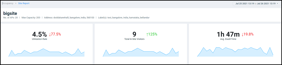
The Utilization tile displays the utilization percentage for the selected site and the increase or decrease in utilization percentage from the previous time. An increase in site utilization is displayed as a green number while a decrease is displayed as a red number.
Total In-Site Visitors Tile
The Total In-Site Visitors tile displays the number of visitors visiting the selected site and the increase or decrease in the number of in-site visitors from the previous time. An increase in in-site visitors is displayed as a green number while a decrease is displayed as a red number. A "visitor" is a device connected to an AP in the site with a unique MAC address.
Avg. Dwell Time Tile
The Avg. Dwell Time tile displays the average amount of time in minutes a device is connected to an AP in the selected site, and the increase or decrease in the dwell time from the previous time. An increase in dwell time is displayed as a green number while a decrease is displayed as a red number.
Utilization and Number of Users Tile
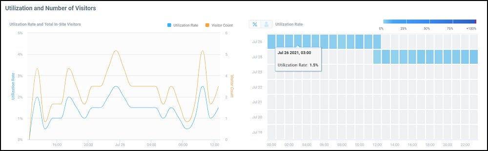
The Utilization and Number of Users tile displays the site utilization and number of users in a time series graph and a heat map. In the time series graph, the utilization rate is displayed as a percentage and the number of users at a time is also displayed. Pause the pointer over the graph for more information. You can choose to view both the utilization rate and user count on the graph or choose only one of them by selecting the check boxes over the graph.
The heat map displays utilization as a percentage and user count per hour, over a 24-hour period, or over a 7-day period, and helps in analyzing these parameters at a glance. You can toggle between the percentage and user count to view either of the parameters. The number of users appears as a set of blue boxes. The depth of the colors for each box can vary and are mapped to the color-range legend atop the heat map. The hour when the user count is high appears as a dark blue box and the hour with the least number of users appears as a light blue box. Pause the pointer over a box to view the corresponding range into which it falls within the color-range legend atop the heat map. Similarly, site utilization appears as a dark red box when at its peak, and the percentage when at its least appears as a light red box.
Dwell Time Tile
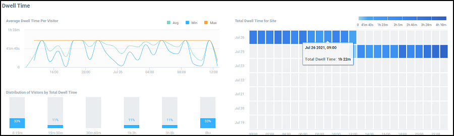
The Dwell Time tile displays the dwell time of a client or device for the selected time period as a time series graph,bar graph, and heat map. The time series graph displays the average, maximum, and minimum dwell time information. Pause the pointer over the graph for more information. You can choose to view all the average, maximum, and minimum values on the graph or choose one or two of them by selecting the check boxes over the graph.
The bar graph displays the dwell time distribution over a time range such as the first 15 minutes, the second 15 minutes, from 30 minutes to 60 minutes, from 1 hour to 3 hours, from 3 hours to 8 hours, and 8 hours and longer. Each bar displays the percentage of dwell time for that time period.
The heat map displays the dwell time per hour for the period selected and helps analyze the dwell time of clients at a glance. Dwell time information per hour is displayed as a blue box. The box appears dark blue when dwell time is high and light blue when it is low. Pause the pointer over a box view the corresponding range into which it falls within the color-range legend atop the heat map.
Clients Table
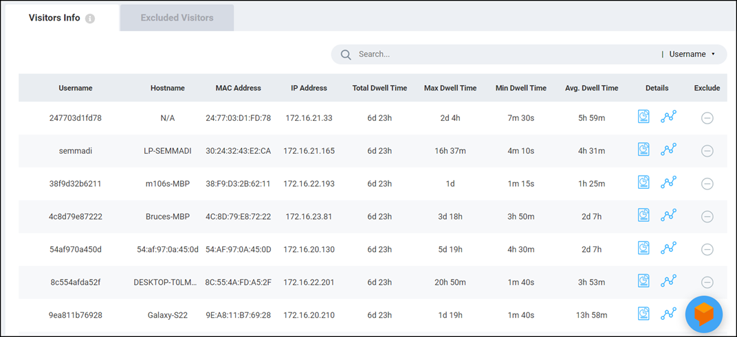
The Clients table displays
information about the top thousand clients. You can use the Search field to
look for clients by username, hostname, client MAC address, or client IP address.
The Clients tab displays
client information such as the device name, MAC address, IP address, hostname, dwell
time (total, average, maximum, and minimum), and contains links to the Client Details page and the
Client Troubleshooting
page. Click the Exclude icon ( ) to
remove the selected client from the Site Report statistics. After the client
is excluded, the client information is removed from the Clients tab and populated in
the Excluded Visitors tab. The listof excluded clients for the site is
maintained in this tab. Including or excluding clients updates the graphs, heat
maps, bar charts and time series graphs in the tiles of the Site Report.
) to
remove the selected client from the Site Report statistics. After the client
is excluded, the client information is removed from the Clients tab and populated in
the Excluded Visitors tab. The listof excluded clients for the site is
maintained in this tab. Including or excluding clients updates the graphs, heat
maps, bar charts and time series graphs in the tiles of the Site Report.
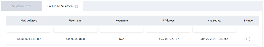
The Excluded Visitors tab
displays information about the clients that were removed from the analysis, such as
the MAC address, username, hostname, and created time. Clicking the Add Back icon
( ) returns the client back to the Site Report for analysis.. The client is
also repopulated back into the Clients tab by refreshing the information in the charts of the Site
Report.
) returns the client back to the Site Report for analysis.. The client is
also repopulated back into the Clients tab by refreshing the information in the charts of the Site
Report.