Monitoring Wireless Network Health
On the Health page, the Wireless tab provides information about the health of the wireless portion of the network by giving insights about key performance indicators (KPIs) of the network. The information provided on the Wireless page allows you to analyze the network health and behavior in real time.
You can evaluate network health based on a variety of thresholds that you are allowed to set, called goals. For example, you can set the goal (or threshold) to five seconds for all clients to connect to the network and confirm the number of clients accomplishing the five-second goal in real time. You can thereby determine the metric to understand the number of clients that connect within or before time, and the ones that are delayed. The success rate of network elements meeting each of the goals is typically displayed as a percentage of the metric.
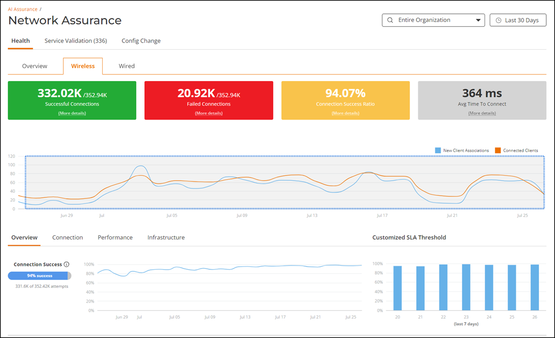
At a high level, the Wireless page also displays the number of connection attempts, successful connections, failed connections, the connection status, and the average time to connect.
On the Navigation bar, click tab. The Wireless page is displayed.
The Network Hierarchy filter and Date and Time filter are displayed in the upper-right corner of the Content panel. These options control the elements displayed within the Content Panel. To modify these options, refer to Content Panel section.
- High-level Network Health Metrics Panel
- Overview tab
- Connection tab
- Performance tab
- Infrastructure tab
High-level Network Health Metrics Panel
The multi-colored metrics panel provides client connection data in big number format as well as a time-series graph showing the numbers of unique new and connected network clients. The big number data tiles are interactive, providing access to a bar graph of detailed metrics.
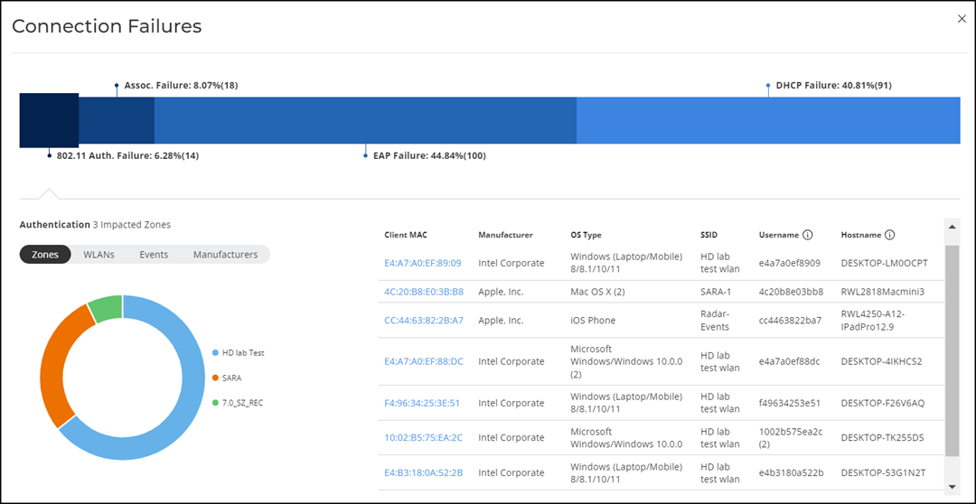
Clicking the More Details option on each tile - Successful Connections, Failed Connections, and Connection Success Ratio opens the Connection Failures sidebar. It displays probable reasons for the client to disconnect from the network such as RADIUS failure, EAP failure, DHCP failure, and so on. This information is displayed as a bar chart showing the failure percentage in each phase. Clicking the failure types displays more information as a pie chart and table.
The pie chart displays the Top 5 Impacted Zones, Top 5 Impacted WLANs, Top 5 Events, and Top 5 Impacted Manufacturers. The table displays Top 10 Impacted Clients detailing information such as the client MAC address, manufacturer information, OS type, SSID, username, and hostname, as well as links to the Client Details page and Client Troubleshooting page for further analysis.
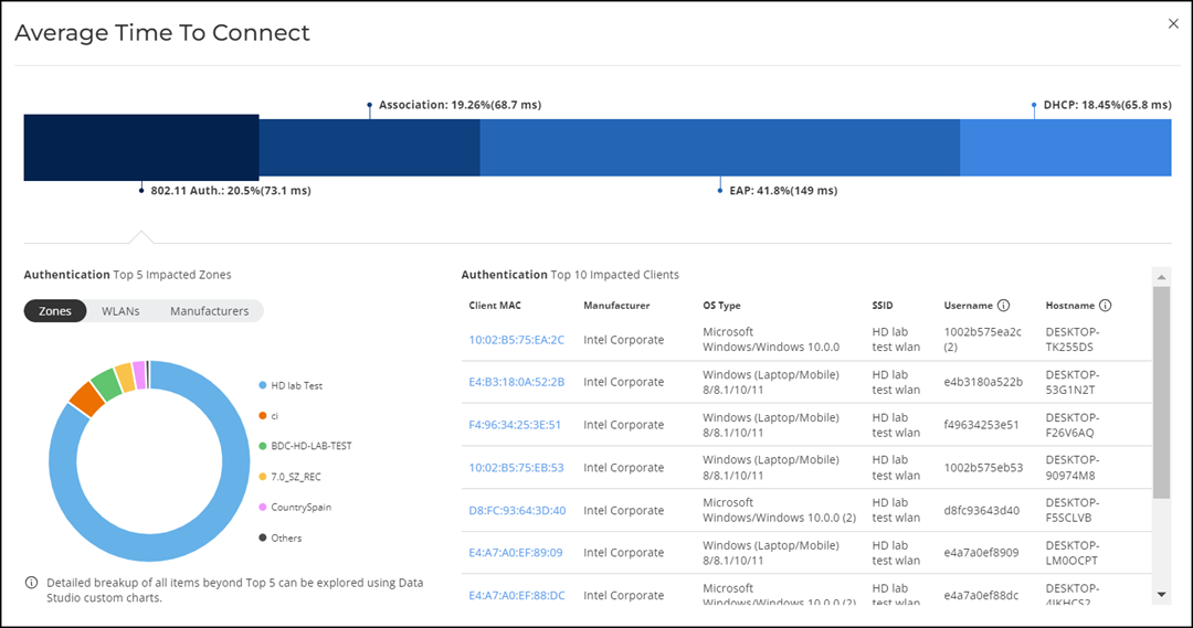
Similarly, you can also click the More Details option on the Avg. Time To Connect bar to display the Average Time To Connect sidebar. It displays the average time taken by the clients to connect to the network through various connection phases such as 802.11 authentication, RADIUS authentication, DHCP authentication, and so on. This information is displayed as a bar chart showing the percentage of time in each phase of connection. Clicking each authentication phase displays more information as a pie chart and table.
The pie chart displays the Top 5 Impacted Zones, Top 5 Impacted WLANs, and Top 5 Impacted Manufacturers. The table displays Top 10 Impacted Clients detailing information such as the client MAC address, manufacturer information, OS type, SSID, username, and hostname, as well as links to the Client Details page and Client Troubleshooting page for further analysis.
The time-series graph (below the multi-colored metrics panel) of new and connected clients can be modified to display the range of clients attempting to connect to the network for the selected network node and date/time filters. You can modify the range (dark gray area) of clients by moving the scroll bar and this automatically changes the trends displayed in the Overview, Connection, Performance, and Infrastructure tabs. Pausing or placing your cursor over a specific location on the graph provides the number of new client associations and connected clients for that specific date and time.
Health KPIs and SLAs
- Overview
- Connection
- Performance
- Infrastructure
Each category provides access to specific health data relevant to its KPIs. Additionally, custom SLA thresholds can also be configured for select KPIs, enabling tailored monitoring and alerting based on specific network requirements.
The content area is graphically divided into three sections: a pill-shaped box depicting the average percentage for the metric or specifying the success rate of the KPI metric meeting a threshold within the larger sample set, a time-series graph depicting the metric value in percentage over time, and a bar chart.
The time-series graph has an interactive element which allows you to zoom in on specific time period by dragging the mouse across the graph. You can click the Reset Zoom button to revert to the full time period based on the time range selected in the Date and Time filter at the top of the page. Note that the numbers related to the time-series graph will change as you zoom in or zoom out of a time range, and these changes are reflected in the pill-shaped box data. However, the bar chart on the right remains fixed based on the time range selected at the top of the page.
There are two types of bar charts: a view-only bar chart that provides information about the threshold trends, and another configurable bar chart that allows you to set the threshold for a metric. The threshold you set for the metric is the value against the goal. You can change the SLA threshold by adjusting the slider below the bar chart. As you change the goal, the percentage is recalculated. Click Apply to set the new threshold for the metric or click Reset to revert to the default threshold value.
Overview Tab
The Overview tab displays information about successful client connections, time taken by the client to connect to the network, client throughput, AP downlink throughput, AP service uptime, and APs which are online for the selected network node and date/time filters.
The following KPIs are displayed on the tab:
- Connection Success: Measures the
number of connection attempts that completed successfully. A connection is
deemed successful when a Wi-Fi client is able to complete the 802.11
authentication, association, L2 authentication, and receives an IP address from
the DHCP. If any of these stages fail, it is considered as a failed connection.
For L3 authentication, such as WISPr and captive portal authentication, since
the Wi-Fi client receives an IP address before the L3 authentication, the client
connection is deemed successful before the L3 authentication completes.
The time-series graph on the left displays the percentage of successful connections across time, and the bar chart on the right captures the daily percentage over the last seven days of the selected time range.
-
Time to Connect (TTC): Measures the total time taken for a
Wi-Fi client to successfully go through all the required stages in order to
establish an IP connection, namely 802.11 authentication, association, L2
authentication, and receiving an IP address from the DHCP. For L3
authentication, such as WISPr and captive portal authentication, since the Wi-Fi
client will receive an IP address before the L3 authentication, the time to
connect does not include the time taken for L3 authentication.
The time-series graph on the left displays the percentage of successful connections across time, that meet the configured TTC SLA. The bar chart on the right displays the distribution of TTC relative to the configured SLA threshold.
- Client Throughput: Measures the
downlink throughput estimate of the client, taking into consideration RF channel
conditions, interference, channel contention, and client capabilities.
The time-series graph on the left displays the percentage of Wi-Fi sessions across time that have a client throughput that meets the configured SLA. The bar chart on the right displays the distribution of the client throughput relative to the configured SLA threshold.
- AP Downlink Throughput: Measures
the downlink throughput estimate of the AP radio, taking into consideration the
RF channel conditions, interference, channel contention and client capabilities.
The time-series graph on the left displays the percentage of AP downlink throughput samples over time that meets the configured SLA. The bar chart on the right displays the distribution of AP downlink throughput across the number of APs relative to the configured SLA threshold.
- AP-Smart Zone
Connection Uptime: Measures the percentage of time the AP radios
are fully available for client service.
The time-series graph on the left displays the percentage of AP-Smart Zone Connection Uptime samples across time that meets the configured SLA. The bar chart on the right displays the distribution of AP service uptime across the number of APs relative to the configured SLA threshold.
- Online
APs: Measures the percentage of APs which are online and
connected to Smart Zone.
The time-series graph on the left displays the Online AP percentage across time. The bar chart on the right captures the daily Online AP percentage over the last seven days of the selected time range.
Connection Tab
The Connection tab displays information about successful client connections, time taken by the client to connect to the network, association, user authentication, DHCP, RADIUS, and roaming success for the selected network node and date/time filters.
The following KPIs are displayed on the page:
- 802.11 Authentication: Measures the percentage of 802.11 authentication attempts that has completed successfully. 802.11 authentication is the first step in establishing a Wi-Fi connection, and it requires a Wi-Fi client to establish its identity as a valid 802.11 device with an AP. No data encryption or security is available at this stage, and it is not to be confused with WPA or 802.1X authentication. The time-series graph on the left displays the the percentage of successful authentication attempts over time. The bar chart on the right captures the daily percentage of successful authentication over the past seven days of the selected time range.
- Association: Measures the percentage of association attempts that have completed successfully. An association attempt is deemed successful when the Wi-Fi client receives an Association ID from the AP. It is normal for a single Wi-Fi client to have more than one association attempt. The time-series graph on the left displays the percentage of successful association attempts over time. The bar chart on the right captures the daily percentage of successful association over the last seven days of the selected time range.
- EAP: Measures the percentage of EAP attempts (consisting of the 4-way handshake between client and AP) that have completed successfully. An EAP attempt is deemed successful when all the necessary handshakes are completed. It is possible for a single Wi-Fi client to have multiple EAP attempts. The time-series graph on the left displays the percentage of successful EAP attempts over time. The bar chart on the right captures the daily percentage of successful EAP attempts over the last seven days of the selected time range.
- RADIUS: Measures the percentage of RADIUS authentication attempts that have completed successfully. A RADIUS authentication attempt is deemed successful when all the necessary handshakes in the RADIUS protocol are completed, and the client is either allowed or denied access. It is possible for a single Wi-Fi client to have multiple authentication attempts. The time-series graph on the left displays the percentage of successful RADIUS authentication over time. The bar chart on the right captures the daily percentage of RADIUS authentication over the last seven days of the selected time range.
- DHCP: Measures the percentage of DHCP connection attempts that have completed successfully. A DHCP connection attempt is deemed successful when the Wi-Fi client has received an IP address from the DHCP server. It is possible for a single Wi-Fi client to have multiple DHCP connection attempts. The time-series graph on the left displays the percentage of successful DHCP attempts over time. The bar chart on the right captures the daily percentage over the last seven days of the selected time range.
- Roaming Success: Measures the percentage of roaming attempts that have completed successfully. A roaming attempt is deemed successful when the Wi-Fi client has its session transferred from one AP to the next. It is possible for a single Wi-Fi client to have multiple roaming attempts. The time-series graph on the left displays the percentage of successful roaming attempts over time. The bar chart on the right captures the daily percentage over the last seven days of the selected time range.
Performance Tab
The Performance tab displays information about client throughput, AP downlink throughput, and client RSS for the selected network node and date/time filters.
The following KPIs are displayed on the tab:
- Client Throughput: Measures the
down link throughput estimate of the client, taking into consideration RF
channel conditions, interference, channel contention, and client capabilities.
The time-series graph on the left displays the percentage of Wi-Fi sessions across time that have a client throughput that meets the configured SLA. The bar chart on the right displays the distribution of the client throughput relative to the configured SLA threshold.
- AP Downlink Throughput: Measures
the downlink throughput estimate of the AP radio, taking into consideration the
RF channel conditions, interference, channel contention and client capabilities.
The time-series graph on the left displays the percentage of AP downlink throughput samples over time that meets the configured SLA. The bar chart on the right displays the distribution of AP downlink throughput across the number of APs relative to the configured SLA threshold.
- Client RSS: Measures the percentage of client sessions with average RSS that met the configured SLA. The bar chart on the right captures the distribution of the RSS relative to the configured SLA threshold.
Infrastructure Tab
The Infrastructure tab displays information about the time taken for the AP to respond to the controller for the selected network node and date/time filters.
The pill-shaped box not only depicts the percentage of AP controller latency, but also specifies the AP controller latency meeting a threshold within the larger sample set.
The following KPIs are displayed on the tab:
- AP-Smart Zone
Connection Uptime: Measures the percentage of time the AP radios
are fully available for client service.
The time-series graph on the left displays the percentage of AP-Controller connection uptime samples across time that meets the configured SLA. The bar chart on the right displays the distribution of AP service uptime across the number of APs relative to the configured SLA threshold.
- AP-to-Smart Zone Latency: Measures the percentage of APs that have AP-to-SZ control plane latency which meets the configured SLA. The bar chart on the right captures the distribution of the latency across the number of APs relative to the configured SLA threshold.
- Cluster Latency: Measures the percentage of samples that have intra-SZ cluster latency (which is the latency between each node within a SZ cluster) which meets the configured SLA. The bar chart on the right captures the distribution of the latency across the number of clusters relative to the configured SLA threshold.
- PoE Utilization Compliance: Measures the percentage of switches in the network consuming power within the allocated budget. This metric indicates the number of switches that are compliant with the predefined limit set in the SLA that specifies the acceptable level of PoE utilization. The time-series graph displays the percentage of switches with PoE utilization below the configured threshold over time. The bar chart on the right displays the distribution of switches within different ranges of PoE utilization relative to the configured SLA threshold.
- Online
APs: Measures the percentage of APs which are online and
connected to Smart Zone.
The time-series graph on the left displays the Online AP percentage across time. The bar chart on the right captures the daily Online AP percentage over the last seven days of the selected time range.