Dashboard
The Dashboard, which is the first page that displays after your log in to RUCKUS AI, provides a brief overview of network status performance in the form of data and a graphical representation.
On the Navigation bar, click Dashboard. The Dashboard page is displayed. The Dashboard page provides a summary of the network health, incident occurrences across the system, network history, solutions to reduce co-channel interference, solutions to enhance network performance, and key service-level agreement (SLA) metrics. The dashboard is a starting point for network administrators seeking specific workflows and issues that may require attention.
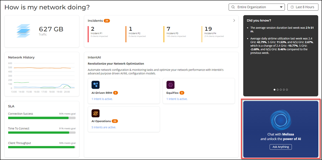
- Scrolling Data tile
- Incidents tile
- Did you know tile
- Network History tile
- IntentAI tile
- SLA tile
The Network Hierarchy and Date and Time filters are displayed in the upper-right corner of the Content panel. These options control the elements displayed within the Content panel. To modify these options, refer to Content Panel.
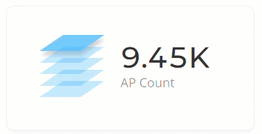
Scrolling Data Tile
The Scrolling Data tile provides a scrolling summary of key usage metrics and displays five layers of data specific to the selected network (in the Network Hierarchy filter) for the selected time period (in the Date and Time filter). The scroll mechanism displays a different layer of data every two seconds. Click on the displayed data result to open the relevant layer page. You can also click directly on any of the layers to view that data immediately, instead of waiting for it to cycle around again.
| Tile Data | Description | Link Destination |
|---|---|---|
| AP Count | Displays the number of unique APs in the selected network during the selected date and time period. | The Access Points page is displayed. This page displays the AP details. For more information, refer to Access Points Report. |
| Unique Clients | Displays the number of unique clients that have connected to the selected network during the selected date and time period. | The Clients page is displayed. This page displays the client, client devices, and user details. For more information, refer to Wireless Clients Report. |
| Traffic | Displays a sum of traffic sent and received by all APs in the selected network during the selected date and time period. | The Wireless page is displayed. This page displays the network and traffic usage. For more information, refer to Wireless Report. |
| Applications | Displays the total number of detected applications in the selected network during the selected date and time period. | The Application page is displayed. This page displays the application consumption. For more information, refer to Applications Report. |
| Active WLANs | Displays the total number of WLANs that have been active on APs (clients have connected) to the selected network during the selected date and time period. | The WLANs page is displayed. This page displays the WLAN traffic, client, and usage details. For more information, refer to WLANs Report. |
Incidents Tile
The Incidents tile displays the total count of incidents that have occurred in the selected network during the selected date and time period. This data is arranged based on the severity levels of the incidents. Also, the total count of clients impacted at each severity level is displayed.
Click the Expand icon (>). The Incidents page is displayed. This page displays the list of all the incidents that have occurred on the network. For more information, refer to Incidents.
- Incidents Count
- Severity Levels
- Clients Impacted
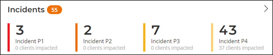
Incidents Count
The total count of incidents that have occurred in the network is displayed beside the Incidents title.
Severity Levels
| Incident | Priority | Color |
|---|---|---|
| P1 | Critical | Red |
| P2 | High | Dark Orange |
| P3 | Medium | Orange |
| P4 | Low | Yellow |
Clients Impacted
For each incident severity level, the total number of impacted clients is displayed below the Severity Level labels.
Click the Expand icon (>). The Incidents page is displayed. This page displays high-level details for each incident, facilitating deeper analysis on a per-incident basis. For more information, refer to Incidents.
Did you know? Tile
The Did you know? tile displays a short, bulleted list about your system, such as top zones, top APs, traffic information, the average duration of a session for a week, or the busiest SSID. The Did you know? section is updated every time you return to the Dashboard.
Network History Tile
- Blue line: This line represents the new client associations. The client count value includes all unique clients that attempted to connect to the network, including both failed and successful connections.
- Orange line: This line represents the connected clients. The client count value indicates only successfully connected clients to the network.
- Green line: This line represents the impacted clients. The client count value includes the number of clients impacted by the incidents, and it also includes clients who were unable to connect.
IntentAI Tile
The IntentAI tile provides access to IntentAI, allowing for easy monitoring and management of network intents. IntentAI is prominently displayed through widgets, each representing different AI-driven features such as AI-Driven RRM, AI Operations, EquiFlex, and Energy Saving. These widgets provide a snapshot of information about IntentAI for the corresponding feature, showing the number of new intents in an orange bubble and a hyperlink that indicates the total number of active intents for each feature. These options ensure that users can quickly interact with the AI-driven features to optimize network performance. For more informaion, refer to IntentAI Overview.
SLA Tile
The SLA tile displays the most important service-level agreement (SLA) metrics, including successful client connections, time taken by the client to connect to the network, and client throughput for the selected network during the selected date and time period. The data is shown in percentage format, indicating by what percentage the network clients met the target.
These, and other SLA metrics, are available on the Health page for viewing and customization. For more information, refer to Health.
Demonstration of Dashboard Overview. This video walks you through the RUCKUS AI Dashboard.