Dashboard Widgets
The RUCKUS One Dashboard presents network data using snapshot and time range widgets. Knowing the difference helps you accurately interpret client counts, device numbers, and usage metrics on the dashboard.
Some widgets display the current state of the network, while others summarize activity over a selected time period. The dashboard clearly identifies each widget type so you can immediately tell whether the data represents real‑time information or aggregated historical data. Because snapshot and time range widgets use different measurement scopes, dashboard values may differ from values shown on other pages, such as the WLAN Network List or Access Point views. For example, the Clients snapshot widget shows how many clients are connected at the snapshot time, while lists and time‑range views show how many clients were active during the selected period or after filters are applied. Before you compare values across pages, use the Snapshot and Time Range indicators and their tool tips to confirm the type of data being displayed.
Snapshot Widgets
Snapshot widgets show the state of the network at a specific point in time. The data reflects the moment when the Dashboard was loaded or last refreshed.
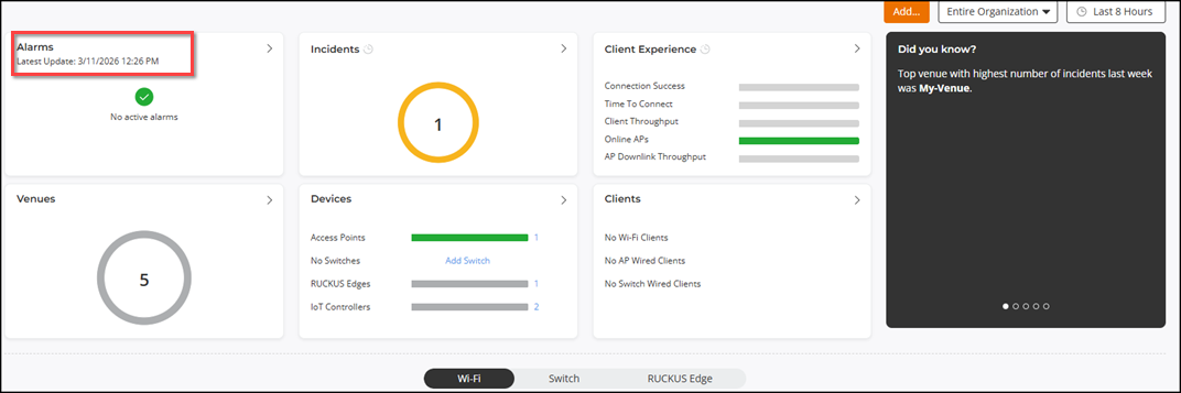
When you hover your cursor over a snapshot widget, a tool tip displays the snapshot timestamp near the widget title. The tool tip shows the exact time and date the data represents, for example: Latest Update: 3/19/2026 12:29 PM (local time).
Time Range Widgets
Time range widgets show metrics calculated over the time period selected at the top of the Dashboard's content area, such as Last 24 hours or Last 7 days. These widgets update automatically when you change the global time range filter.
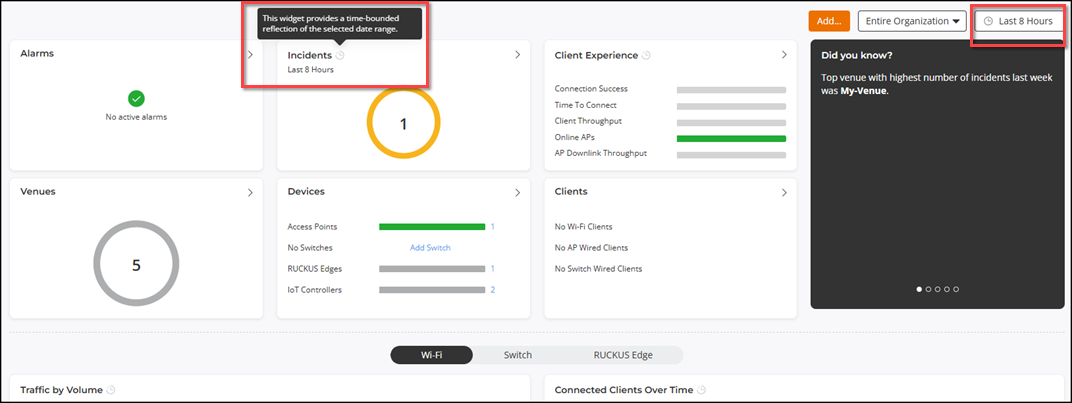
When you hover your cursor over a time range widget, a tool tip displays the global time range filter used to aggregate the data. Examples include: 3/10/2026 4:30 AM - 3/19/2026 12:30 PM or Last 8 Hours.