Airtime Utilization Report
The Airtime Utilization Report page provides an overview of airtime utilization.
- On the navigation bar, select . The Reports page is displayed.
- Click View on the Airtime Utilization tile. The Airtime Utilization Report page is displayed.
The Airtime Utilization Report page has the following components:
- Overview tile
- Top APs by Airtime Utilization tile
- Top APs by Airtime Utilization table
- Airtime Utilization Trend for 2.4 GHz tile
- Airtime Utilization Trend for 5 GHz tile
- Airtime Utilization Trend for 6(5) GHz tile
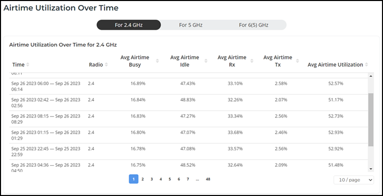
- Airtime Utilization Over Time table
The data displayed on this page is based on the selected Date and Time filter and Network Hierarchy filter. Use the Date and Time filter in the upper-right corner to select a predefined time range or configure a custom date and time range. Use the Network Hierarchy filter to refine the displayed data by network scope.
The top right corner of the page also displays options to download reports in PDF and PNG formats. You can also share the report via e-mails on-demand or periodically by configuring a schedule (daily, weekly, or monthly).
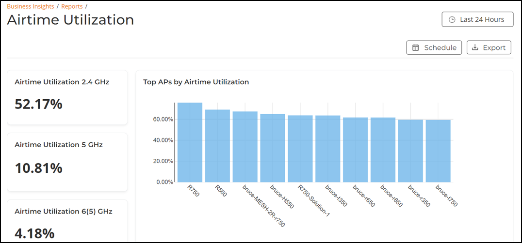
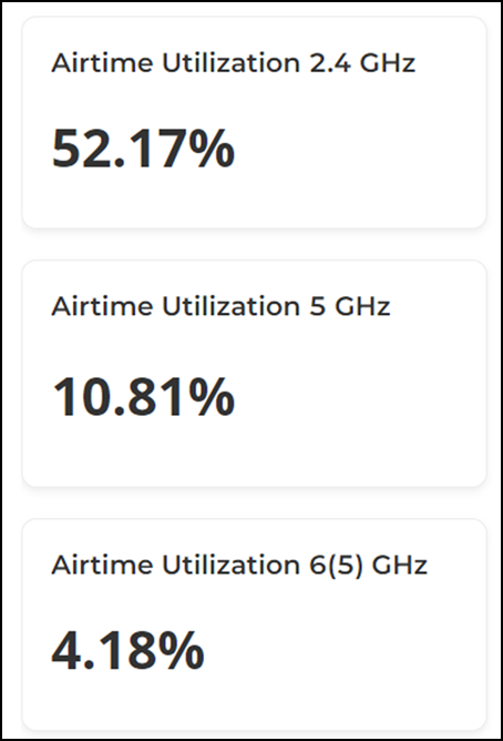
Overview Tile
The Overview tile displays the airtime utilization percentage of 2.4 GHz, 5 GHz, and 6(5) GHz radios on all APs for the selected time period in the Date and Time filter.
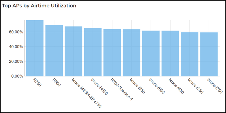
Top APs by Airtime Utilization Tile
The Top APs by Airtime Utilization tile contains a graph that displays the information about APs that have the highest airtime utilization percentage rates for the selected time period in the Date and Time filter. Pausing the pointer over the graph displays an information box with the airtime utilization details at that time and date.
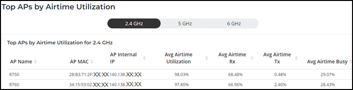
Top APs by Airtime Utilization Table
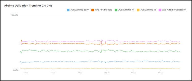
Airtime Utilization Trend for 2.4 GHz Tile
The Airtime Utilization Trend for 2.4 GHz tile contains a graph that displays the information about APs that have the highest utilization on the 2.4 GHz radio for the selected time period in the Date and Time filter. Pausing the pointer over the graph displays an information box with the average airtime details at that time and date. Click any of the colored squares to hide the selected details in the graph. The information icon that is hidden is displayed in gray.
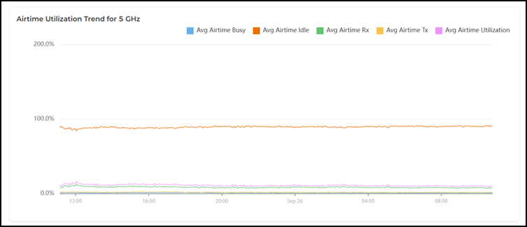
Airtime Utilization Trend for 5 GHz Tile
The Airtime Utilization Trend for 5 GHz tile contains a graph that displays the information about APs that have the highest utilization on the 5 GHz radio for the selected time period in the Date and Time filter. Pausing the pointer over the graph displays an information box with the average airtime details at that time and date. Click any of the colored squares to hide the selected details in the graph. The information icon that is hidden is displayed in gray.
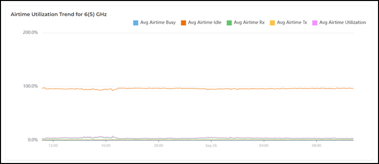
Airtime Utilization Trend for 6(5) GHz Tile
Airtime Utilization Over Time Table
The Airtime Utilization Over Time table displays the utilization rates between time periods and examines specific airtime utilization data, such as time spent busy or idle, transmitting or receiving, and user traffic compared management traffic of 2.4 GHz, 5 GHz, and 6(5) GHz radios over time for the selected time period in the Date and Time filter. The table is displayed with the time, radio, average airtime busy percentage, average airtime idle percentage, average airtime inbound traffic percentage, average airtime outbound traffic percentage, and average airtime utilization percentage. You can select the number of durations displayed in the table from the drop down at the bottom of the table. The range is from 10 durations per table to 200 durations per table. By default, 2.4 GHz information is displayed, use the 2.4 GHz, 5 GHz, and 6(5) GHz icons to toggle between the radios.