Designing the Workflow
You can begin building your onboarding workflow once it is created. You can continue working on it immediately after creation (refer to Adding an Onboarding Workflow), or open the workflow from the listing page to access the configuration page. In the Workflow Designer, you can configure workflow actions, customize the onboarding portal, and publish the workflow to complete the setup.
-
Click the name of the workflow.
The Active Workflow Design page is displayed with the message 'Onboarding Workflow not configured'.
Configuring a Workflow 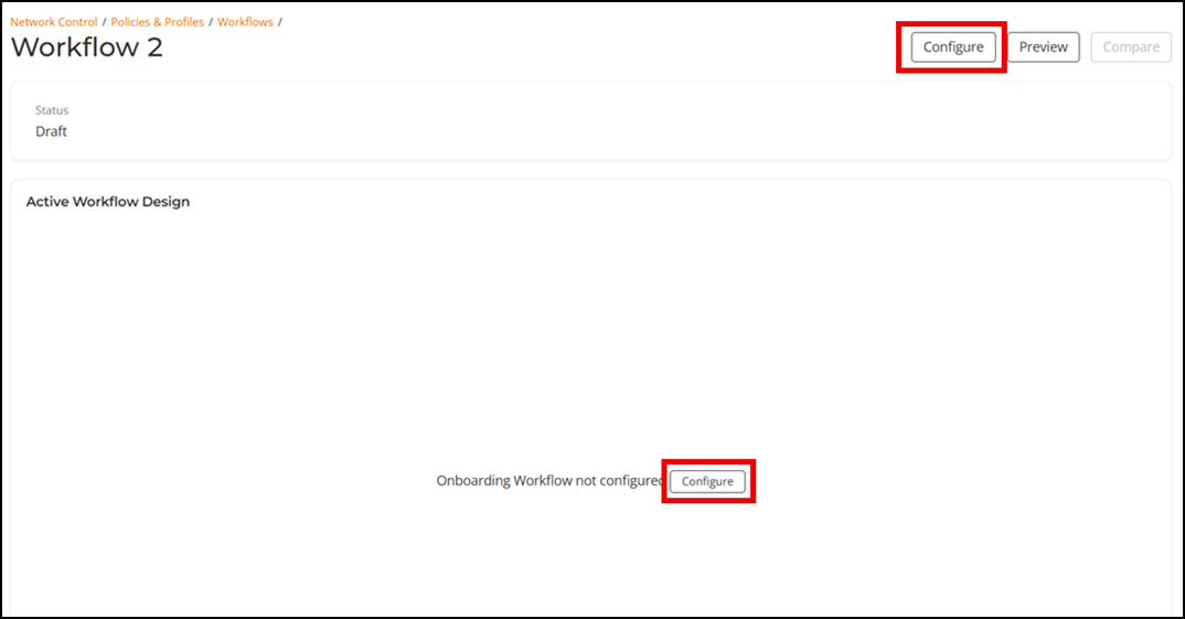
-
Click Start building your
Onboarding Workflow.
A sidebar with the Actions Library and Workflows Library tabs is displayed.
- The Actions
Library tab has the following subsections. Each
subsection includes plugins (services) that you can add to the
workflow:
- User Interaction
- Device Onboarding
- Authentication
- Operational
- Splits
Actions Library Tab 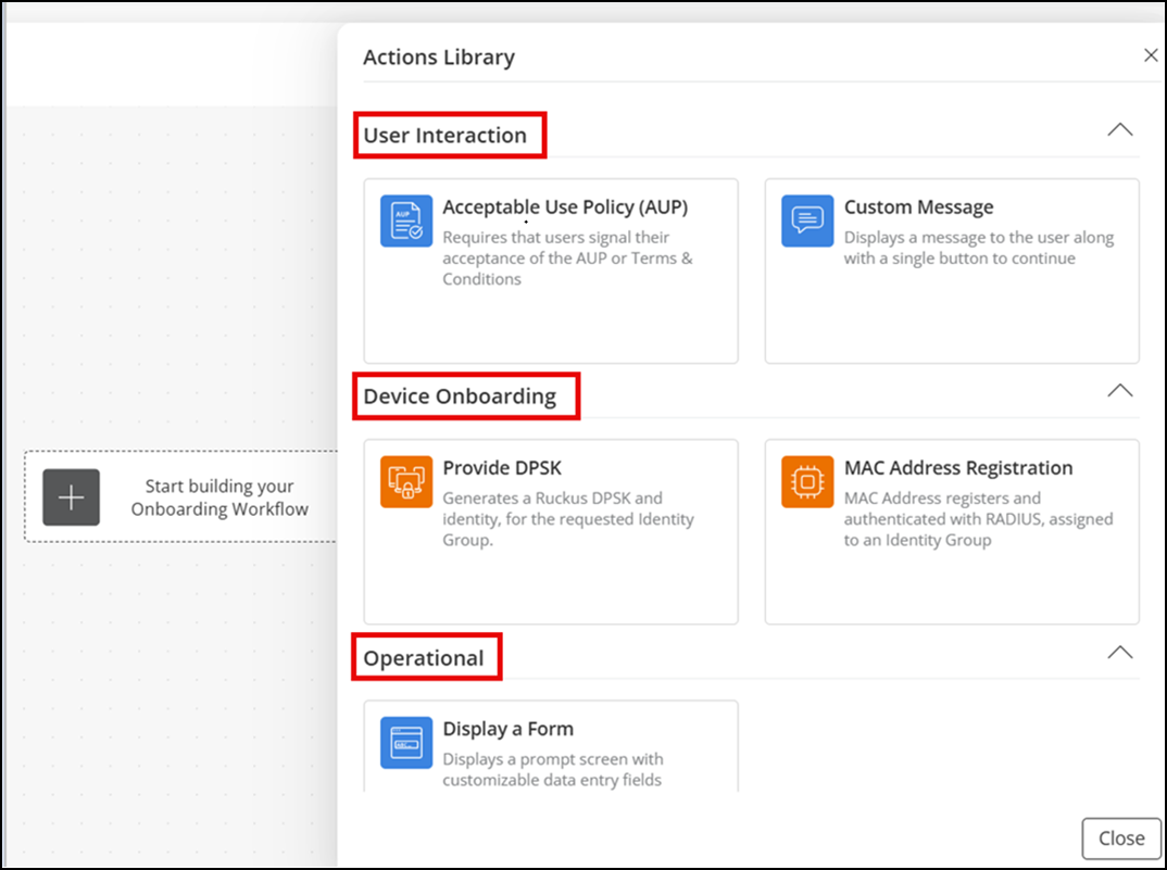
- The Workflows
Library tab displays a list of existing workflows.
The Workflows Library tab displays a list of existing workflows that you can reuse in your onboarding workflow. Refer to Adding an Existing Workflow to a New Workflow for more details.
- Click OK to close the sidebar.
Note: When designing a workflow, there are common actions and options that you can use across multiple steps. Understanding these helps streamline workflow creation and avoids repetition.- Once you start
creating a workflow, selecting a process flow tile in the Workflow
Designer displays the
 icon. Click this icon to open the
Actions Library sidebar.
icon. Click this icon to open the
Actions Library sidebar. - The Preview option is available in multiple steps. Use it to view how the configured portal design will appear on a PC, tablet, or mobile device.
- When you select any
added plugin tile on the Workflow Designer, a
three-dot
 icon appears in the upper-right corner.
Hover your cursor over to access the
icon appears in the upper-right corner.
Hover your cursor over to access the  (edit),
  (preview), and
  (delete) icons. You can delete by
clicking Delete Step Only or Delete Step and
Children.
(delete) icons. You can delete by
clicking Delete Step Only or Delete Step and
Children. Workflow Designer Icons Overview 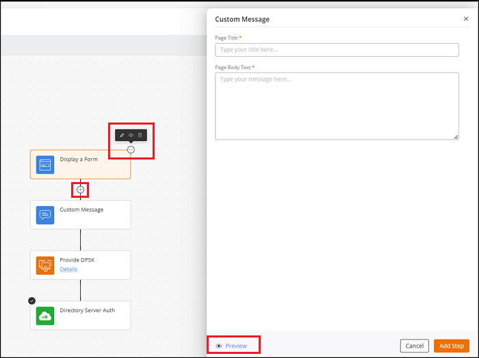
- The Actions
Library tab has the following subsections. Each
subsection includes plugins (services) that you can add to the
workflow:
-
In the Actions Library tab, configure the following
User Interaction options:
- Acceptable Use Policy (AUP): Displays the network usage terms and requires users to accept the policy before continuing.
- Custom Message: Presents a custom title and message to users during onboarding.
-
Acceptable Use Policy (AUP)
- Hover your cursor over Acceptable Use Policy
(AUP) and click
Add.
The Acceptable Use Policy (AUP) sidebar is displayed.
Acceptable Use Policy (AUP) 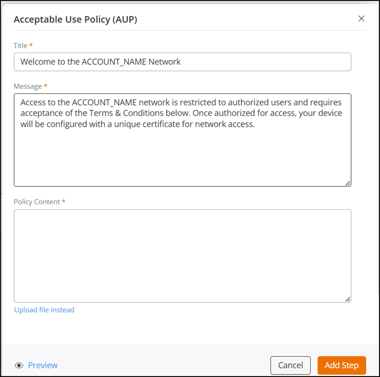
- In the Acceptable Use Policy (AUP) sidebar,
complete the following and click Add
Step:
- Action Label: Enter a name for the step. This label identifies the step in the workflow and is editable. The field supports a maximum of 32 characters.
- Title: Displays the default text Welcome to the ACCOUNT_NAME Network for the portal welcome statement. Replace ACCOUNT_NAME with your network name. You can modify the text if required.
- Message: Displays the default text. Replace ACCOUNT_NAME with the name of your network. You can modify the text if required.
- Policy Content: Enter the terms and
conditions that your client must agree to before
accessing the network.
Alternatively, click Upload file instead to select and upload a local file containing policy wording that you have already written. Supported file formats are .pdf, .docx, .dot, and .doc.
- Hover your cursor over Acceptable Use Policy
(AUP) and click
Add.
-
Custom Message
- Hover your cursor over Custom Message and
click Add.The Custom Message sidebar is displayed.
Custom Message 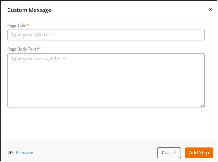
- In the Custom Message sidebar, complete the
following and click Add Step:
- Action Label: Enter a name for the step. This label identifies the step in the workflow and is editable. The field supports a maximum of 32 characters.
- Page Title: Enter the page title.
- Page Body Text: Enter the text to display on the onboarding page.
- Hover your cursor over Custom Message and
click Add.
-
In the Actions Library tab, configure the following
Operational option:
- Display a Form: Collects user information through predefined or custom input fields.
-
Display a Form
- Hover your cursor over Display a Form and
click Add.The Display a Form sidebar is displayed.
Display a Form 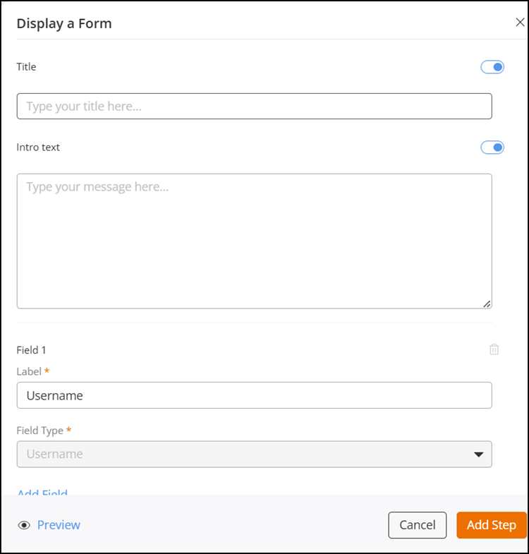
-
- In the
Display a Form sidebar,
complete the following fields and then click Add
Step:
- Action Label: Enter a name for the step. This label identifies the step in the workflow and is editable. The field supports a maximum of 32 characters.
- Title: Enter a title for the form.
The title appears at the top of the portal UI
page.Note: This field is enabled by default but can be disabled using the toggle switch on the right.
- Intro text: Enter introductory text.
The text appears near the top of the portal UI
page.Note: This field is enabled by default but can be disabled using the toggle switch on the right.
- Field 1: This field is predefined. This predefined field has a modifiable label called Username, and its field type is Username, which cannot be changed.
- Add Field: Select Add Field to add additional fields. For each added field, enter a label and select a field type from the drop‑down list. The available field types include Email Address, Phone Number, First Name, Last Name, or Custom Field.
- In the
Display a Form sidebar,
complete the following fields and then click Add
Step:
- Hover your cursor over Display a Form and
click Add.
-
In the Actions
Library tab, configure only one of the following Device
Onboarding authentication options:
- Provide DPSK: Generates a DPSK and an identity for the selected Identity Group.
- MAC Address Registration: Registers the client device MAC address with RADIUS and associates it with the selected Identity Group.
- Install a certificate: Issues a device certificate based on the selected template and maps it to the Identity Group and linked networks.
- Stay on Captive
Network: Keeps devices on the initial Wi‑Fi network
while they complete a simple click‑through onboarding workflow before
receiving internet access. After joining the Wi-Fi network, the device
is redirected to an onboarding page to complete a short workflow. Once
the workflow completes, internet access is granted.Note: If the onboarding URL is opened directly instead of through the Wi‑Fi redirect, the process cannot complete because required device information is not received.Note: If the device identity changes each time it connects, the onboarding page may reappear or the connection experience may become inconsistent.
- Provide Passphrase: Configures and delivers a Wi‑Fi network pre‑shared key (password and QR code) to users during onboarding.
Note: You must have an Identity Group defined before adding a device authentication option. Refer to Adding an Identity Group for more details.-
Provide DPSK
- Hover your cursor
over Provide DPSK and click Add.The Provide DPSK sidebar is displayed.
Provide DPSK 
- In the
Provide DPSK sidebar, complete the
following fields and then click Add
Step:
- Action Label: Enter a name for the step. This label identifies the step in the workflow and is editable. The field supports a maximum of 32 characters.
- Choose DPSK Service: Select a DPSK
service from the drop-down list.
If a DPSK service with the required configuration is not available, click Add Service to create a new DPSK service. The Add DPSK Service dialog box is displayed. Refer to Adding a DPSK Service for more details.
When you select a DPSK service, the following details appear:
- The identity group associated with the service is automatically populated in the Identity Group field.
- The Wi‑Fi networks linked to the DPSK service are listed in the Wi-Fi Networks field. If no networks are linked, a message indicating that no networks are linked to this DPSK service is displayed.
- Assign to Identity: Select an identity from the drop‑down list that you want to associate with the DPSK service.
- Wi-Fi
Networks: Click Add
Network to add a network. The
Add DPSK Network dialog box is
displayed. Enter the required network configuration
details. Refer to GUID-3B1452E6-A847-41D0-B0B2-E26A0289E1FB.html
for more details.
After clicking Add Step, the process tile is added to the Workflow Designer.
- Hover your cursor
over Provide DPSK and click Add.
-
MAC Address
Registration
- Hover your cursor
over MAC Address Registration and click
Add. The MAC Address Registration sidebar is displayed.
MAC Address Registration 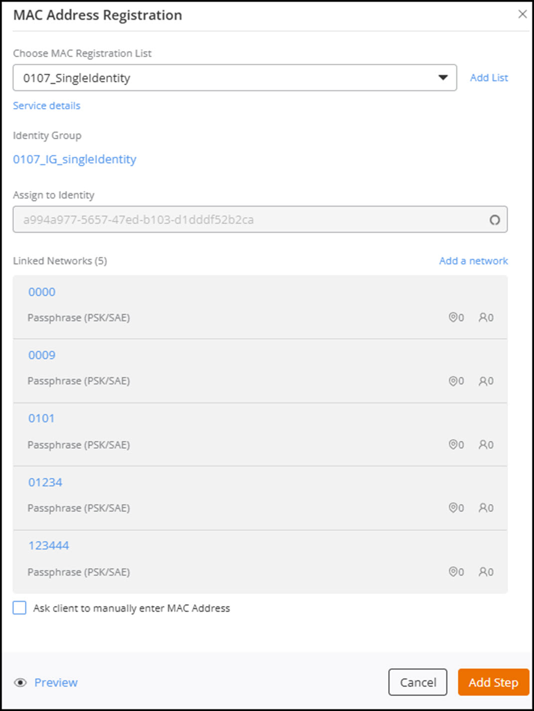
- In the
MAC Address Registration sidebar,
complete the following fields and then click Add
Step:
- Action Label: Enter a name for the step. This label identifies the step in the workflow and is editable. The field supports a maximum of 32 characters.
- Choose MAC Registration List: Select a
MAC Registration List from the drop‑down menu.
If a MAC registration list with the required configuration is not available, click Add List to create a new one. The Add MAC Registration List dialog box is displayed. Refer to Adding MAC Registration Lists for more details.
When you select a MAC registration list, the following details appear:
- The identity group associated with the selected list is automatically populated in the Identity Group field.
- The networks linked to the selected MAC registration list are displayed in the Linked Networks field. If no networks are linked, a message indicating that no networks are linked to this MAC registration list is displayed.
- Assign to Identity: Select the identity you want to associate with the MAC address registration.
- Linked Networks: Click Add a network to add a network. The Add MAC Registration Network dialog box is displayed. Enter the required network configuration details.
- (Optional) Ask
client to manually enter MAC Address:
Select this checkbox if you want the client to manually
enter the MAC address.
After clicking Add Step, the process tile is added to the Workflow Designer.
- Hover your cursor
over MAC Address Registration and click
Add.
-
Install a
certificate
- Hover your cursor
over Install a certificate and click
Add.The Install a certificate sidebar is displayed.
Install a certificate 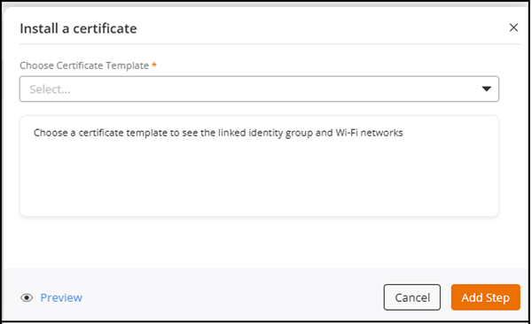
- In the
Install a certificate sidebar, complete
the following fields and then click Add
Step:
- Action Label: Enter a name for the step. This label identifies the step in the workflow and is editable. The field supports a maximum of 32 characters.
- Choose Certificate Template: Select the
required certificate template from the drop‑down list.When you select a certificate template:
- The Identity Group displays the target identity group.
- The Linked Networks field displays the Wi‑Fi networks associated with the template. The total number of networks appears in parentheses. If no networks are linked, a message indicating that no networks are linked is displayed.
- Assign to Identity: Select the identity to which the certificate will be assigned.
After clicking Add Step, the process tile is added to the Workflow Designer. - Hover your cursor
over Install a certificate and click
Add.
-
Stay on Captive
Network
- Hover your cursor
over Stay on Captive Network and click
Add.The Stay on Captive Network sidebar is displayed.
Stay on Captive Network 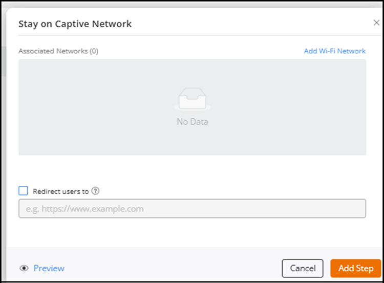
- In the
Stay on Captive Network sidebar,
complete the following fields and then click Add
Step:
- Action Label: Enter a name for the step. This label identifies the step in the workflow and is editable. The field supports a maximum of 32 characters.
- Add
Wi‑Fi Network: Click Add
Wi‑Fi Network to create a new captive
portal network that uses a workflow portal.
The Add Wi‑Fi Network dialog box is displayed. Refer to Creating a Captive Portal Network That Uses a Workflow Portal for more information.
The newly created captive portal network appears under Associated Networks, showing the number of associated networks in parentheses, associated clients, and venues.
You can create multiple captive portal networks that use a workflow portal.Note: The Access Point uses this captive portal network to redirect users to the onboarding workflow. - (Optional) Redirect users to: Select the Redirect users to checkbox to enable URL redirection. When enabled, enter the URL where end users should be redirected after completing the workflow. If the checkbox is not selected or no URL is configured, users remain on either the page they originally requested or the network’s default landing page.
After clicking Add Step, the process tile is added to the Workflow Designer. - Hover your cursor
over Stay on Captive Network and click
Add.
-
Provide Passphrase
- Hover your cursor
over Provide Passphrase and click
Add.
The Provide Passphrase sidebar is displayed.
Provide Passphrase 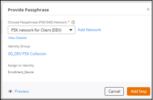
- In the Provide Passphrase sidebar, complete
the following fields and then click Add
Step:
- Action Label: Enter a name for the step. This label identifies the step in the workflow and is editable. The field supports a maximum of 32 characters.
- Choose Passphrase (PSK/SAE) Network:
Select the passphrase network from the drop‑down list.
If the required network does not exist, click Add Network to create a new Passphrase (PSK/SAE) network. Refer to Creating a Network That Uses a Passphrase (PSK/SAE).
When you select a passphrase network:- The Identity Group displays the target identity group.
- The Assign to Identity field displays the mapped identity for that network.
- Passphrase Delivery: Toggle the switch
on to enable passphrase delivery to the end user.
When enabled, the following fields are displayed:
- Delivery Control: Select Send automatically to send the email
or SMS when the workflow completes, or select
User Controls Delivery to display
Email and SMS buttons in the enrollment portal so
the user can send the passphrase.Note: The enrollment portal displays Email and SMS buttons only for delivery methods enabled in Delivery Medium and only when the workflow has collected the user’s email address or phone number.
- Delivery Medium: Enable Email or SMS, depending on your workflow
design.Note: An authentication or Data Prompt step earlier in the workflow must collect the user’s email address and/or phone number. If no prior step collects the email address or phone number, an error message is displayed.Note: If no SMS provider is configured in , the SMS option is disabled, and users do not see SMS delivery options in the enrollment portal.Note: If the SMS provider is removed after configuration, SMS delivery becomes unavailable.
- Preview Passphrase Delivery: Click
Preview Passphrase Delivery to open
the preview window and verify the content that
will be sent to the user.
The Email tab displays the Wi‑Fi Network Name, Personal Password (passphrase), and the message body used for email delivery. The SMS tab displays a concise message with the SSID and passphrase.
- Delivery Control: Select Send automatically to send the email
or SMS when the workflow completes, or select
User Controls Delivery to display
Email and SMS buttons in the enrollment portal so
the user can send the passphrase.
After clicking Add Step, the process tile is added to the Workflow Designer.Note: The workflow designer does not enforce that a prior step collects email or phone information, so ensure that your workflow includes a step to gather these values. - Hover your cursor
over Provide Passphrase and click
Add.
-
In the Actions Library tab, configure only one of the
following Authentication options:
- SAML Authentication: Authenticates users through a configured SAML Identity Provider profile.
- Directory Server Auth: Authenticates users against a configured directory server profile such as AD or LDAP.
-
SAML Authentication
- Hover your cursor over SAML
Authentication and click
Add.The SAML Authentication sidebar is displayed.
SAML Authentication 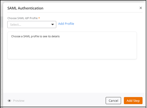
- In the SAML Authentication sidebar,
complete the following fields and then click Add
Step:
- Action Label: Enter a name for the step. This label identifies the step in the workflow and is editable. The field supports a maximum of 32 characters.
- Choose SAML IdP Profile: Select a
SAML IdP profile from the drop-down list or click
Add Profile to create a new
SAML IdP Profile. Refer to Adding and Managing a SAML Identity Profile
for more details.
When you select an existing profile, the following details are displayed:
- Require SAML requests to be signed: Displays Yes if request signing is enabled, and No if it is disabled.
- SAML response encryption: Displays Yes if response encryption is enabled, and No if it is disabled.
- Server Certificate: Displays the name of the server certificate.
- Hover your cursor over SAML
Authentication and click
Add.
-
Directory Server Auth
- Hover your cursor over Directory
Server Auth and click Add.The Directory Server Auth sidebar is displayed.
Directory Server Auth 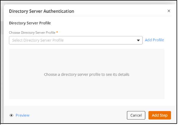
- In the Directory Server Auth sidebar,
complete the following fields and then click Add
Step:
- Action Label: Enter a name for the step. This label identifies the step in the workflow and is editable. The field supports a maximum of 32 characters.
- Choose Directory Server Profile: Select
a Directory Server profile from the drop‑down list, or
select Add
Profile to create a new Directory Server
profile. Refer to Adding and Managing a Directory Server
Profile for more details.
When you select an existing profile, the following details are displayed:
- Server Type: Displays the server type (AD or LDAP).
- Enables TLS encryption: Displays Yes if TLS encryption is enabled and No if it is disabled.
- FQDN or IP Address: Displays the domain name or IPv4 address and port number.
- Windows Domain Name: Displays the Windows Domain Name in formats such as dc=domain, dc=ruckuswireless, or dc=com.
- Admin Domain Name: Displays the administrator domain name in formats such as admin@domain.ruckuswireless.com.
-
Admin Password: Displays the password
in dotted format with an icon to reveal it.
- Hover your cursor over Directory
Server Auth and click Add.
-
In the Actions
Library tab, configure the following Splits options:
- User Choice Split: This step displays multiple options for the user to choose a path.
- Logical
Split: This step automatically routes users to different
workflow paths based on predefined logical conditions.Note:
- A workflow can contain up to 20 split steps, including Logical Splits and User Choice Splits.
- Across all splits, a workflow can contain up to 25 total branches.
-
User Choice Split
- Hover your cursor
over User Choice Split and click Add.The User Choice Split sidebar is displayed.
User Choice Split 
- In the
User Choice Split sidebar, complete the
following fields and then click Add
Step:
- Action Label: Enter a name for the step. This label identifies the step in the workflow and is editable. The field supports a maximum of 32 characters.
- Page Title: Toggle the switch on to enter the title shown to users when they reach this split step. This title helps users understand the choice they need to make.
- Page
Body Text: Toggle the switch on to enter
a brief instruction or message.
Example: Select the type of onboarding process to continue.
- Branch 1: Configure the default
option:
- Branch title: Enter the display name for the option (for example, Student or Employee). This name appears as the selectable button or tile.
- Branch description: Enter a brief
explanation of what happens when users choose this
option. The limit is up to 100 characters.
Example: Continue with student onboarding steps.
- Change icon: Click Change icon to upload an image that represents the option. The maximum image size is 2 MB, and supported formats include PNG, JPEG, and SVG.
- Click
Add
Branch to add more branches and repeat
the configuration for each option. Note:
- A workflow can contain up to 20 split steps, including Logical Splits and User Choice Splits.
- You can create up to 25 branches across all splits in the workflow.
- Click the
icon next to the option
name to remove a branch.Note:
- At least one branch is required for the split to be valid.
- Removing a branch detaches its connected steps from the workflow without deleting them. Detached steps can be reattached later.
- All branches under a single split must contain the same type of action to maintain workflow consistency.
- Hover your cursor
over User Choice Split and click Add.
-
Logical Split
- Hover your cursor
over Logical Split and click Add.
The Logical Split sidebar is displayed.
Logical Split 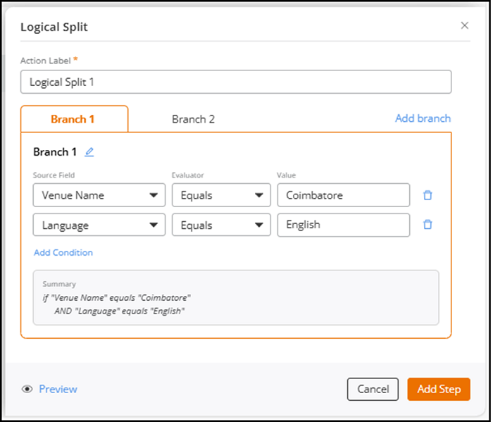
- In the
Logical Split sidebar, complete the
following fields and then click Add
Step:
- Action Label: Enter a name for the
step. This label identifies the step in the workflow and
is editable. The field supports a maximum of 32
characters.
A Logical Split contains one or more branches. Each branch represents a path the workflow can follow when its conditions evaluate to true.
- Branch 1:
- Source Field: Select a field from the
drop‑down list. The list includes fields such as
Venue Name, Language, Device OS, Browser Name, AP
Group, Device MAC Address, Device Type, Captive Portal SSID, and Device IP Address.Note: Duplicate source fields are not allowed in the same branch, and fields already selected in the branch are displayed as disabled.
- Evaluator: Select how the system compares the field and the value. Options include Equals, Does not equal, Starts with, Ends with, Contains, and Does not contain.
- Value: Enter the comparison value.
- Add
Condition: Click Add
Condition to add one or more logical
conditions.Note: Each branch can include up to five conditions, and all conditions use AND logic, meaning every condition must be TRUE for the branch to match.
The Summary box displays a read‑only summary of the conditions in the branch. The summary is displayed in plain text and updates automatically as you add or modify conditions.
- Source Field: Select a field from the
drop‑down list. The list includes fields such as
Venue Name, Language, Device OS, Browser Name, AP
Group, Device MAC Address, Device Type, Captive Portal SSID, and Device IP Address.
- (Optional) Click Add
Branch to create additional
branches.Note: A Logical Split includes 1 to 10 branches, each branch name must be unique, and names longer than 32 characters are truncated with a tooltip. The UI automatically expands horizontally to display up to 10 branch tabs, and labels may truncate when space is limited.
- (Optional) You can click icon to rename a branch and
the icon to remove a
branch.
- Action Label: Enter a name for the
step. This label identifies the step in the workflow and
is editable. The field supports a maximum of 32
characters.
Note:- The workflow evaluates branches in order.
- The first matching branch, where all conditions evaluate to TRUE, is selected.
- A branch with no conditions acts as an always‑match fallback and is typically used as a default route.
- You can add, reorder, or delete branches at any time.
- A workflow can contain up to 20 split steps, including Logical Splits and User Choice Splits.
- Across all splits, a workflow can contain up to 25 total branches.
After clicking Add Step, the process tile is added to the Workflow Designer. - Hover your cursor
over Logical Split and click Add.
-
In the upper-right corner of the
Workflow Designer page, click Portal Look &
Feel.
The Portal Design page is displayed.
Portal Design - Customization 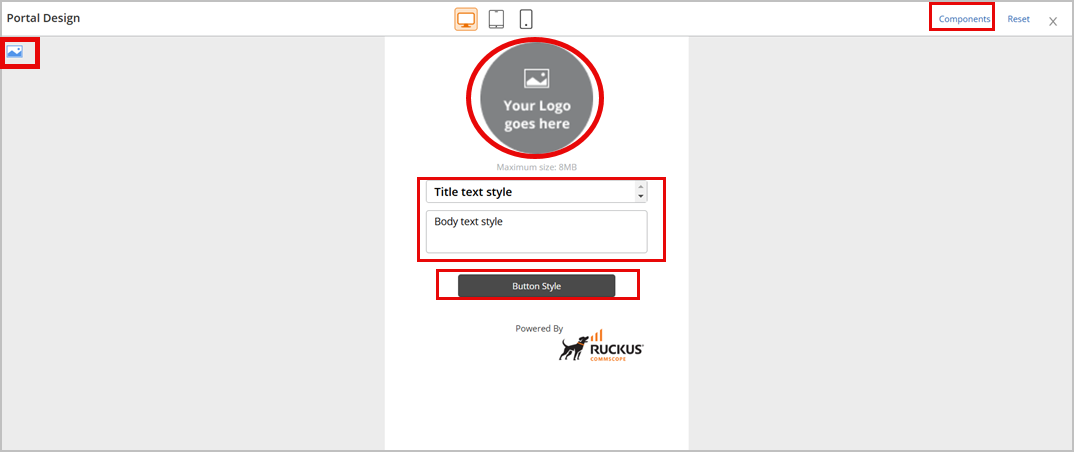
On the Portal Design page, you can customize the following:
- Your Logo
- Title Text Style
- Body Text Style
- Button Style
- Background Image or Color
- Logo
- Powered By
- WiFi4EU (Snippet Settings)
-
Click
 in
the upper-right corner of the Portal Design page to return
to the Workflow Designer wizard.
in
the upper-right corner of the Portal Design page to return
to the Workflow Designer wizard.